Earlier,when discussing Style,I described myself as an absolute beginner in painting,so this topic about Tone(or Value) should be interesting for me,but maybe also for those with more experience.
I’m not sure that I like your Tone……
There’s a lot of confusion about tone when using colour but we can consider it a parallel to what we are very happy to accept when we think of values of grey. We’re comfortable with the idea that there are different “intensities” of grey, from very dark (almost black) to very pale indeed. In fact we have all seen photos in newspapers that are completely in shades of grey. So, how do the photos or paintings done in shades of grey (or monochrome) manage to give a convincing feel of depth and form. The answer is in the use of different tones.
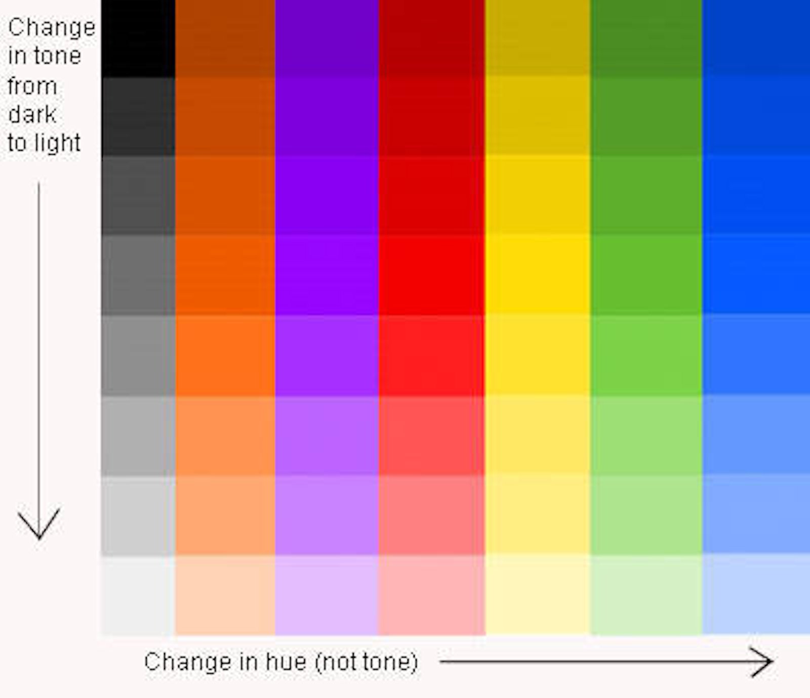
As the chart to the right shows, we ought consider tone in colour just as we do with tone in the grey scale.
The simple truth is that a successful painting or drawing may be produced using no colour (or just one) if tone is used correctly but a convincing painting will not result, however when many colours are used; if tone theory isn’t correctly applied.
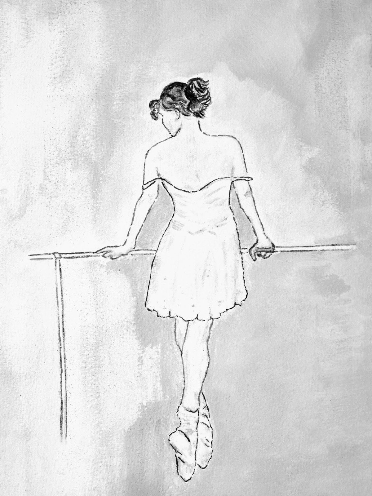
A good way of seeing if your painting (or any picture for that matter) has good tonal values is to make a “black and white”copy of it.If definition is lost in this version then chances are that the tonal values are not correct.
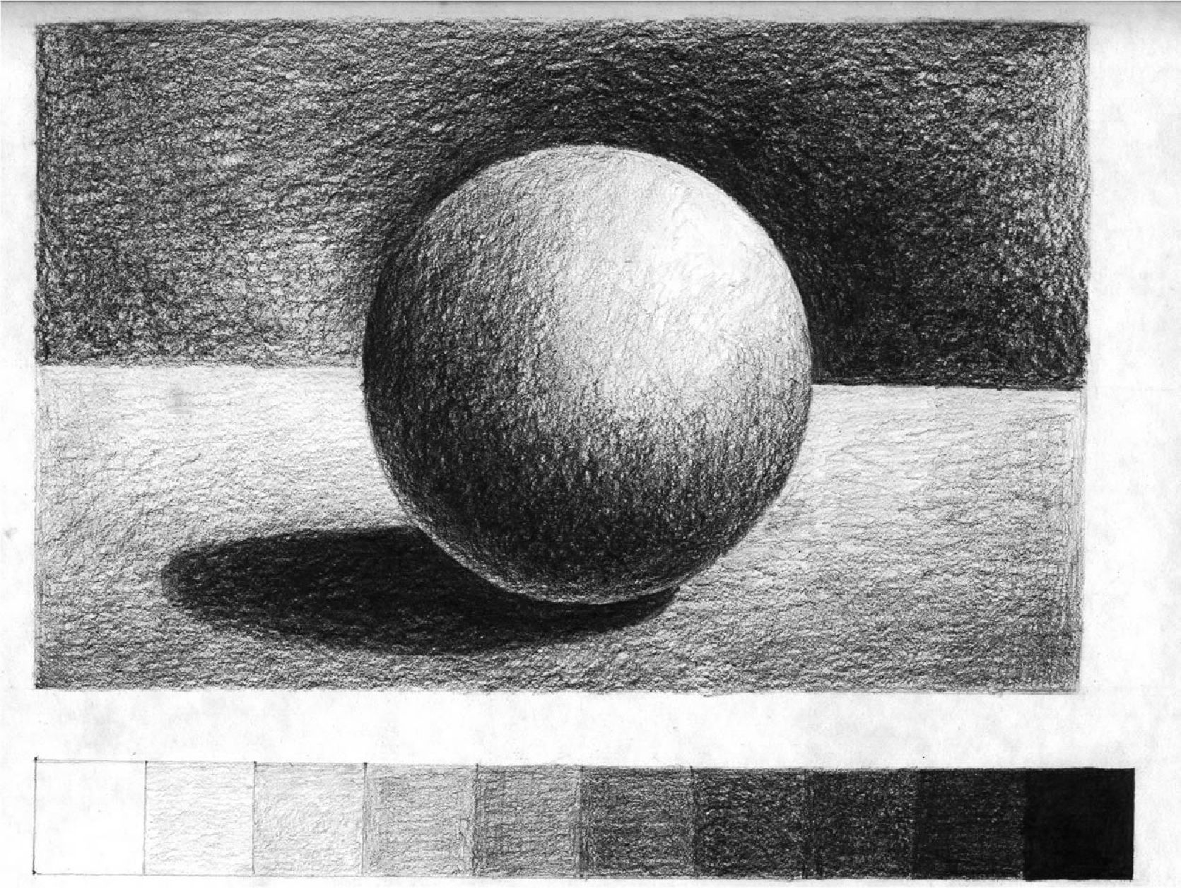
Look at the drawing to the right. We know immediately what it is…….we know what shape it is. Why? We say “well, it’s obvious isn’t it……it’s a sphere” but how do we know? What is there about this 2 dimensional image that tells us that? Again the answer is simple……. And that’s half the battle in explaining some principles …..they’re often too obvious for us to see because we’ve spend a lifetime recognising shapes by the shadows and light that hits them.
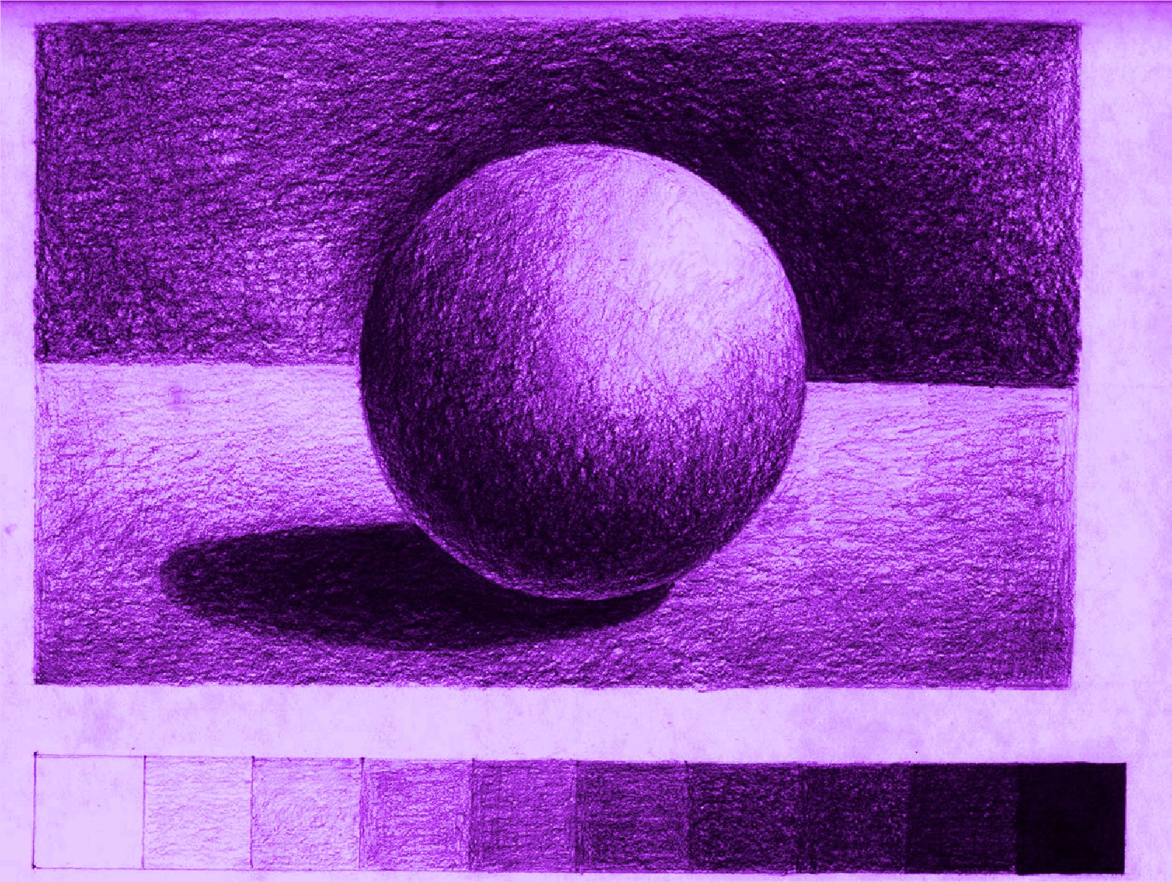
We know that this is a sphere by the shading on one side and the light on the other. But this is a tonal picture….. there is no “colour”. It’s true that this picture could have been created using a range of tone values of any one colour (as shown left) but it isn’t the colour that tells us the shape…… it’s the tonal values.
Note also how the eye is drawn to those areas where there is light against dark. So the correct use of tone not only makes our brain recognise the 2 dimensional picture as the 3D image that we want the viewer to see, but it also makes interest. We want the viewer to see that a tree is cylindrical, that an apple is spherical, that the field in our landscape undulates. This can all be achieved by correct application of tonal values
Tone can be used:
- to create a contrast of light and dark.
- to create the illusion of form.
- to create a dramatic or tranquil atmosphere.
- to create a sense of depth and distance.
- to create a rhythm or pattern within a composition.
Look at some striking examples of the expert’s use of Tone
Tone As the Contrast of Light and Dark

CARAVAGGIO (c.1527-1610)
Basket of Fruit, 1595-96 (oil on canvas)
‘Basket of Fruit’ is a striking display of summer fruit that, uncharacteristically for Caravaggio, appears dark against a light background. It is considered to be the first freestanding still life in Western art and is the only true example of the genre by the artist.
Tone as Form

ALBRECHT DÜRER (1471-1528)
Old Man aged 93, 1521 (brush drawing on paper primed with color)
Note above the drawing reads ‘The man was 93 years old and still healthy.’
Albrecht Dürer the great German artist from Nuremberg, made many tonal studies of heads, hands and drapery as preparatory sketches for his paintings. While on a visit to Venice in 1505, he adopted a drawing technique called ‘chiaroscuro’ (Italian for ‘light-dark’) which used three basic tones to create the illusion of form:
- the dark tones were created with black ink.
- the light tones were established with white gouache, an opaque form of watercolor.
- the mid-tones were provided by the color of the Venetian Blue paper that he found in Northern Italy.
Tone As Drama

PABLO PICASSO (1881-1973)
Guernica, 1937 (oil on canvas)
The painting of ‘Guernica’ is the depiction of the artist’s horror at the bombing of the small Basque village during the Spanish civil war. Pablo Picasso painted this huge canvas (11ft 6in x 25ft 7in) for the Spanish Pavilion at the Paris World Fair to focus international attention on this barbaric act.
‘Guernica’ is probably the most dramatic painting of the 20th century, yet it is painted in tones of black and white without any hint of color. Picasso deliberately avoids using color due to its emotional import which would detract from the dark despair of the subject.
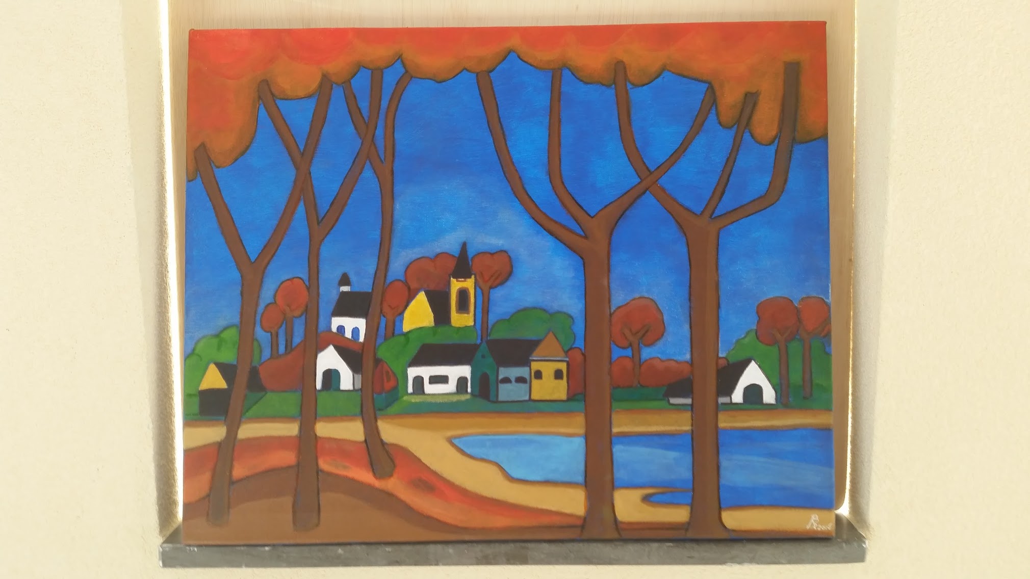
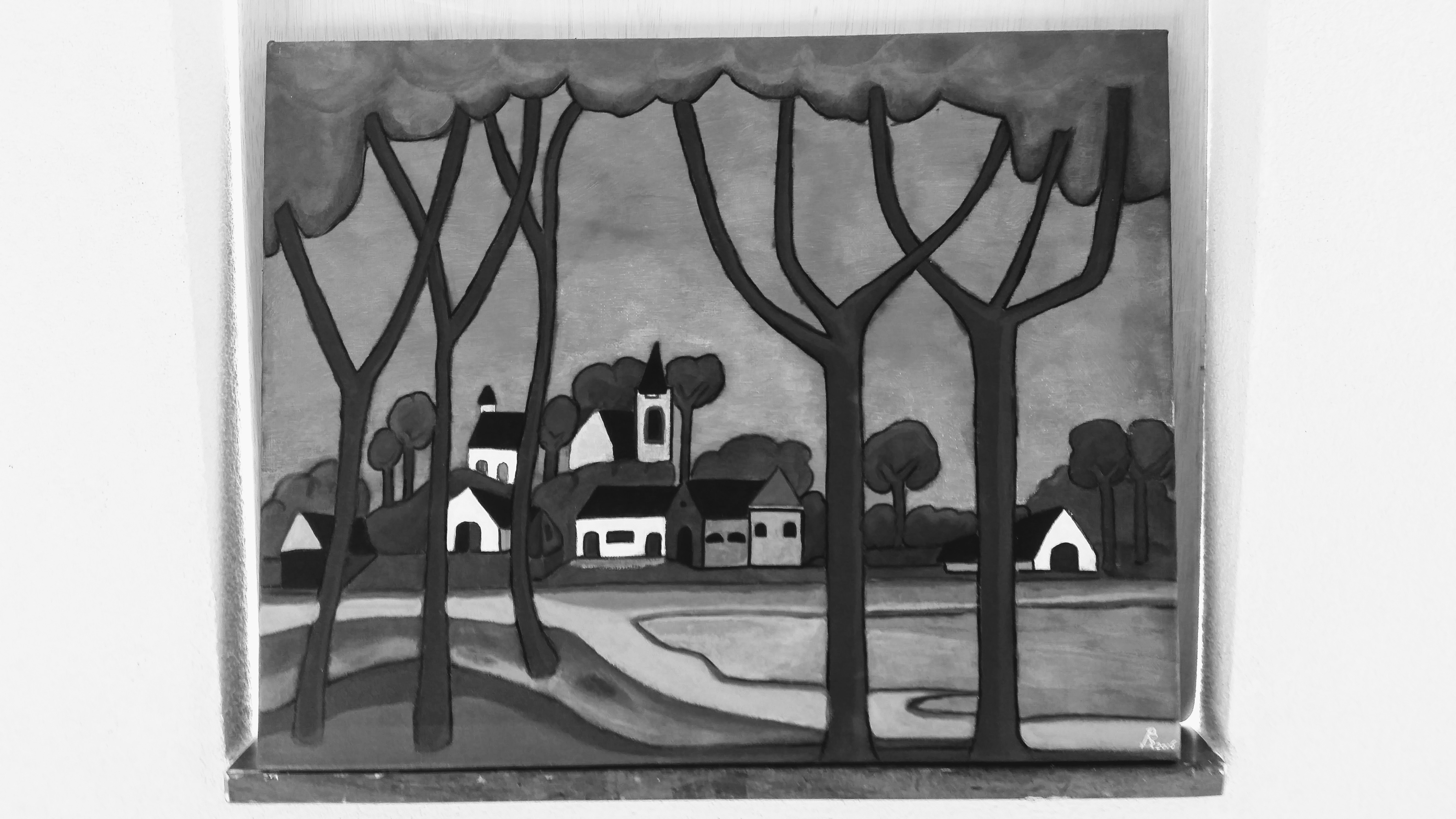
Let me finish this subject with a beginners example of Tone in an early painting of me,called “gezicht op Hoevelaken”,followed by an overview of it’s tonal values or greyscale.According to me,the tonal values are well chosen,in order to create depth and distance
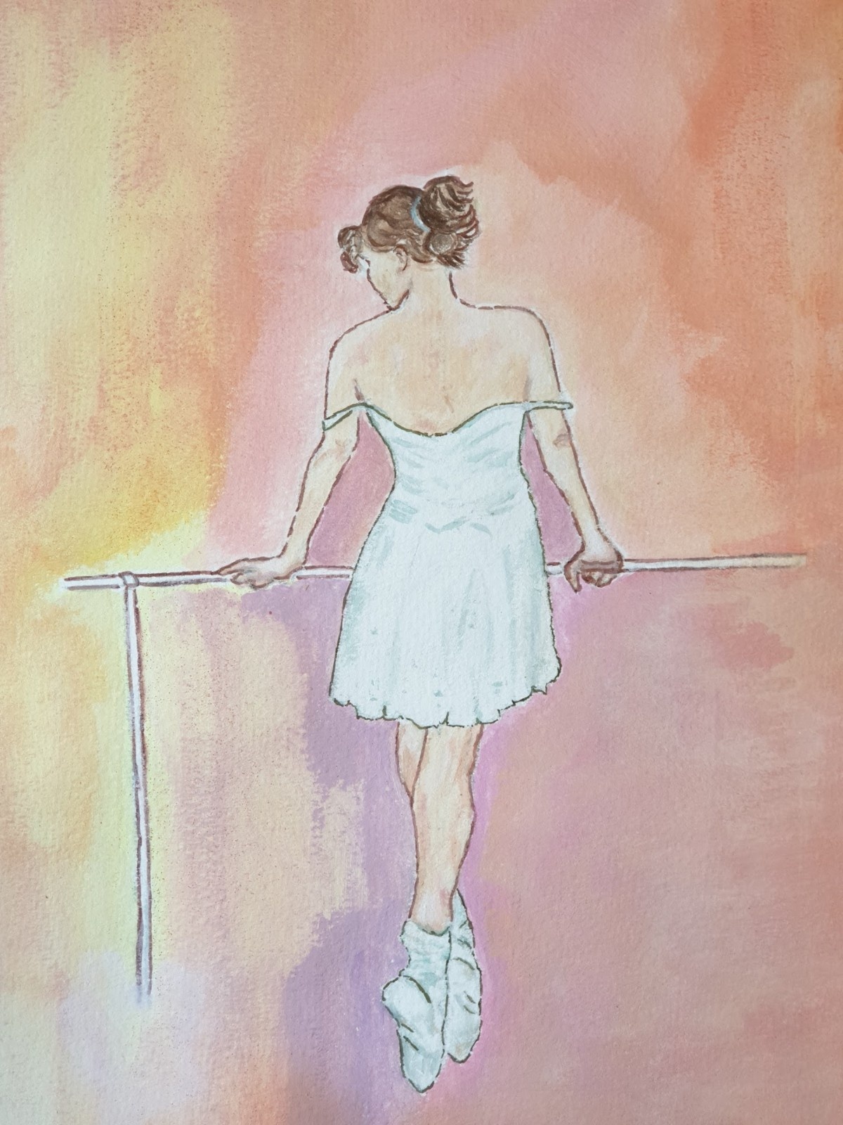
The following example of “my” Ballerina the Barre however shows a lack of tone variation,resulting in a weak contrast .