Haiga (haikai drawing) is a style of Japanese painting that incorporates the aesthetics of haikai,a Japanese verse or prose. Haiga are typically painted by haiku poets (haijin), and often accompanied by a haiku poem. Like the poetic form it accompanied, haiga was based on simple, yet often profound, observations of the everyday world
Haiku poetry: This kind of poetry was originally developed by Japanese poets.These are poems that use sensory language to capture a feeling or an image,often inspired by nature. A Haiku is composed of three word groupings in separate lines.The seventeen total syllables are divided into a five-seven-five syllable count for each corresponding line.Because Japanese words are commonly shorter than that of the English language,it is not uncommon to vary the 17-syllable count.
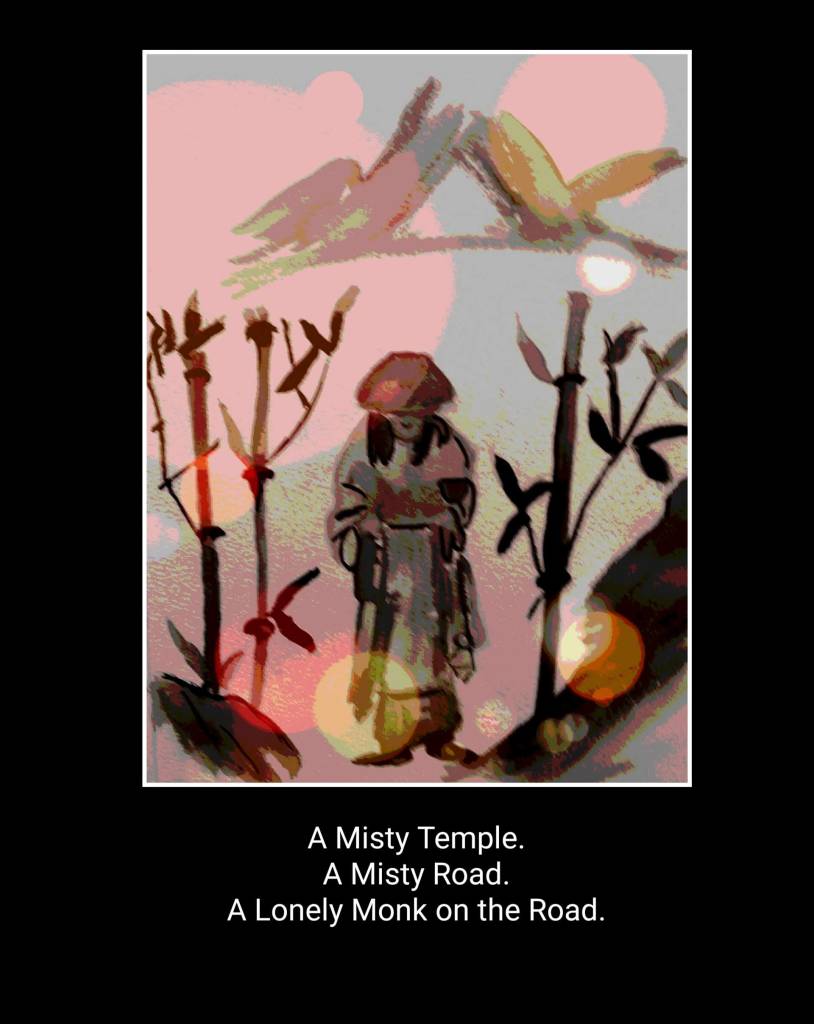
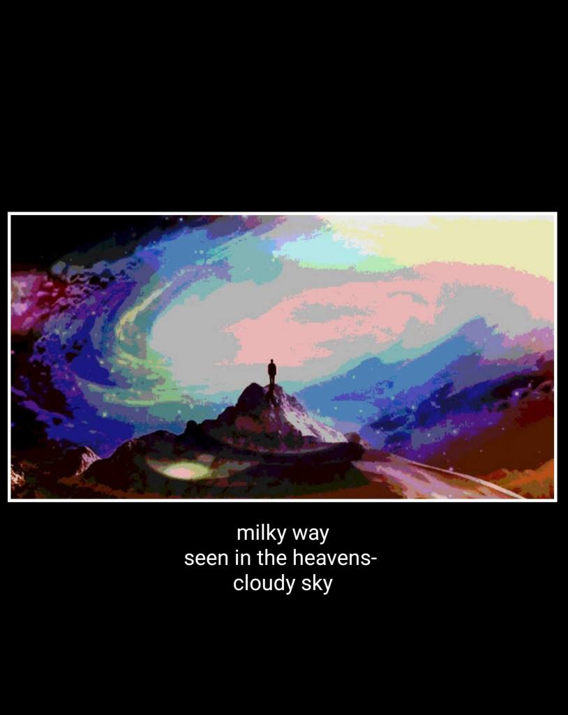
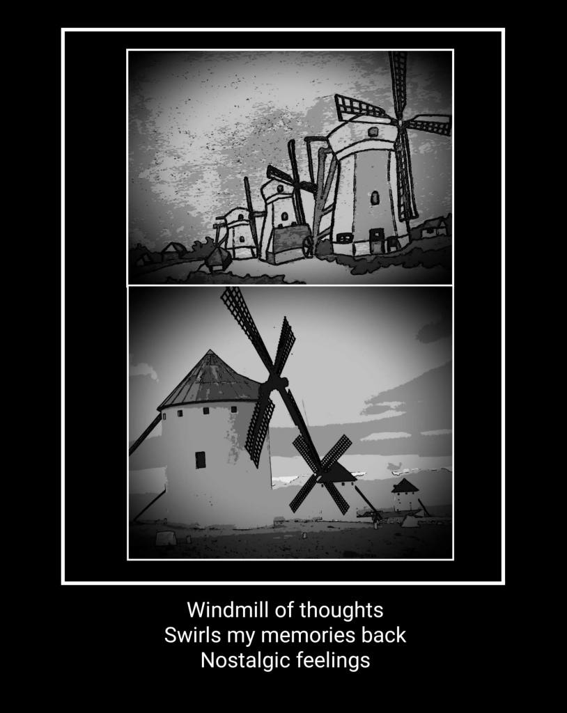
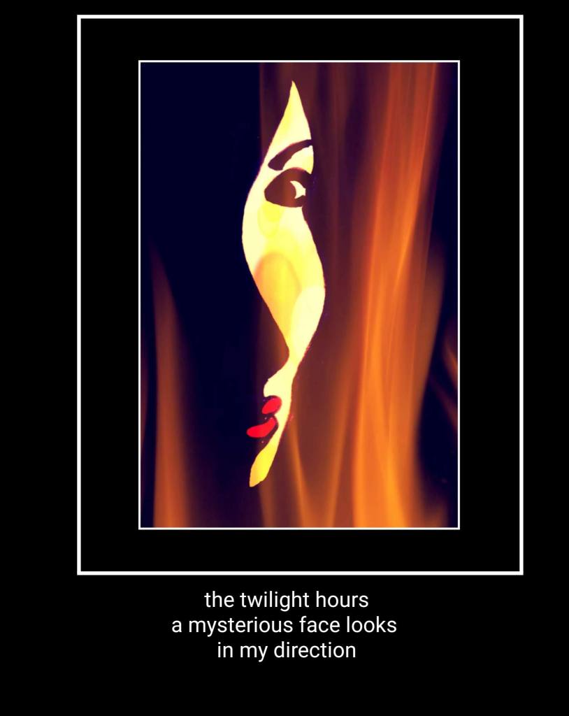
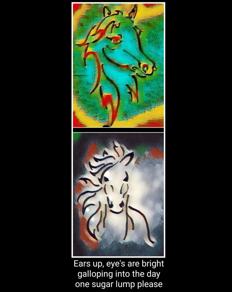
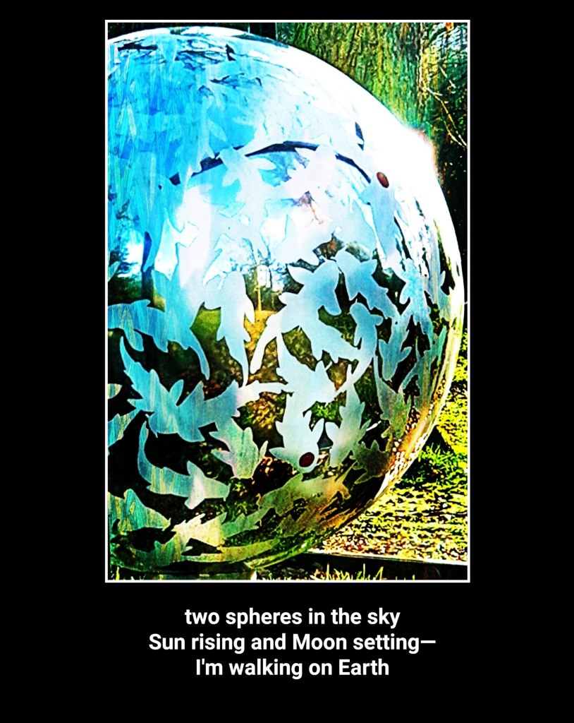
Matsuo Bashō(1644-1694) was the most famous poet of the Edo period in Japan. One of his most famous Haikus is about the frog and the old pond.
An old silent pond… A frog jumps into the pond, splash! Silence again.
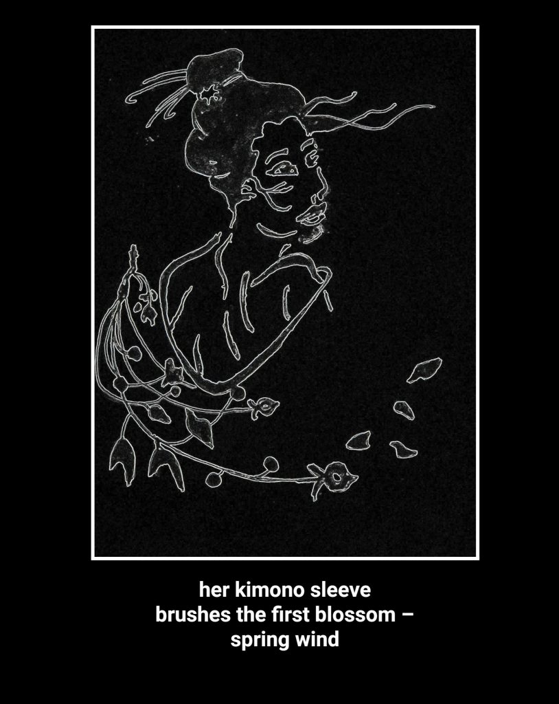
Te next painting tries to capture this Haiku.
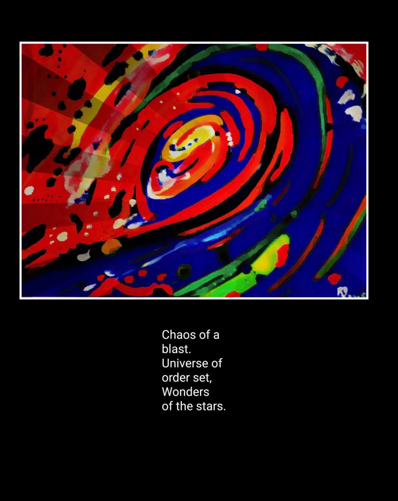
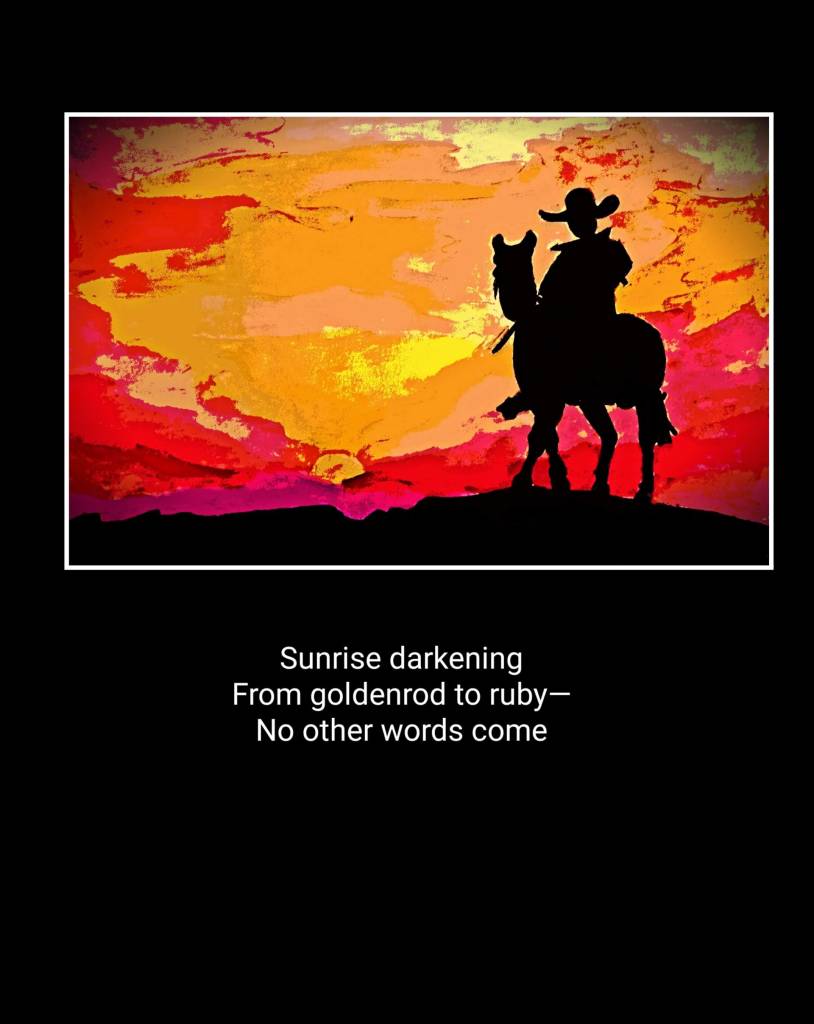
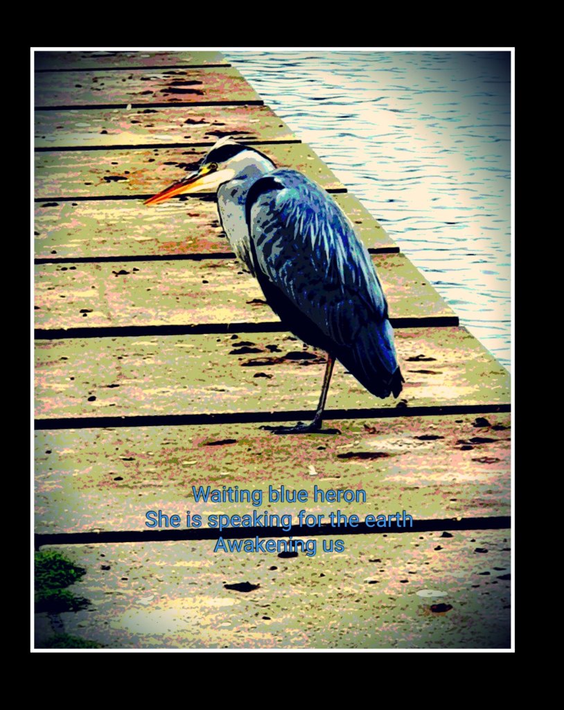
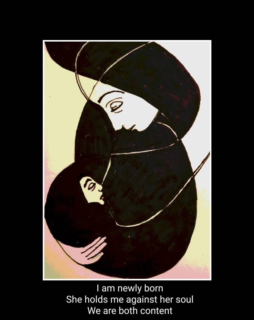
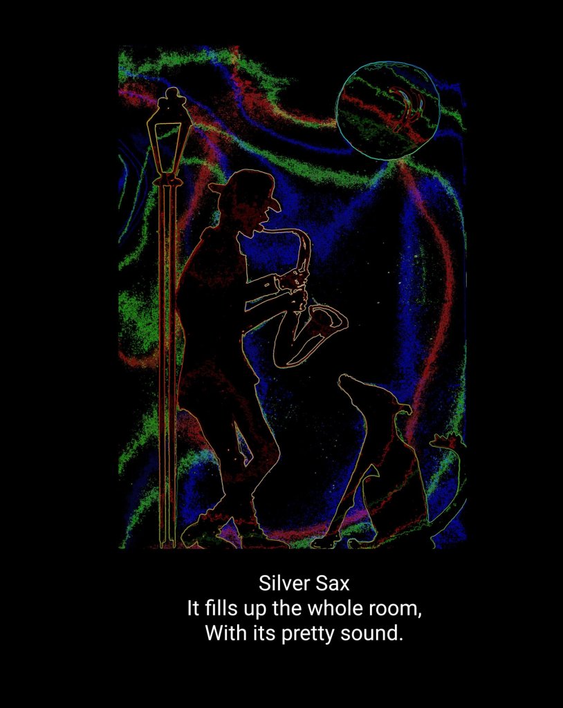
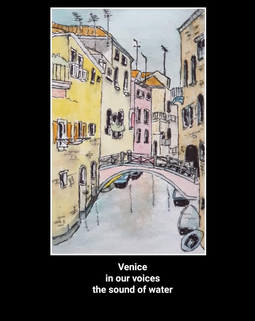
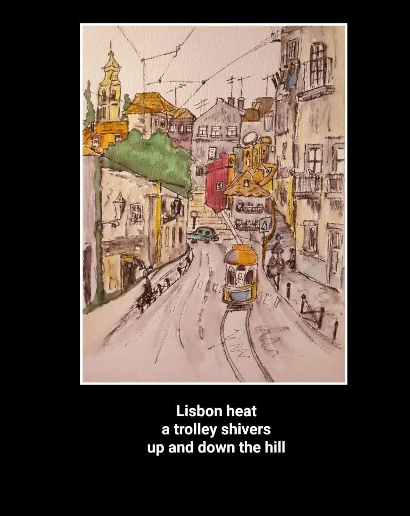
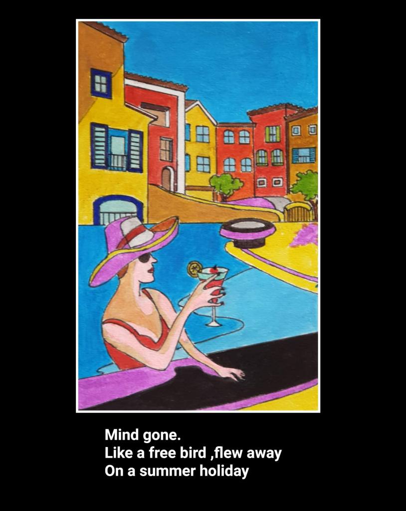
The old pond
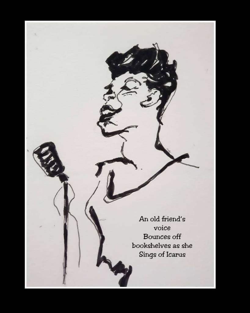
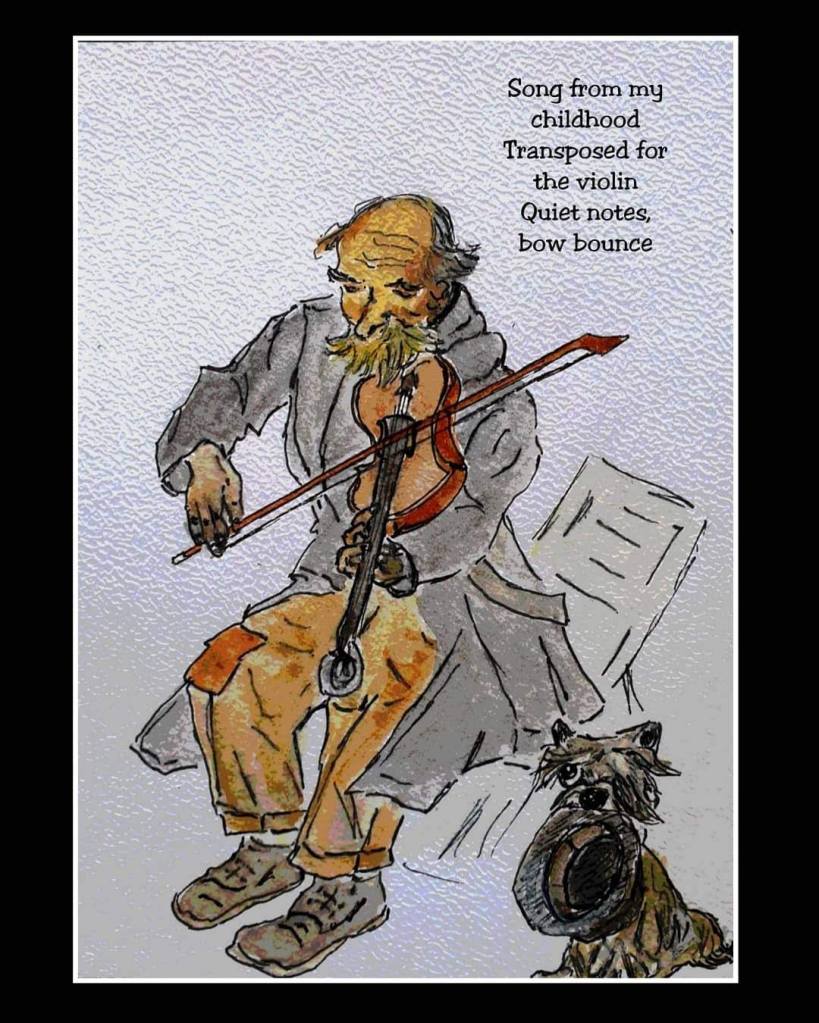
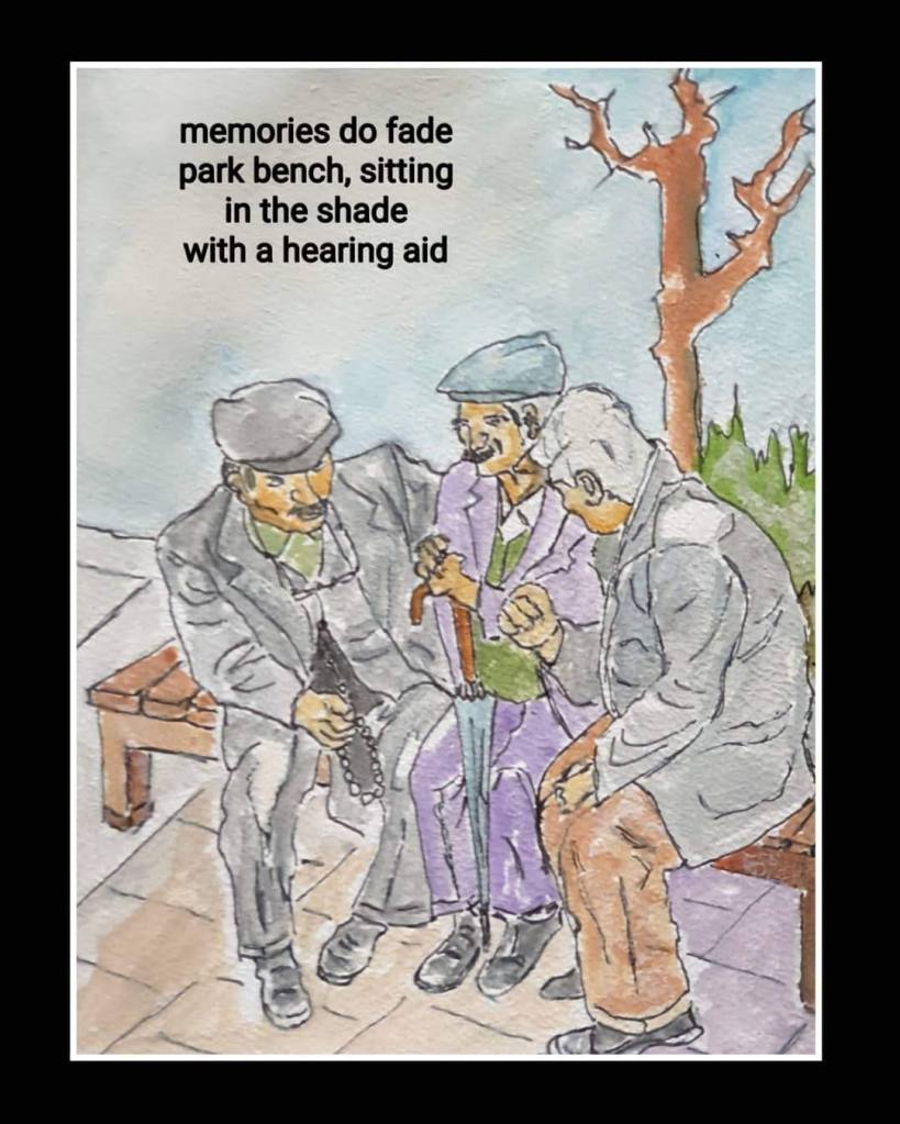
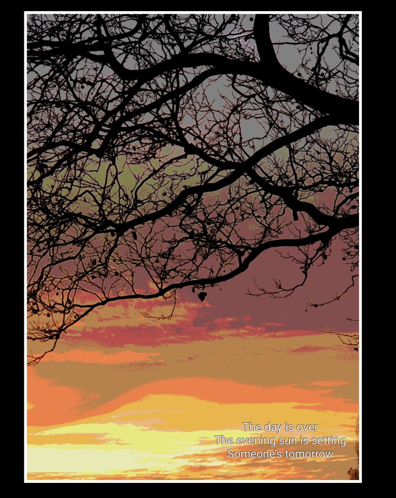
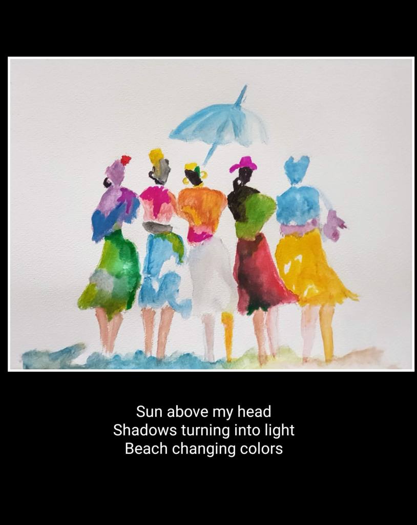
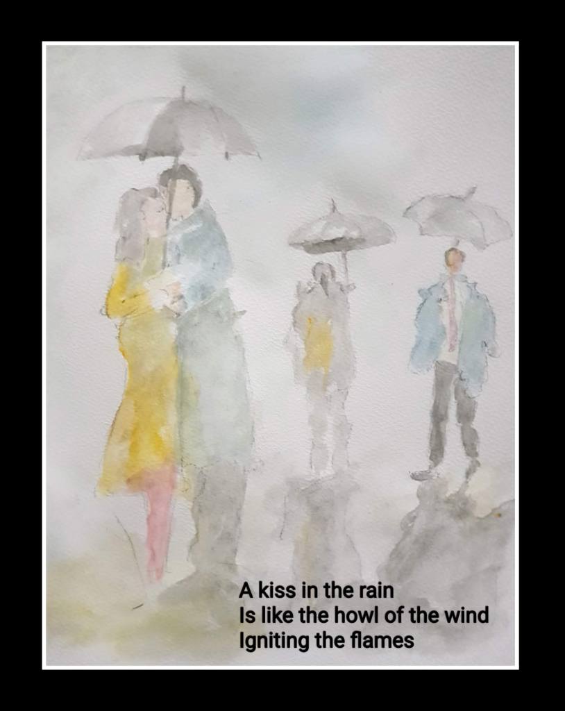
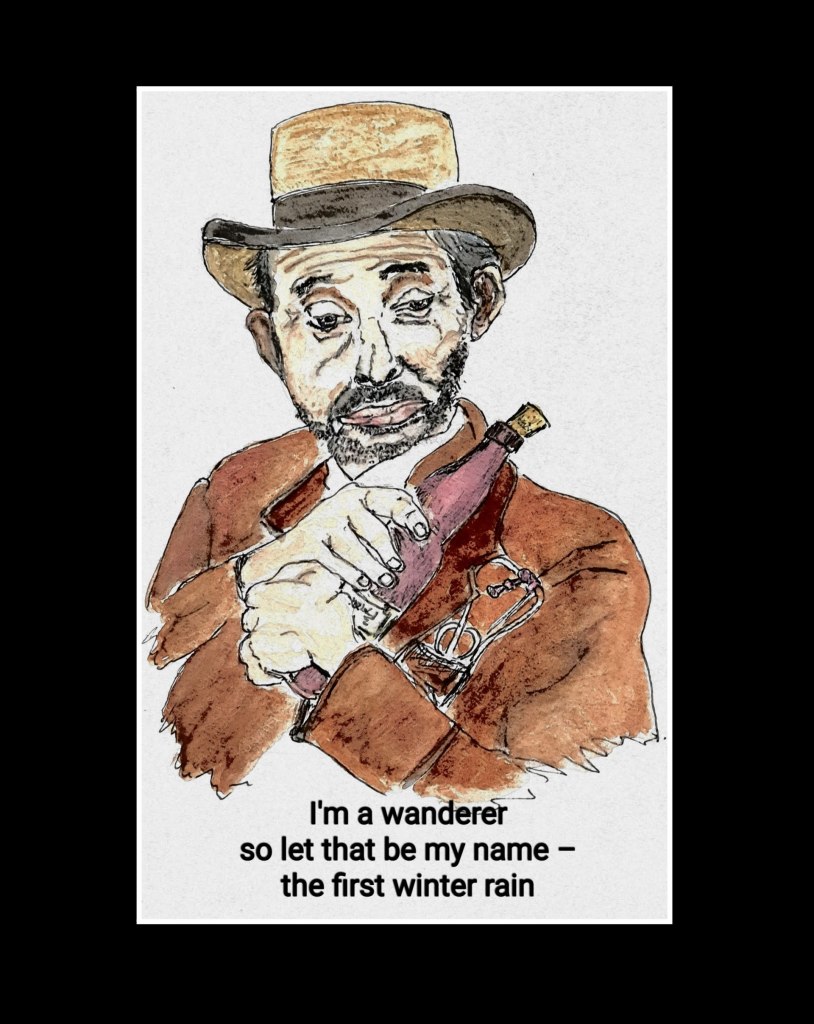
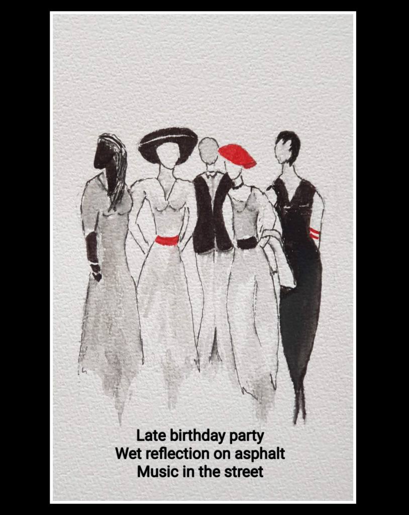
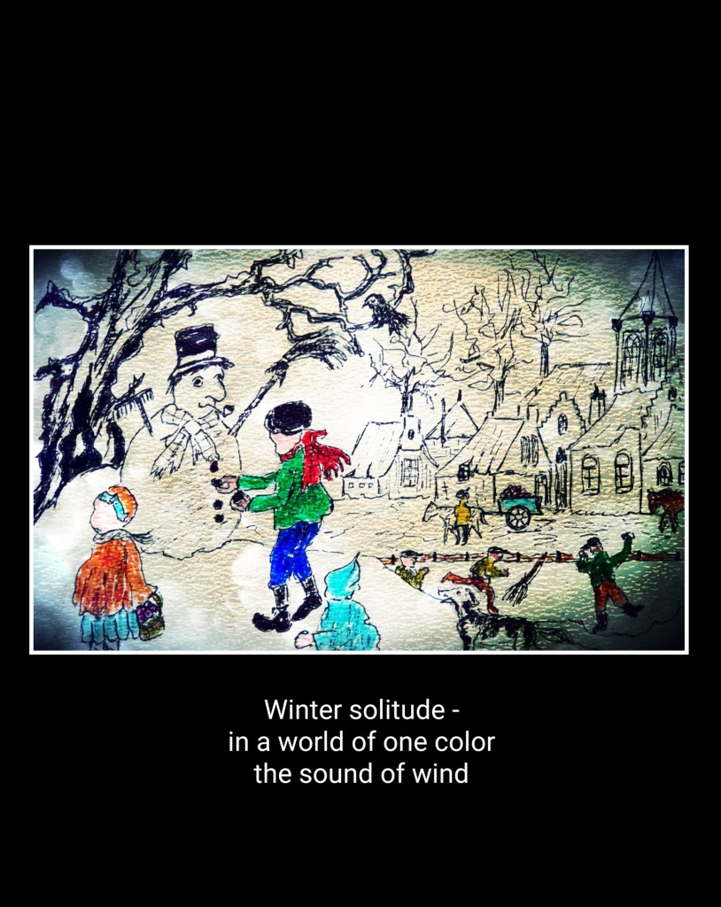
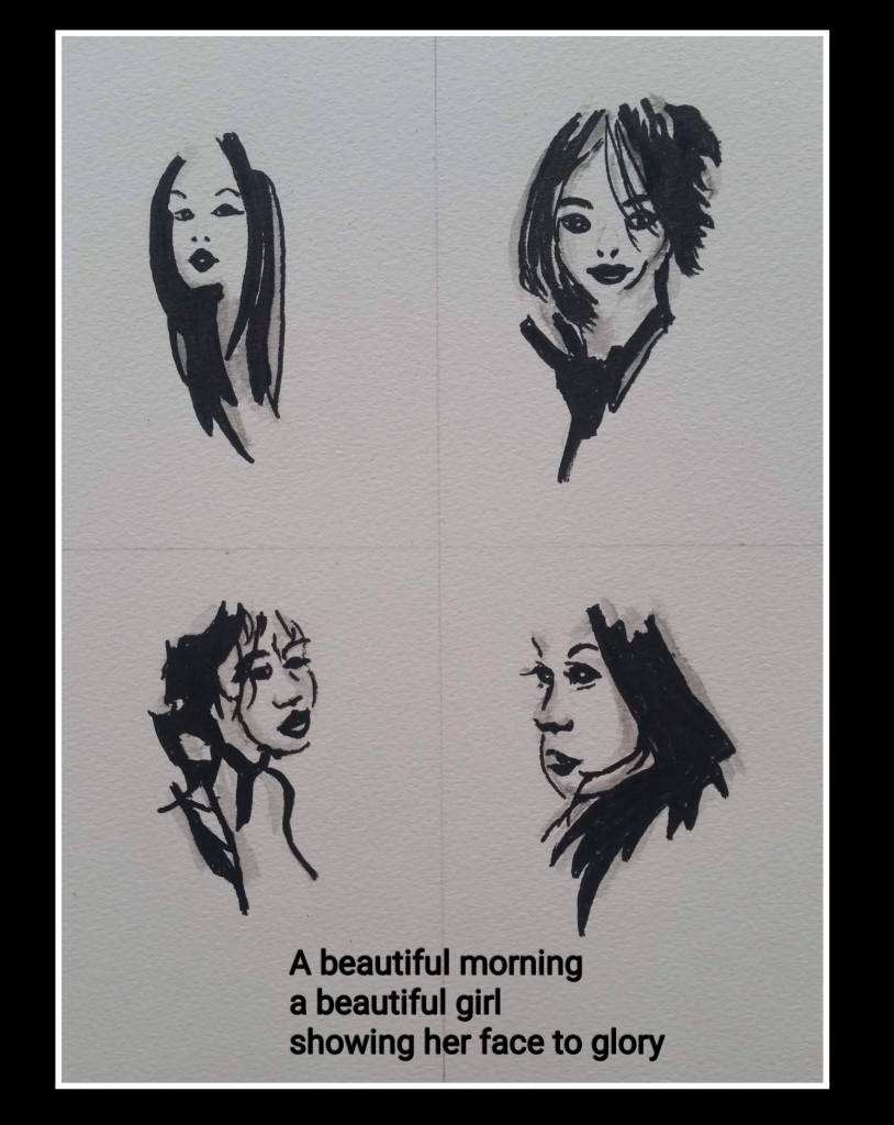
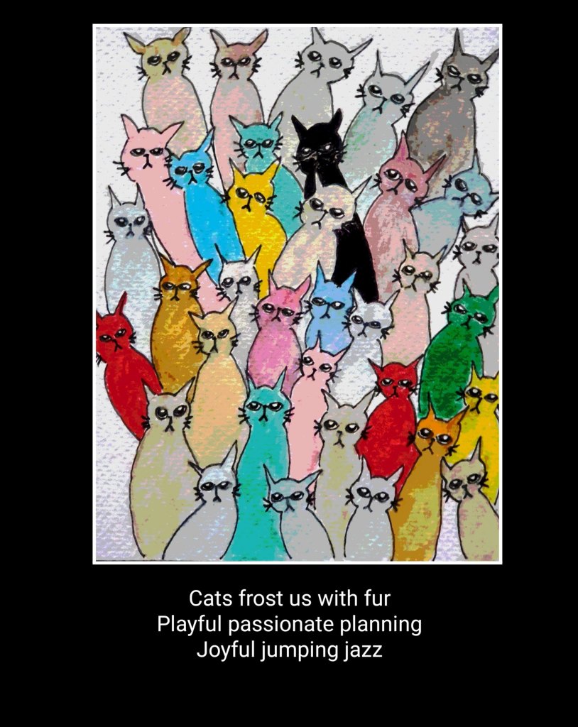
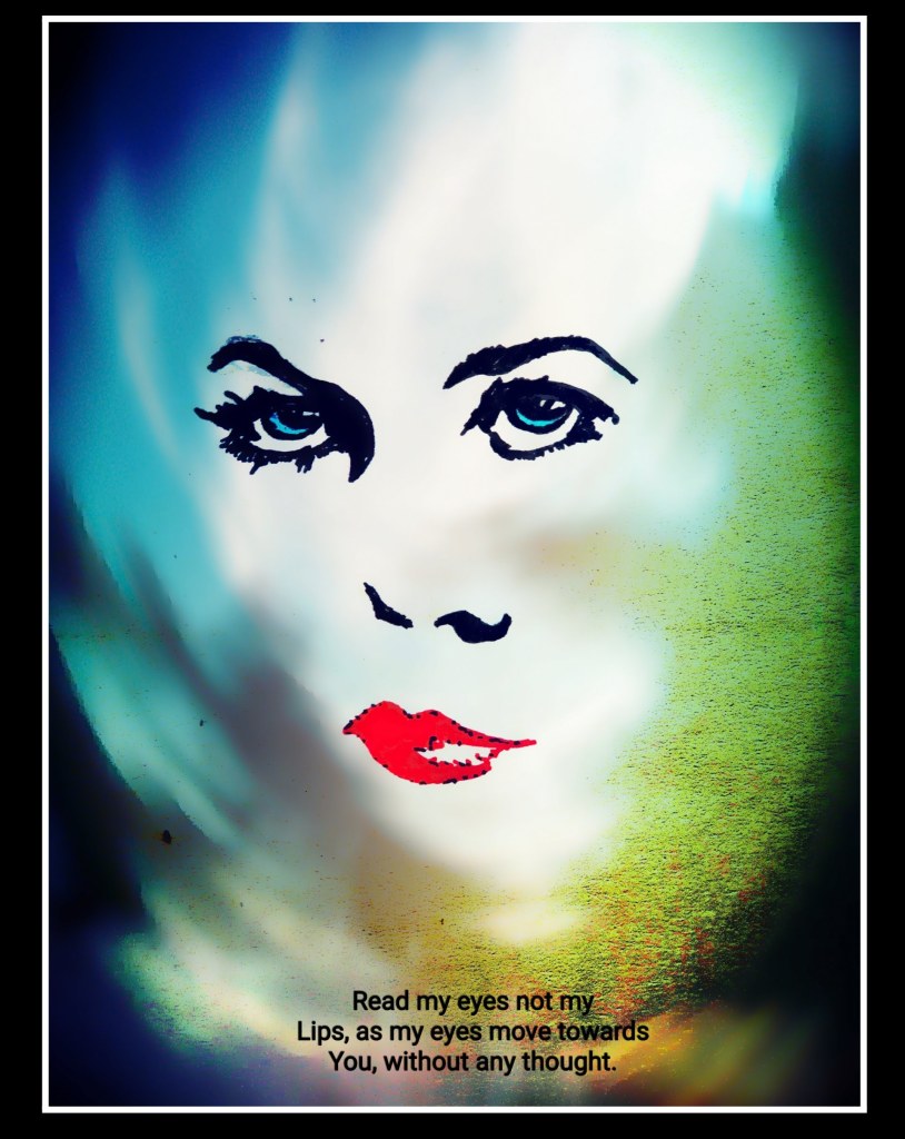
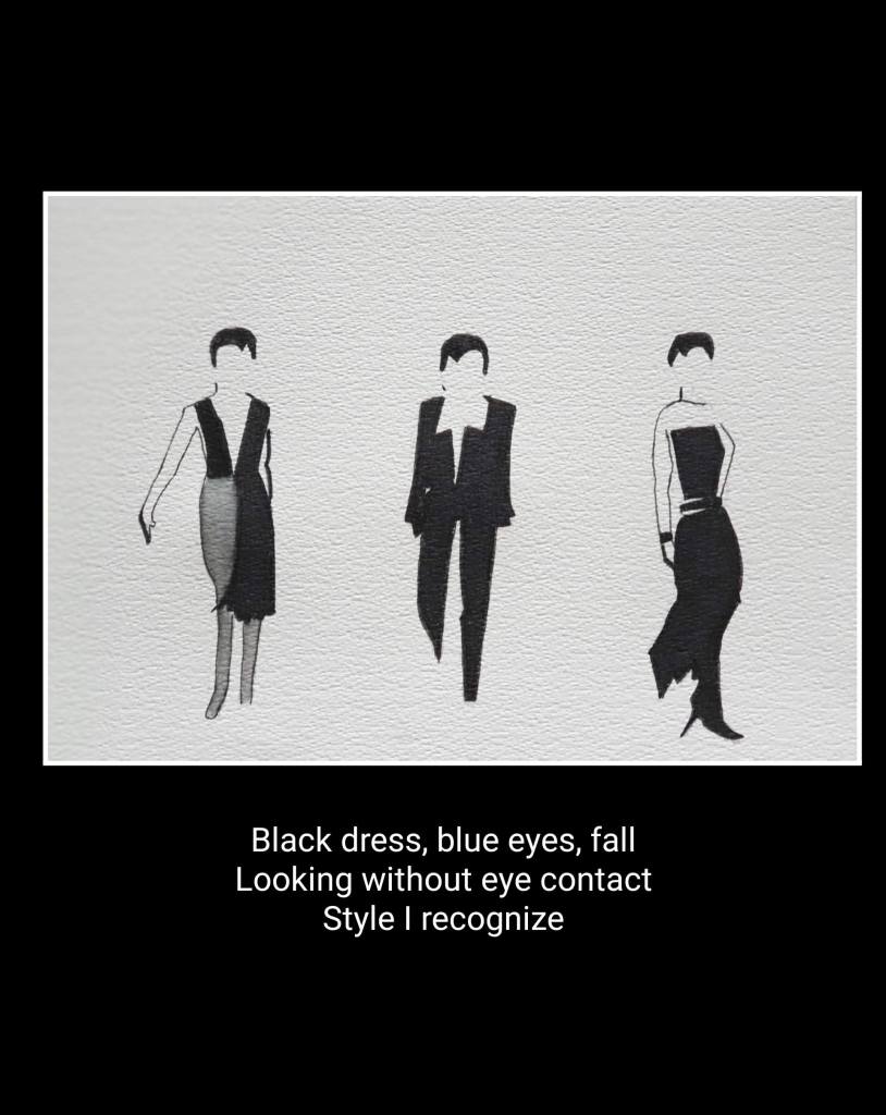
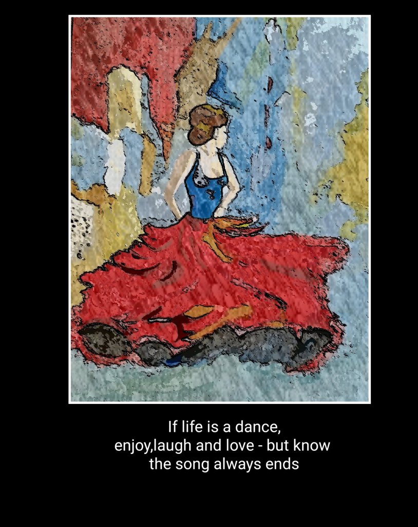
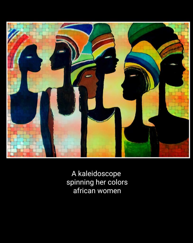
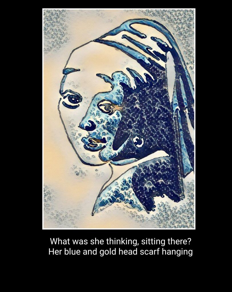
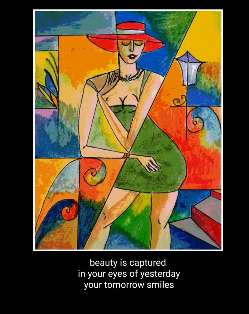
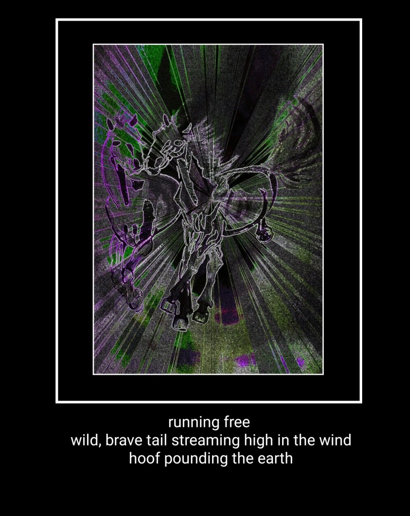
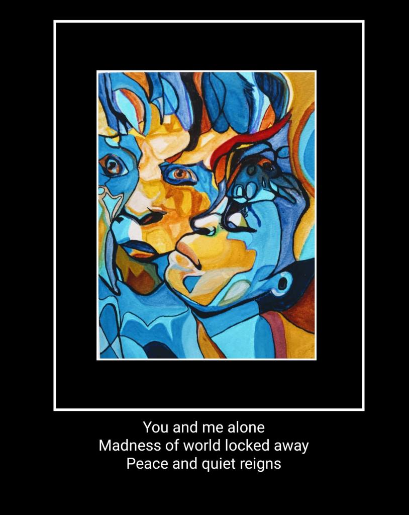
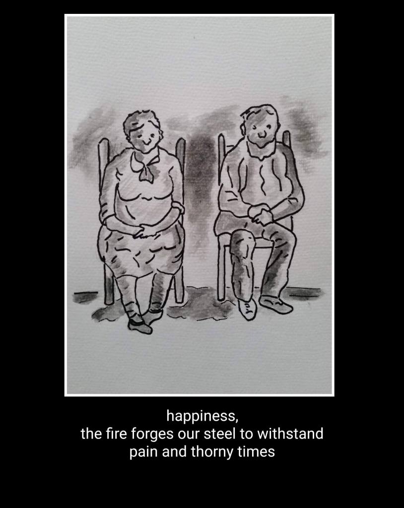
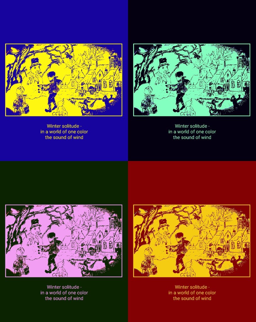
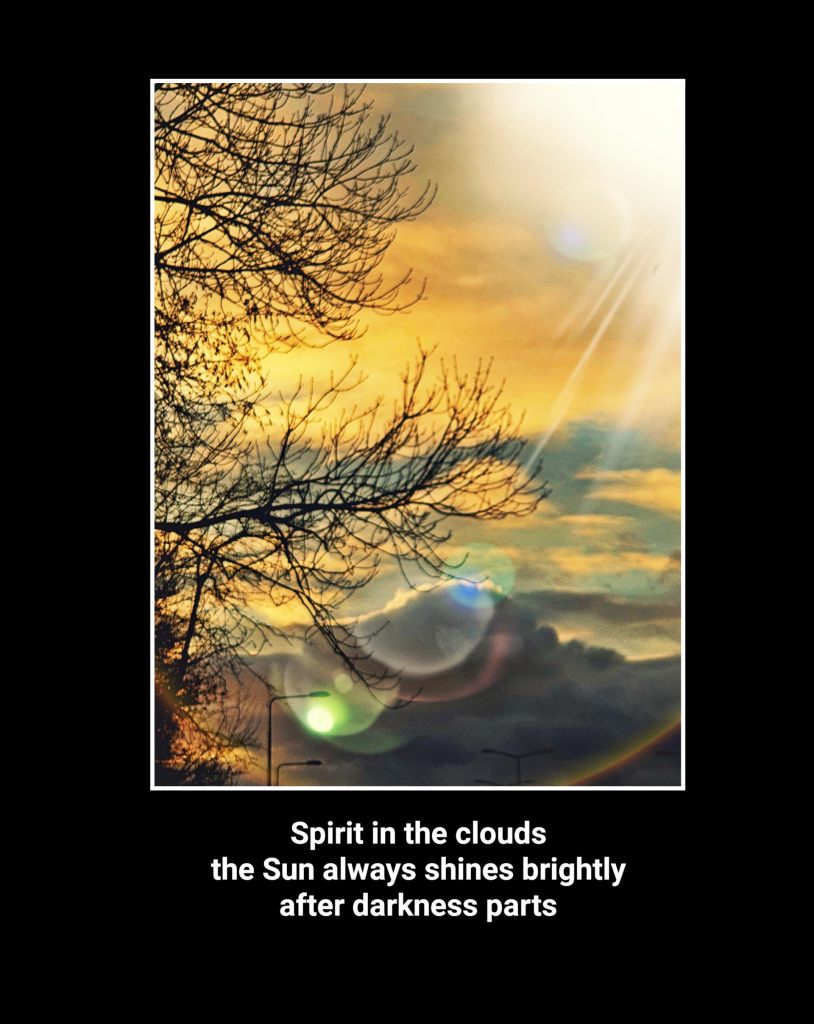
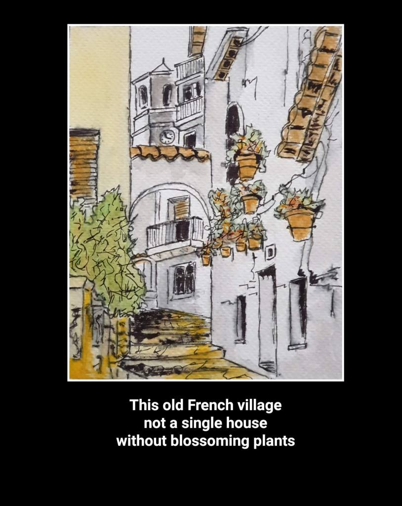
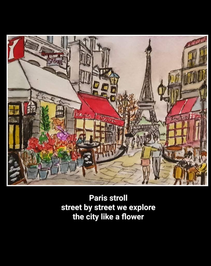
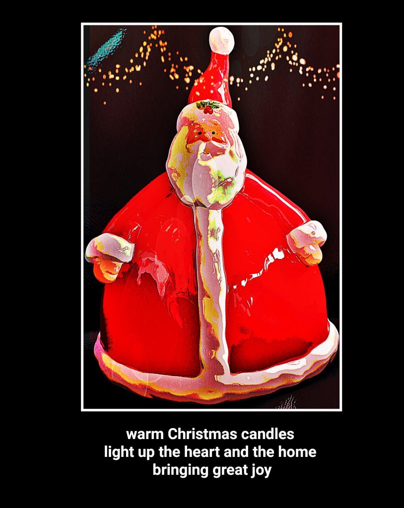
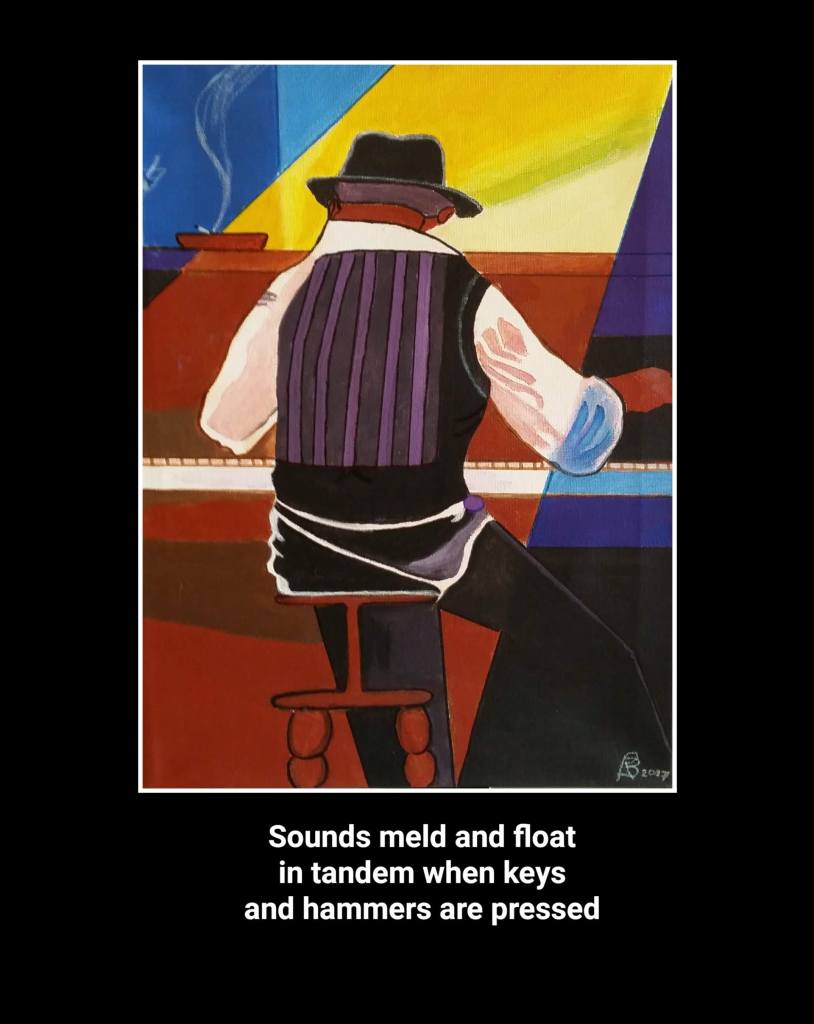
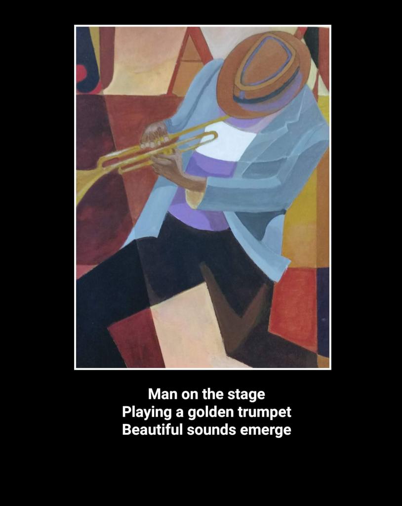
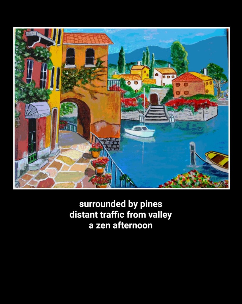
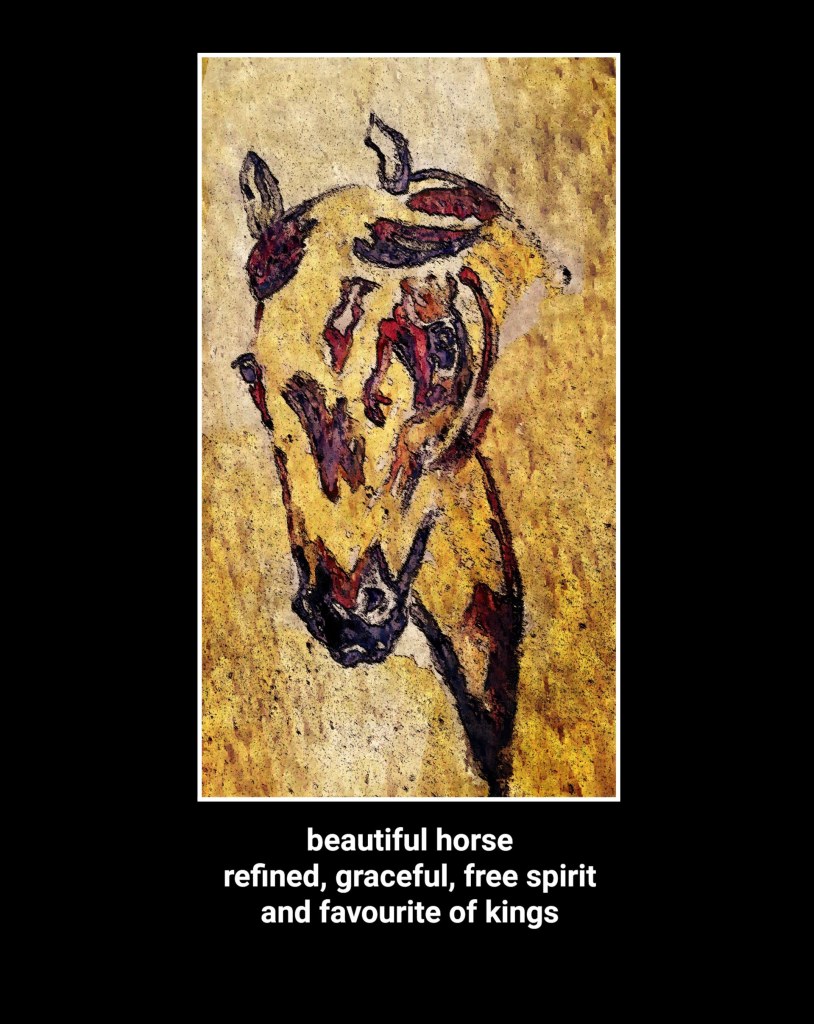
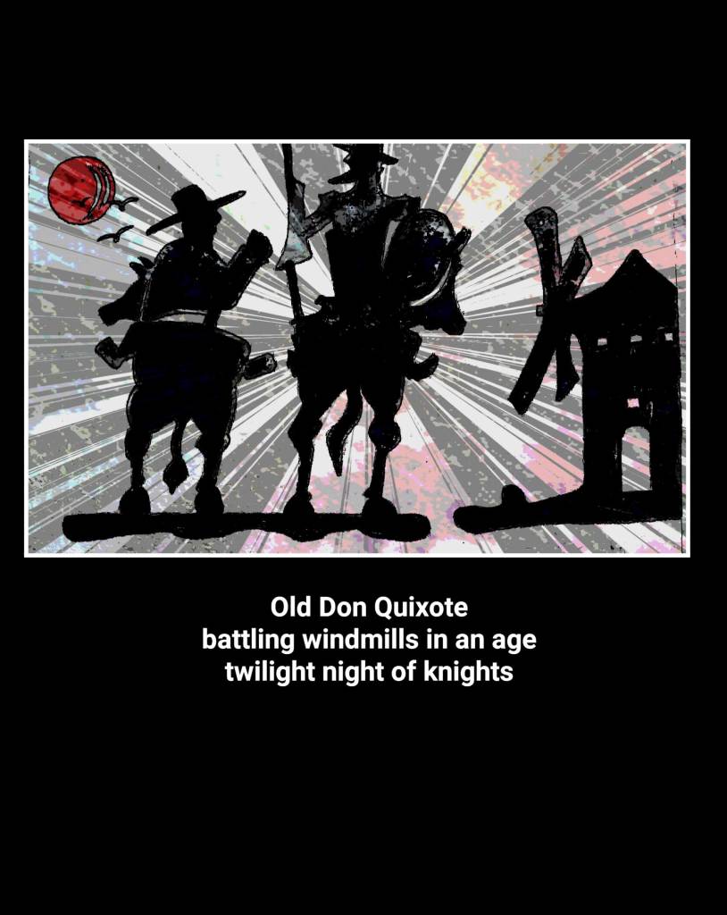
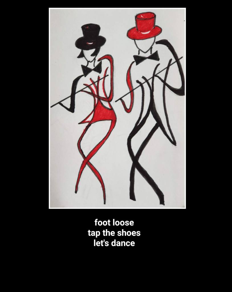
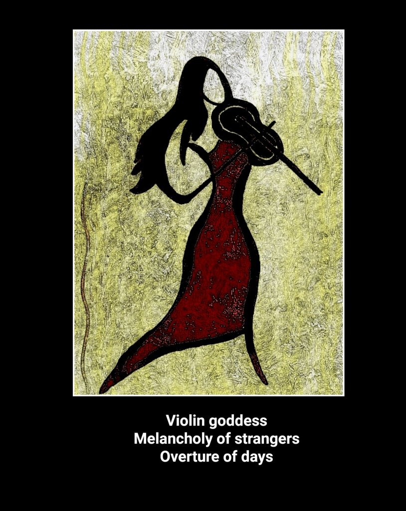
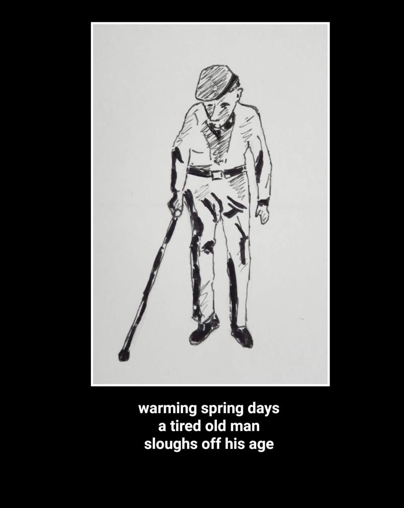
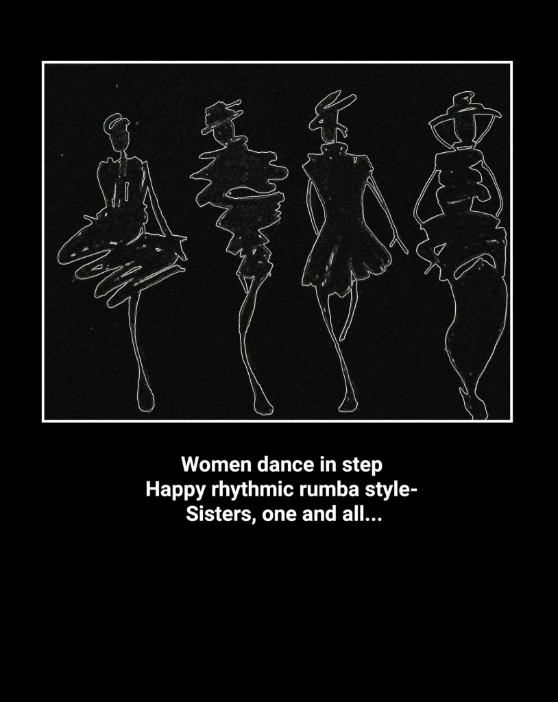
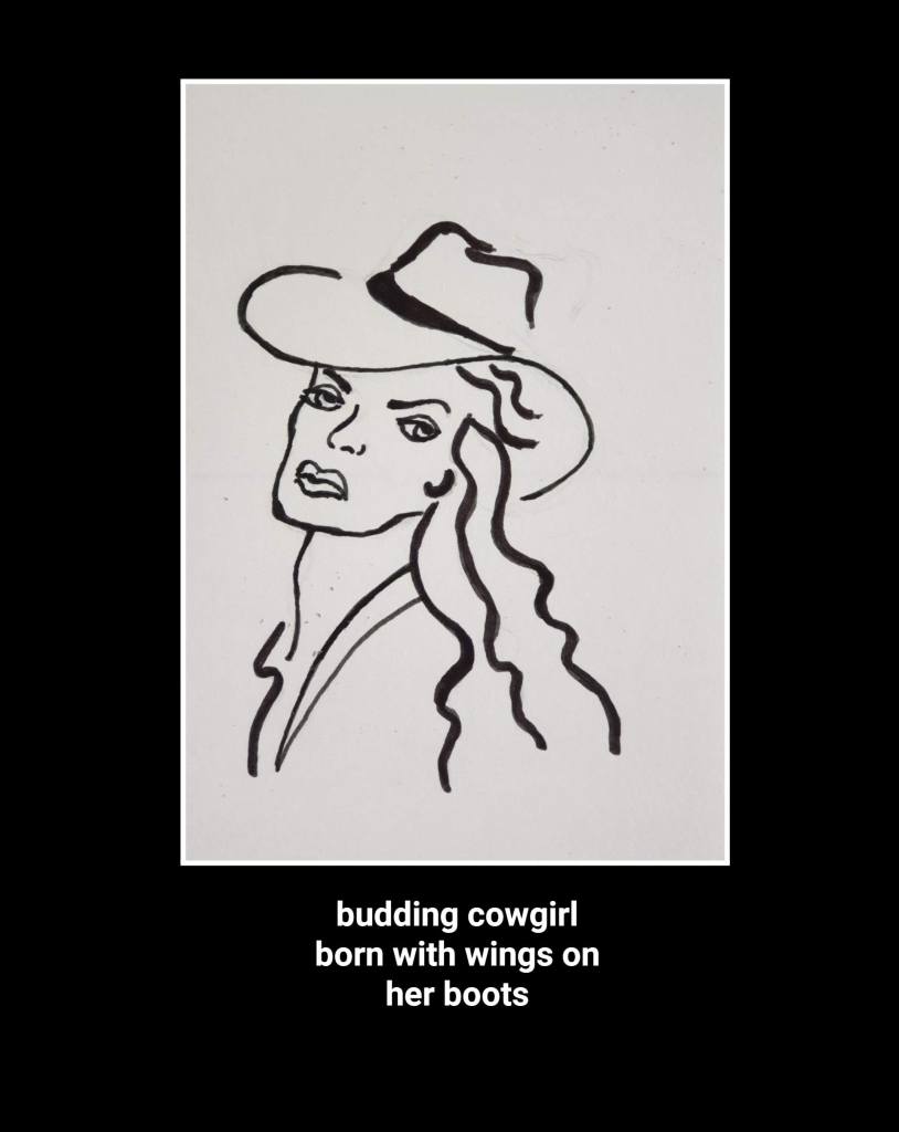
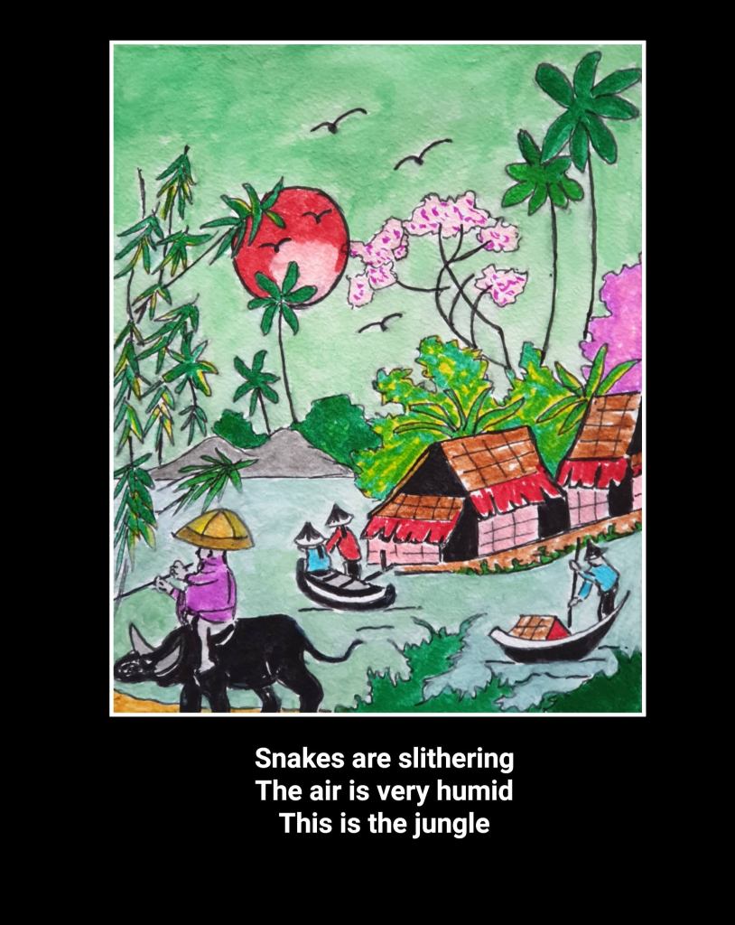
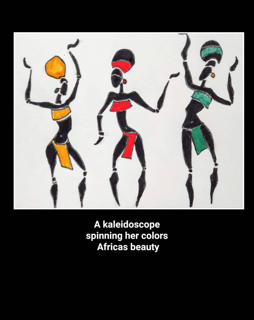
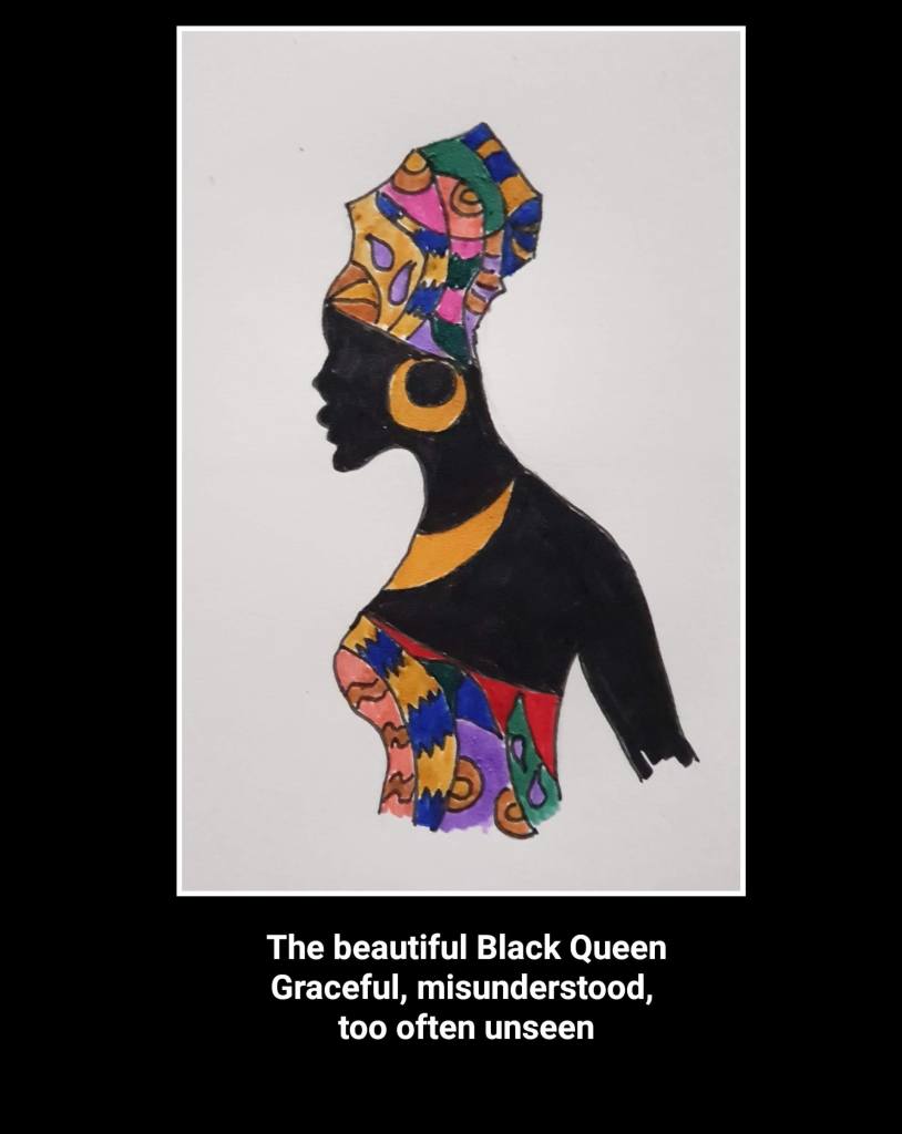
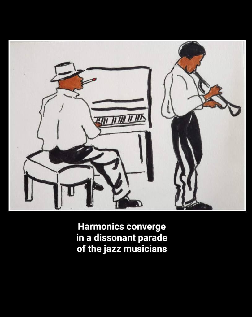
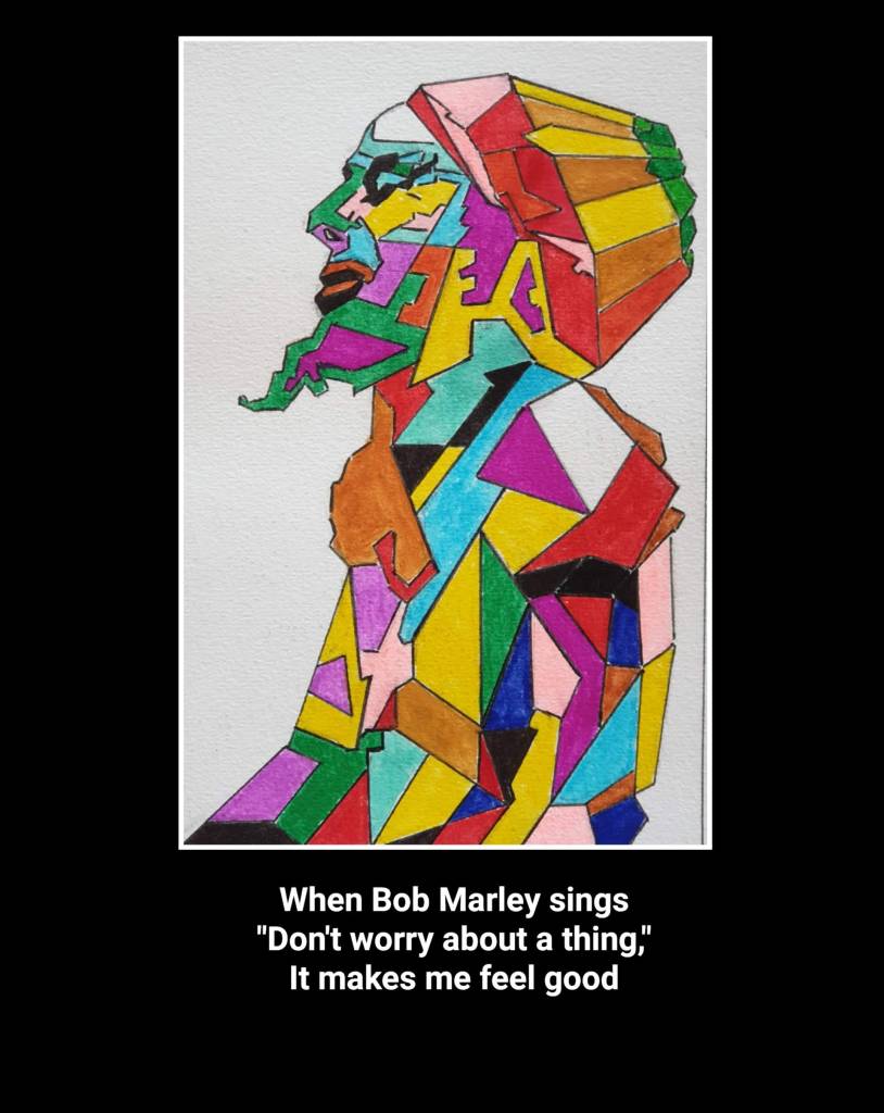
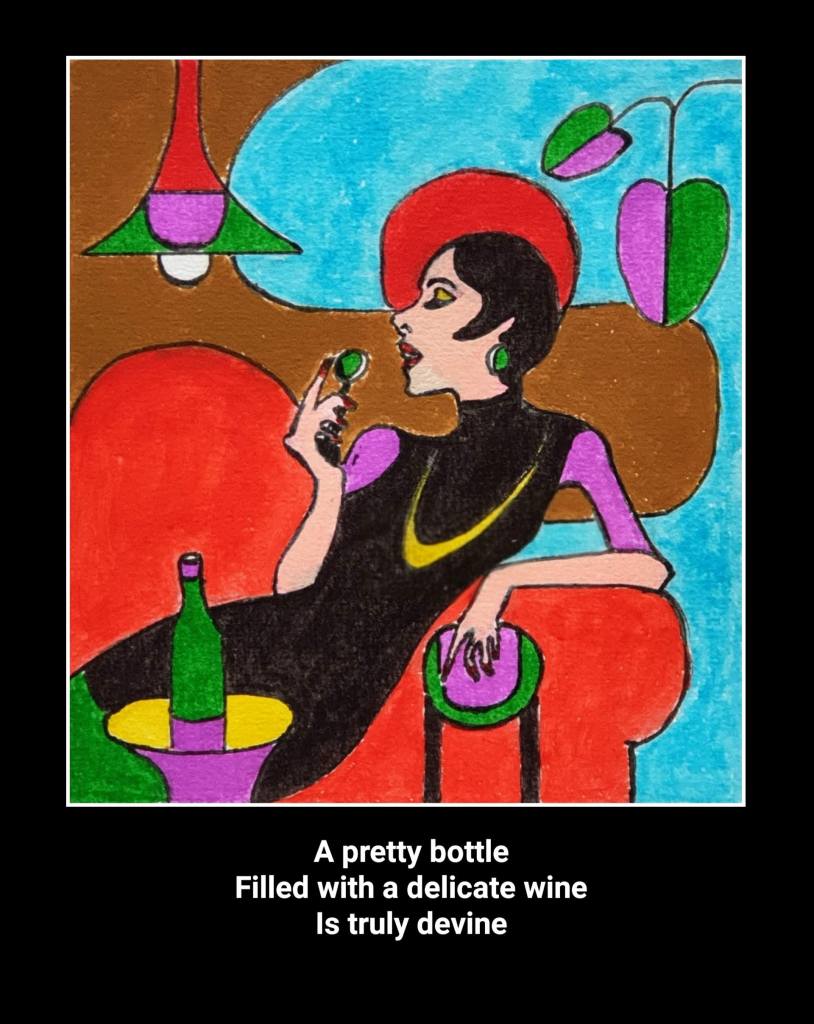
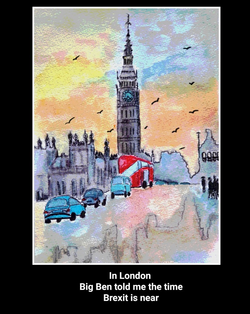
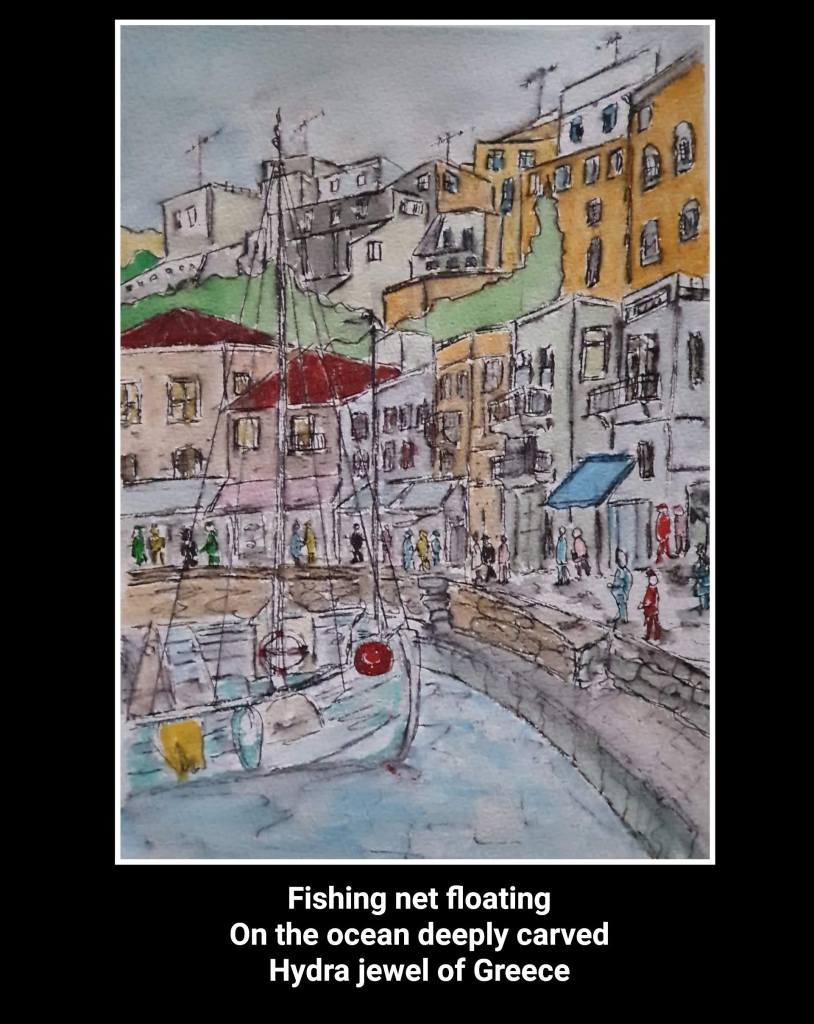
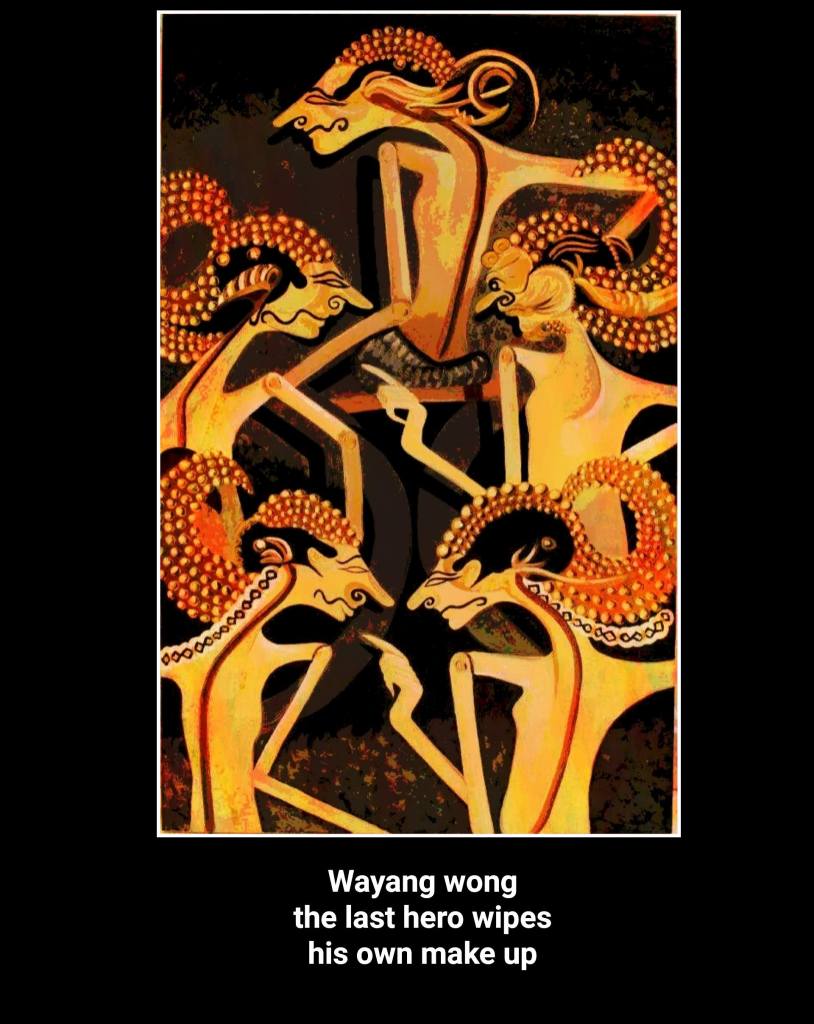
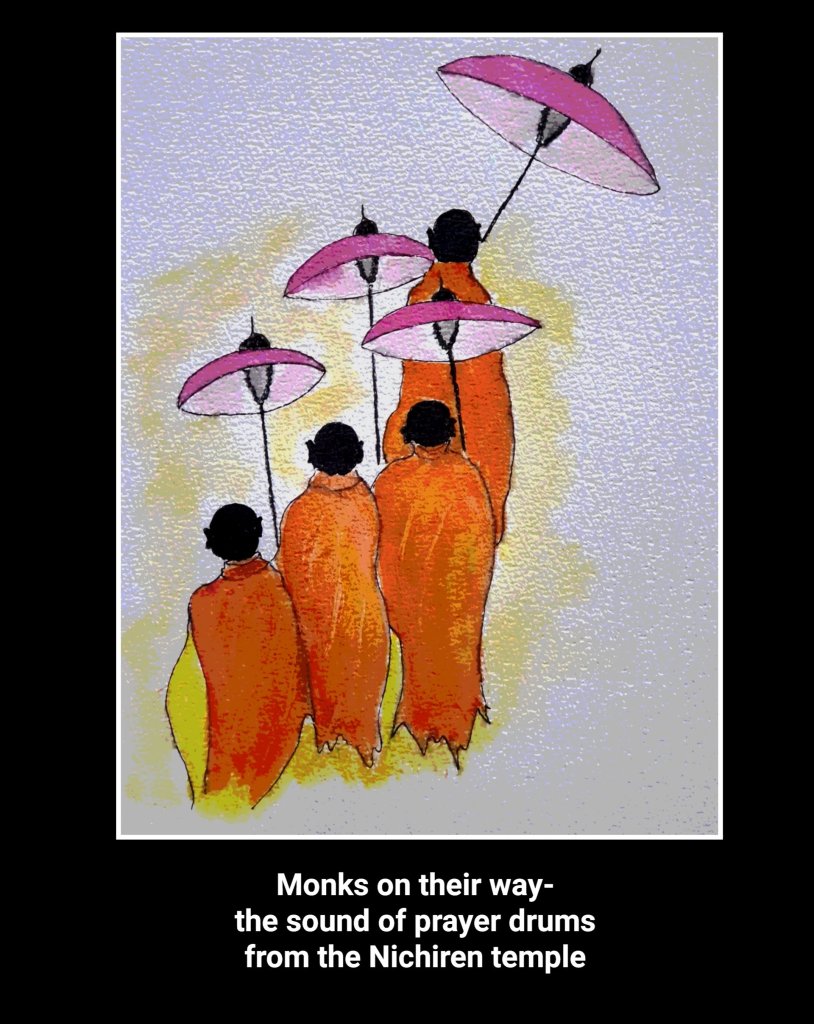
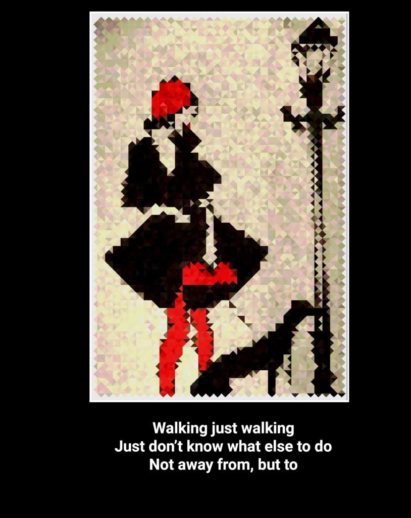
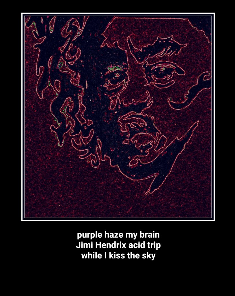
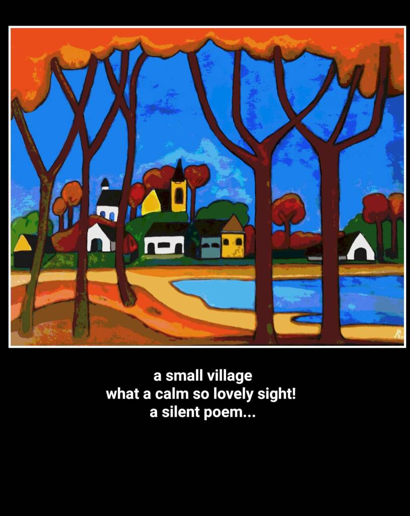
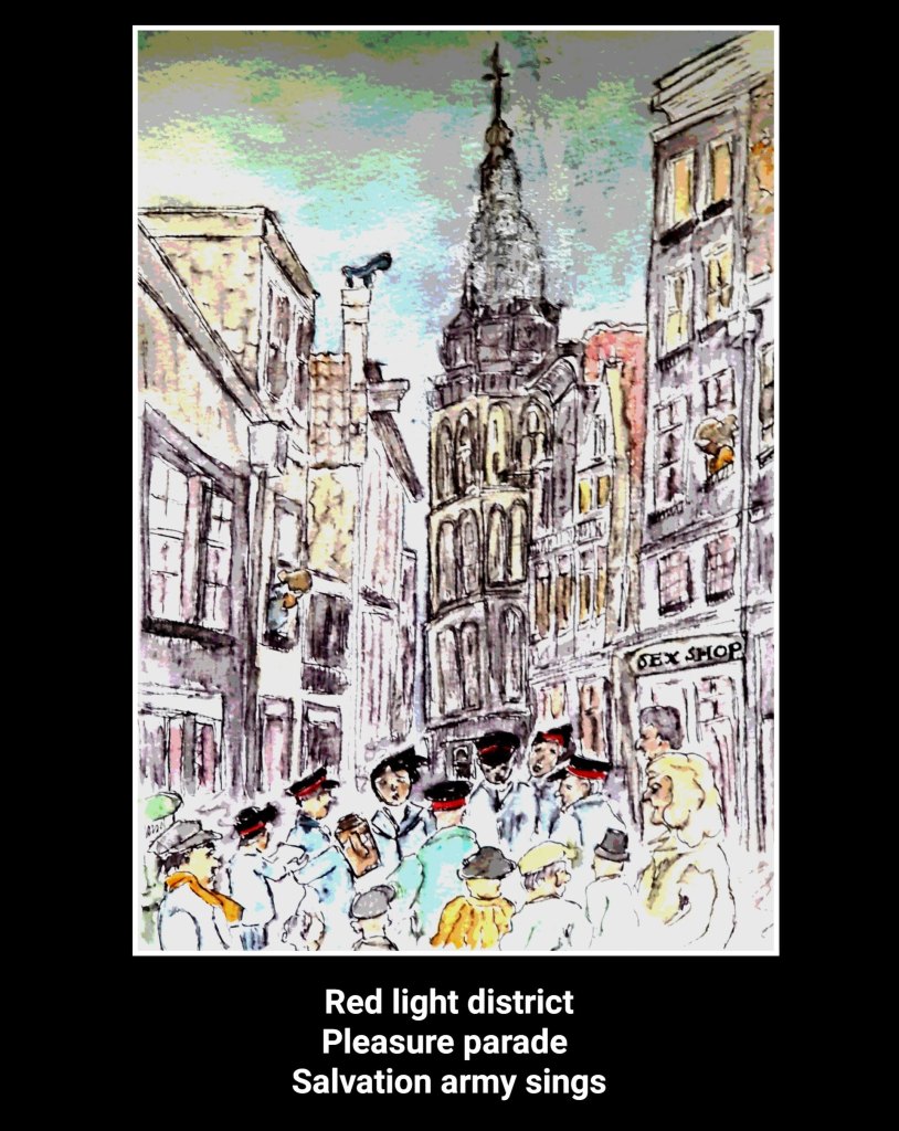
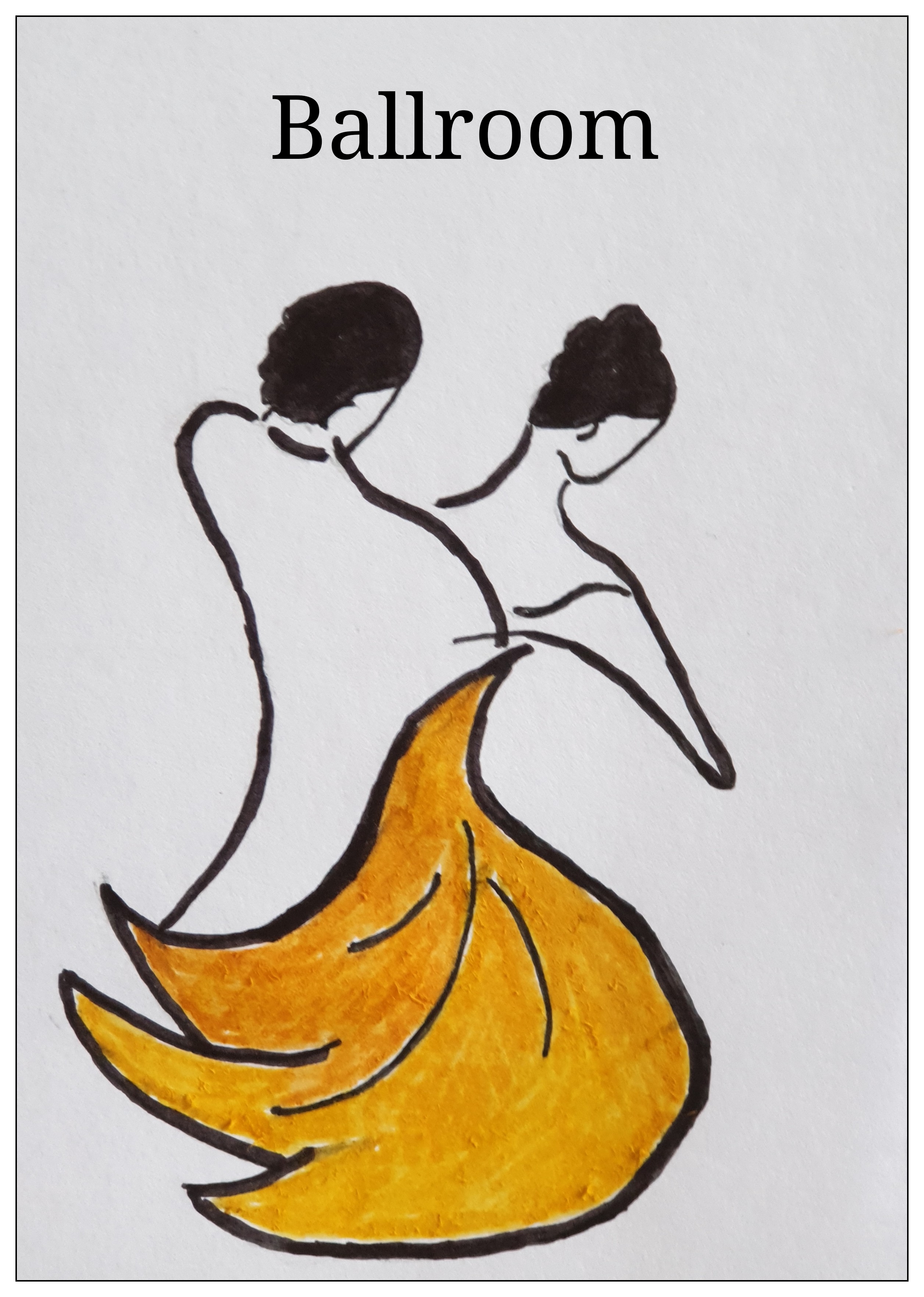
I like to experiment with paintings,drawings and sometimes photo’s in combination with short Haiku-style poetry.For me the combination reflects a certain emotion or feeling. The following selection illustrates this.
La Linea (“The Line”) is an Italian animated series created by the Italian cartoonist Osvaldo Cavandoli. The series consists of 90 episodes, which were originally broadcast on the Italian channel RAI between 1971 and 1986. All episodes were short subjects, ranging from 2:28 to 6:37 in runtime.
The cartoon features a man (known as “Mr. Linea”) drawn as a single outline around his silhouette, walking on an infinite line of which he is a part. The character encounters obstacles and often turns to the cartoonist, represented as a live-action hand holding a white grease pencil, to draw him a solution, with various degrees of success
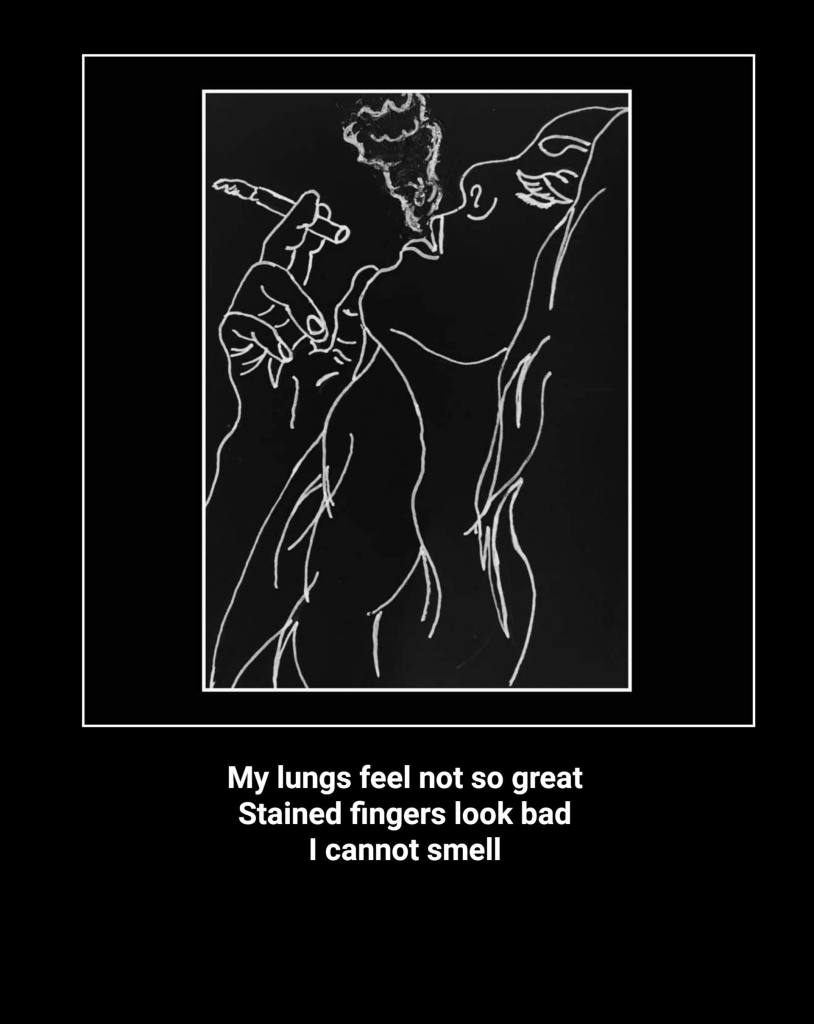
I still remember the simple but fabulous line drawings from the broadcasting on Dutch television in the early 70’s.
Today the so called (minimalistic) line-art or line-drawing is widespread. Line art or line drawing is any image that consists of distinct straight or curved lines placed against a (usually plain) background, without gradations in shade (darkness) or hue(color) to represent two-dimensional or three-dimensional objects. Line art can use lines of different colors, although line art is usually monochromatic. Line art emphasizes form and outline, over color, shading, and texture. However, areas of solid pigment and dots can also be used in addition to lines. The lines in a piece of line art may be all of a constant width (as in some pencil drawings), of several (few) constant widths (as in technical illustrations), or of freely varying widths (as in brush work or engraving)
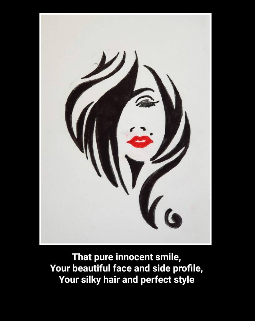
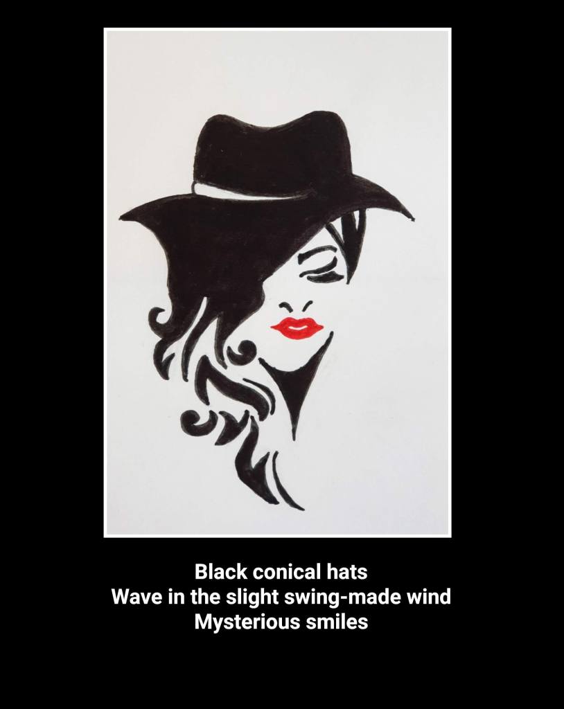
Of course I had to try and make a few line drawings,which ,in a way,also remembers me to Sumi-e,the Japanese minimalistic ink-drawings where one also tries to capture essence and movement in a few strokes or lines.
When reading about “Pop Art“,I saw some new possibilities to express myself. Pop Art is a distinctive genre of art that first “popped” up in post-war Britain and America. Primarily characterized by an interest in popular culture and imaginative interpretations of commercial products, the movement ushered in a new and accessible approach to art. Ranging from quirky to critical, the pieces produced by Pop artists in the 1950s and 1960s commented on contemporaneous life and events.
In addition to the unique iconography itself, the artists’ treatment of the subject matter helps to define the genre. Renowned for its bold imagery, bright color palette, and repetitive approach inspired by mass production, the movement is celebrated for its unique and recognizable style.
Some famous artists in this art movement are a.o.
ROY LICHTENSTEIN, WHAAM! (1963)
Known for his colorful, comic-book-inspired paintings, artist Roy Lichtenstein put an animated and energetic spin on Pop Art. Whaam!, one of his most well-known compositions, adapts a scene from All American Men of War, a popular series published by DC comics from 1956 to 1966.
Original panel by Irv Novick for DC Comics’ ‘All-American Men of War,’ No. 89 (Feb. 1962)
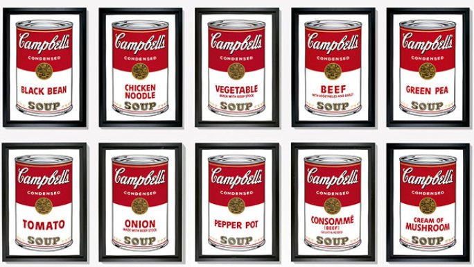
ANDY WARHOL, 32 SOUP CANS (1962)
In 1962, American artist Andy Warhol first explored his well-known “soup can” motif. 32 Soup Cans is composed of 32 hand-painted and hand-stamped canvases, each depicting a different flavor of Campbell’s Soup. Warhol, a pioneering pop artist, chose this subject matter because it captured Pop Art’s focus on mass production and his own artistic interest in repetition. “I used to drink it. I used to have the same lunch every day, for 20 years, I guess, the same thing over and over again.”
Campbell’s Soup Cans
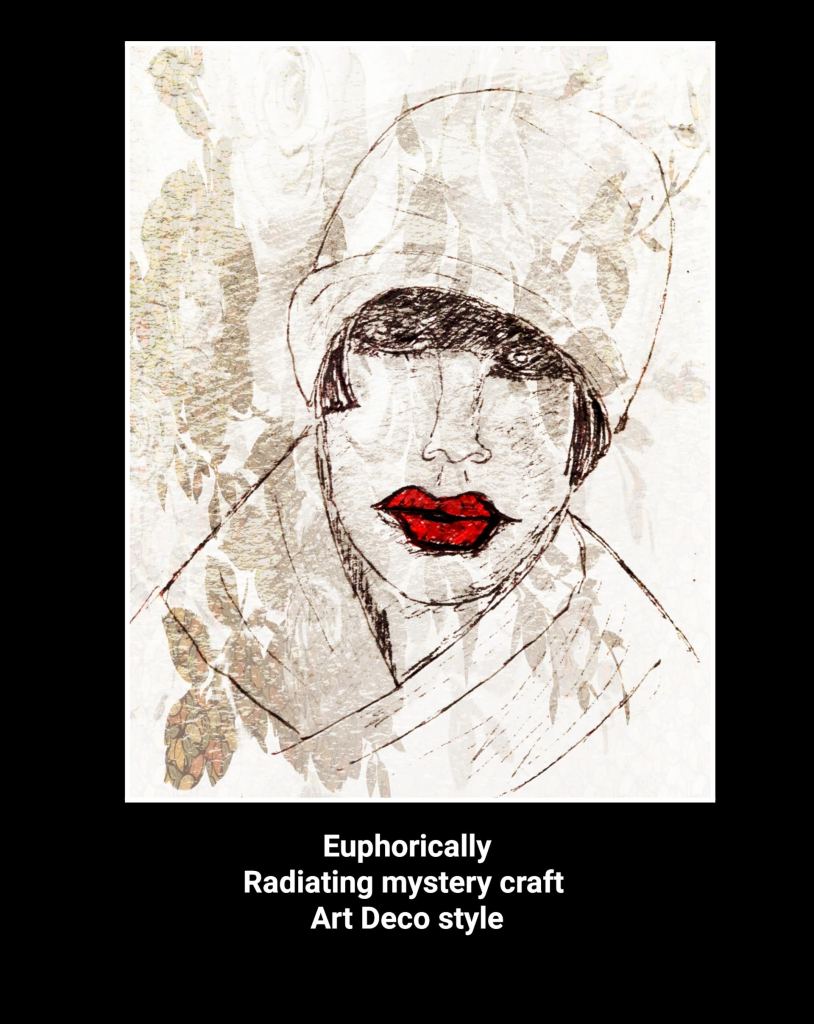
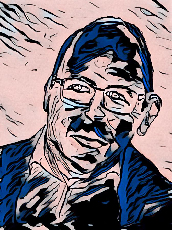
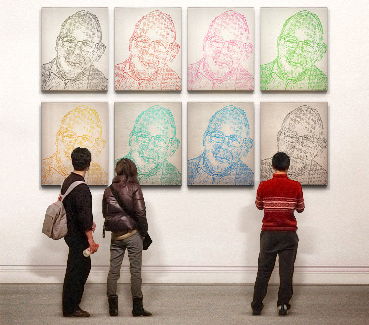
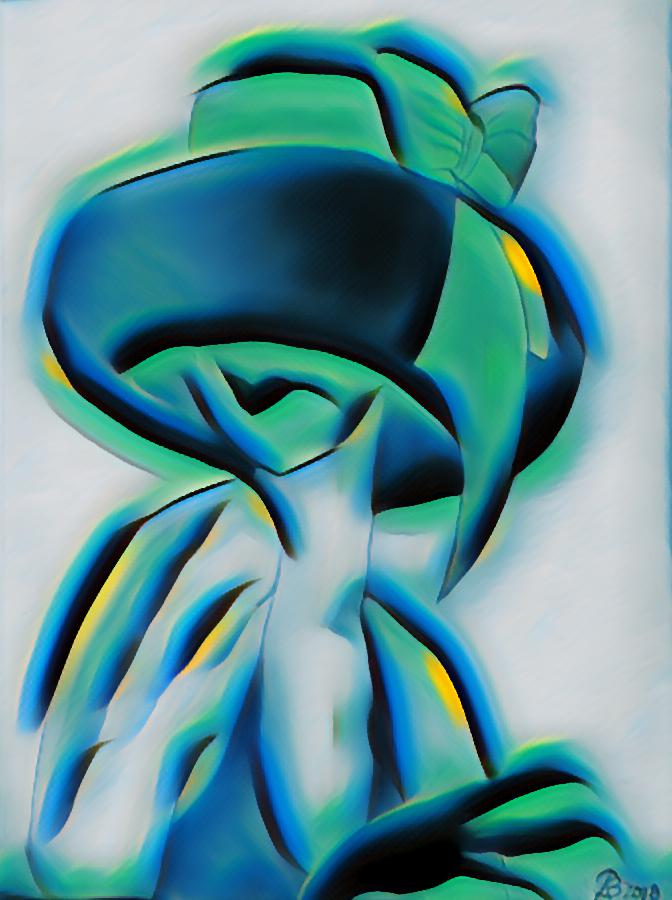
With a big wink to these world famous artists,I’ve reworked my “selfie” into the style of Roy Lichtenstein and even to a Warhol-style museum object!
Selfie with a wink to Roy LichtensteinFake it till you make it!
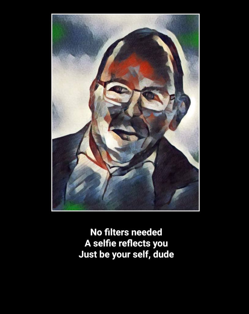
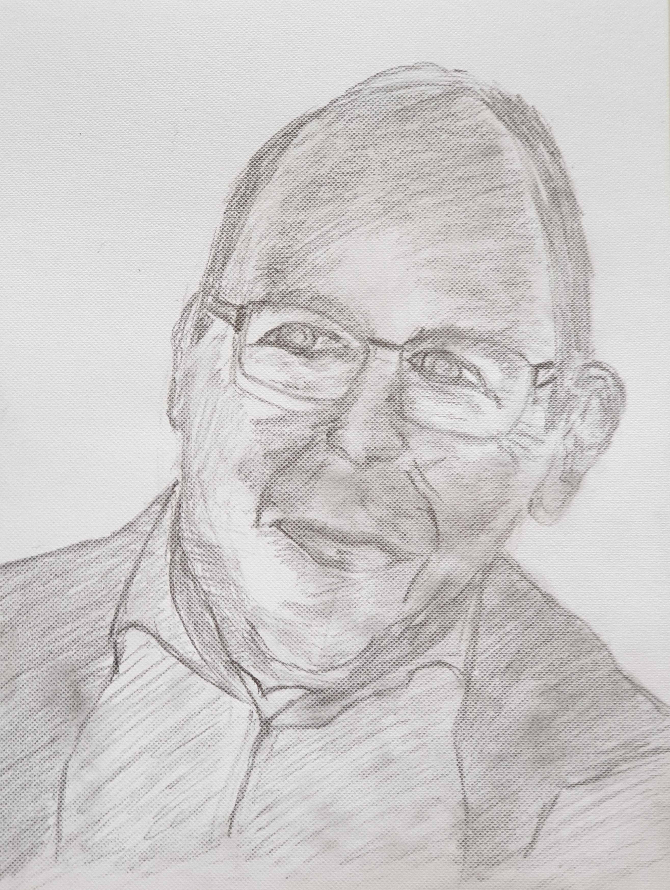
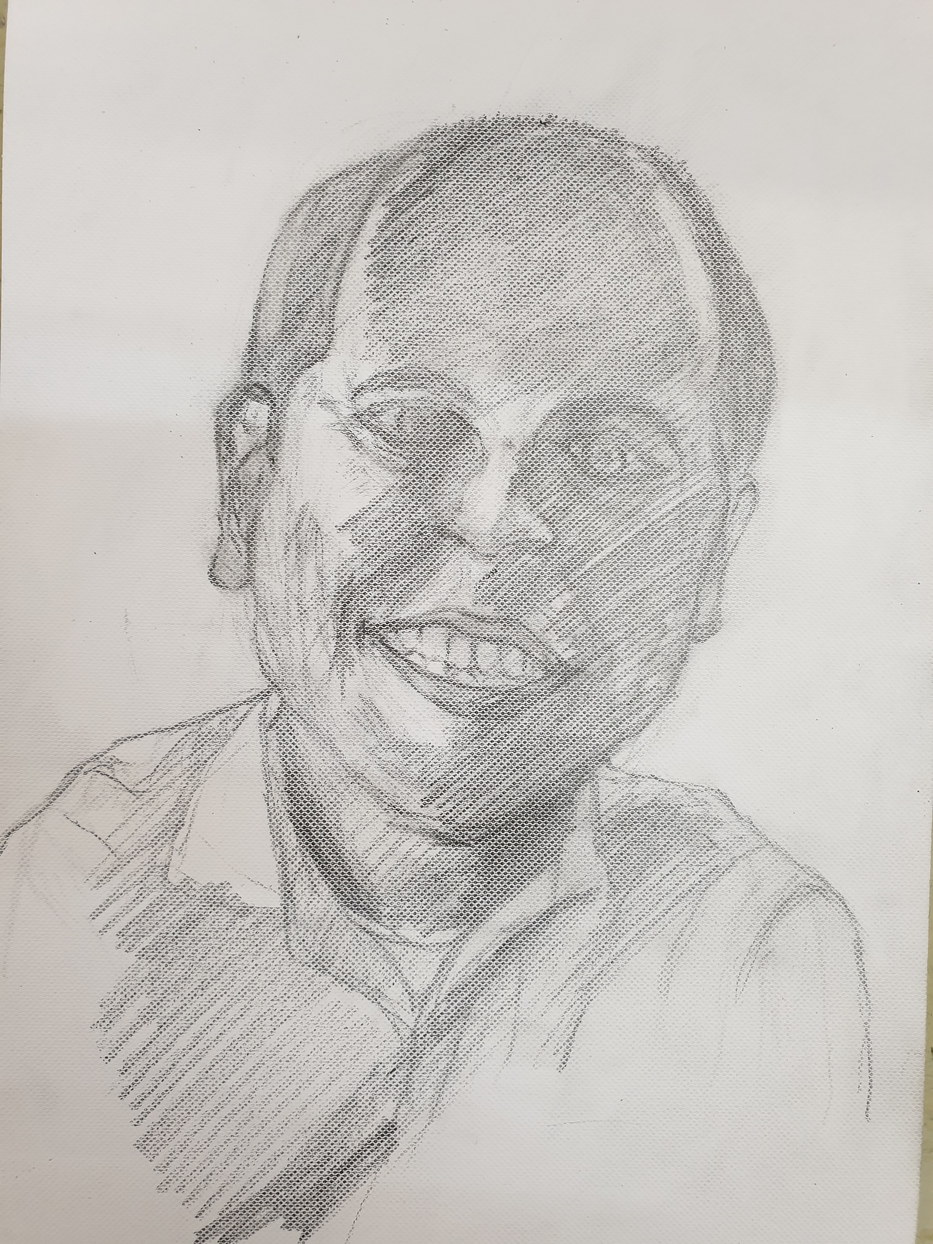
A few days after my last drawing-lesson I became a bit reckless to try and draw a “selfie”.
Ruud (Selfie)
But with thay selfie I could complete our family.
Family quartet
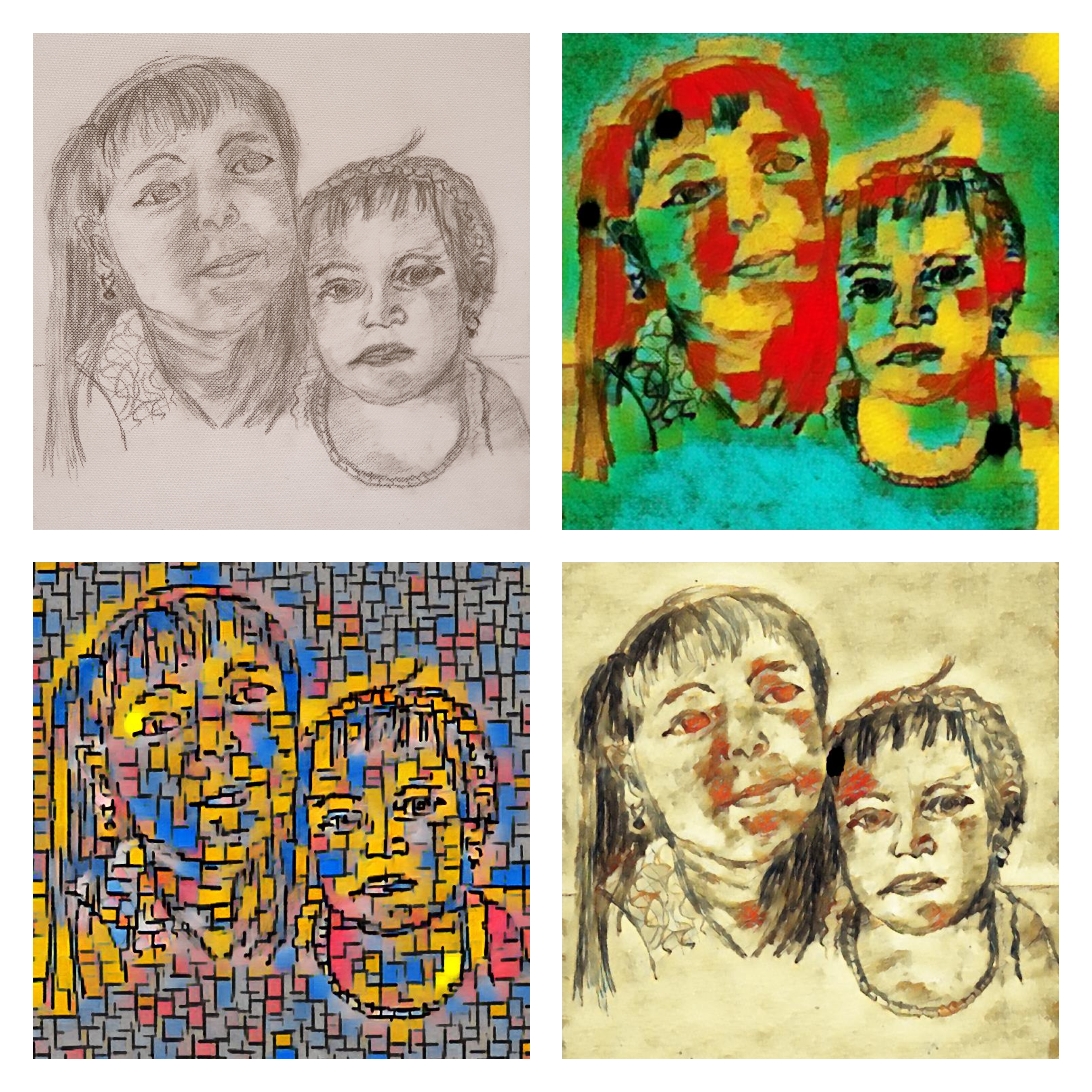
Drawing little children proved to be even more difficult,but I tried to draw the portrait of the two grandchildren of our housekeeper Carolina.I only had a small picture of them and never saw them in real life,but anyhow I made an effort. Working also with some filters,the result was more or less acceptable to me.
When,a long time ago,I tried to master the piece of music “Take five”,composed by Dave Brubeck,on the piano,I had to drop a lot of habits. Brubeck drew inspiration for this style of music in the spring of 1958 during a U,S. State- Department-sponsored tour of EurAsia. After learning from native symphony musicians about the form, he was inspired to create an album that deviated from the usual 4/4 time of jazz and experimented with the exotic styles he had experienced abroad. Especially the unusual quintuple (5/4) time from which it derives its name,made this piece of music attractive but difficult to play.
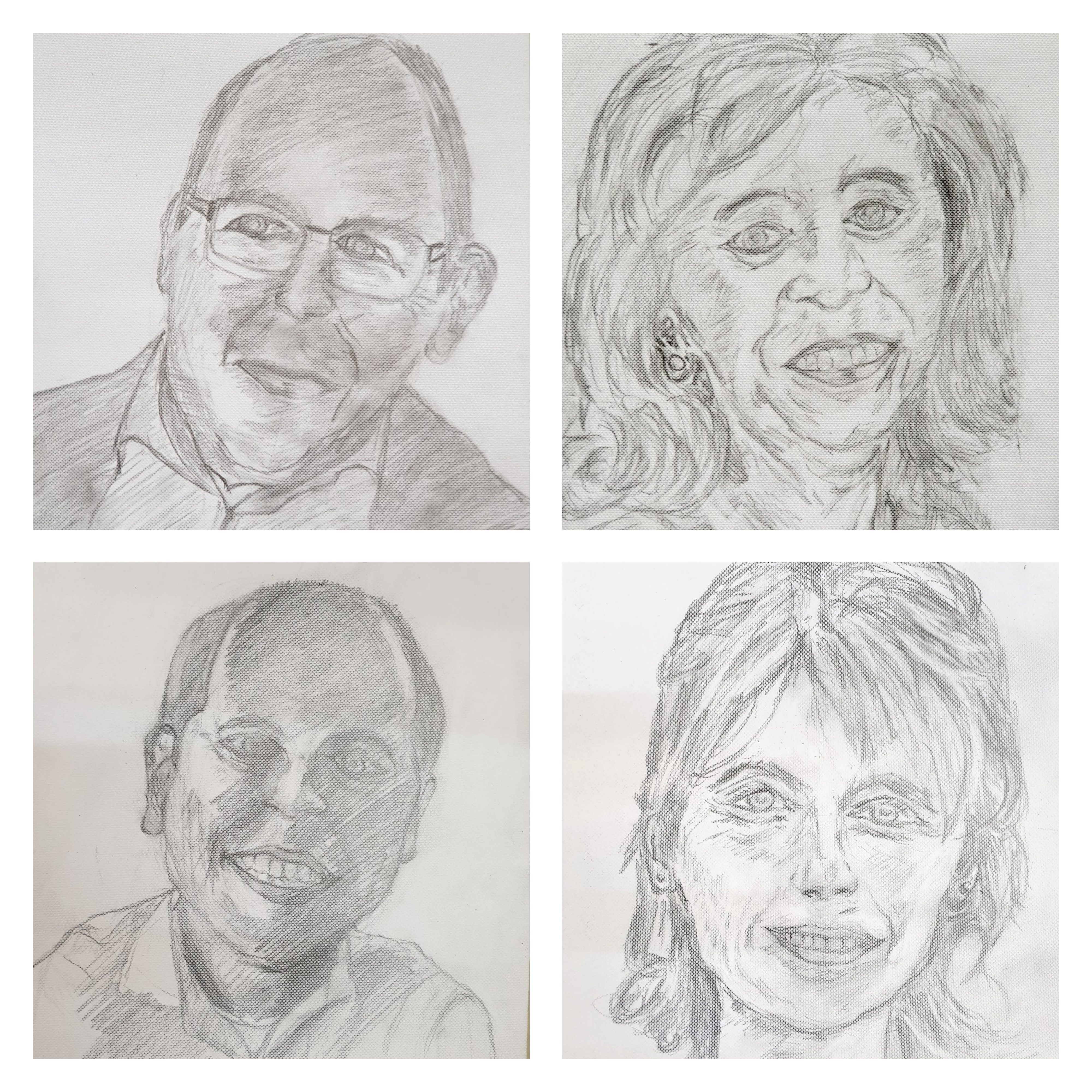
The same experience I’ve had,when I started with my first of five lessons in portrait -drawing.Here the main new way of looking for me was through “Tone”,or seeing planes of light and dark,instead of sharp lines and lots of details.Corné,my art teacher,continued to emphasize this. It was almost a Zen-like experience,whereby Zen involves dropping illusion and seeing things without distortion created by your own thoughts.
With this in mind I tried to draw a portrait of our son Michel,where the portrait gained in liveliness by applying various tone-values.
Michel
Maybe,you’ll find it interesting to see directly into the style and mastery of Corné,by looking at his website https://corneakkers.com/
I really (un)learned a lot during my interesting lessons.
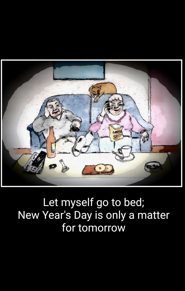
Last week I have sent my Blog to the printshop in order to make a printed copy of it,but every now and then I keep adding some paintings or drawings to the (online) Blog.
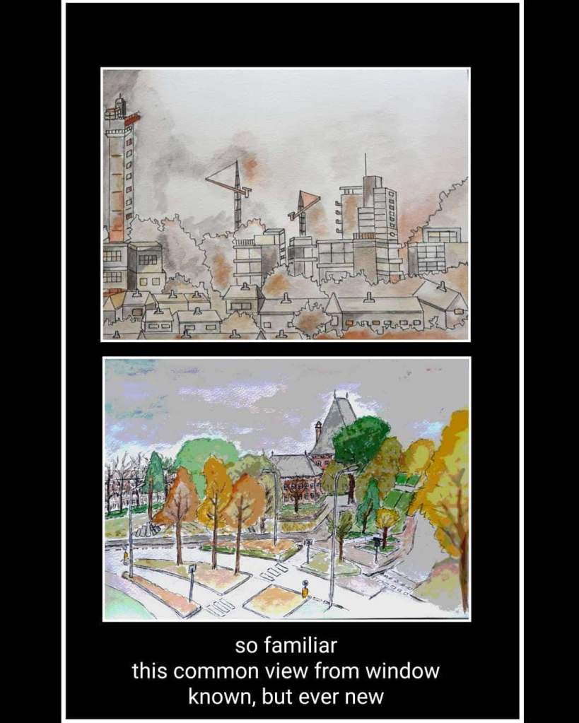
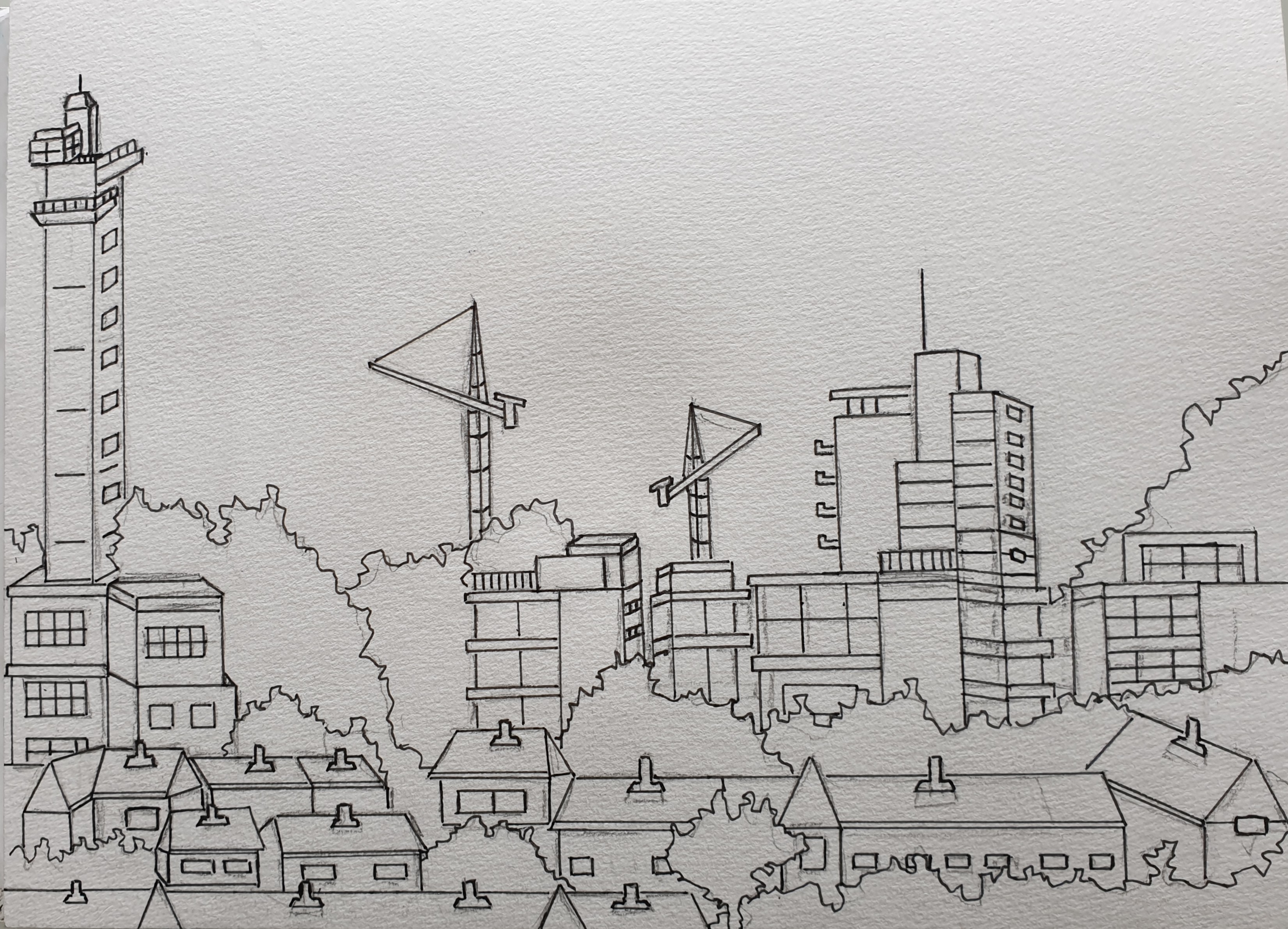
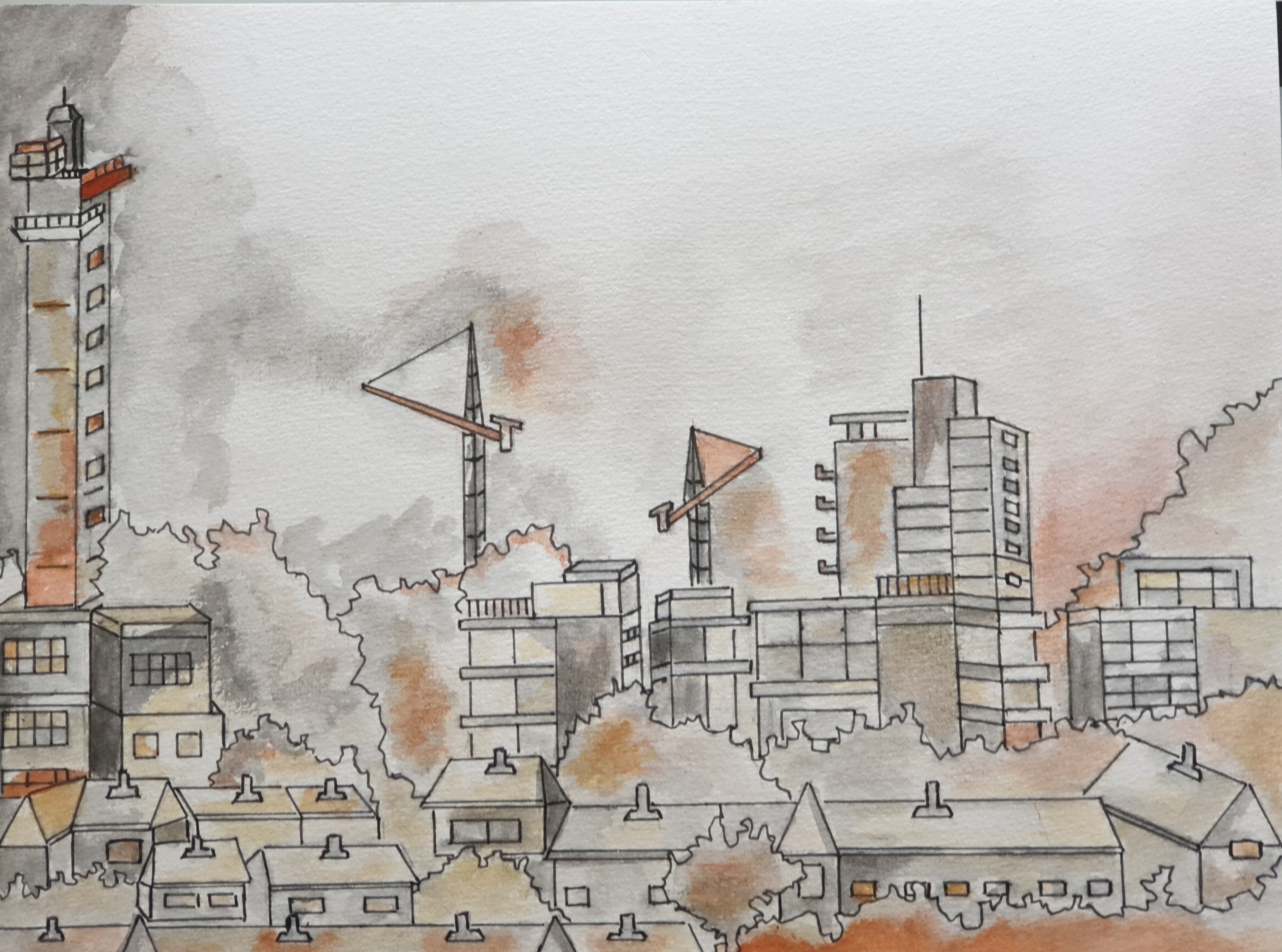
When,on one of those rainy days I looked out of my window,I decided to sketch the view. On the foreground,an impression of the so called “red roof village”,an old part of Leidschendam,and on the background the large cranes,used for the (re)construction of shopping mall Leidsenhage into the Mall of the Netherlands.Between the old village and the new mall,the so called Neher park with the tower of the Neherlab,that once served as the researchlab of the Dutch telecom organisation.
Looking out of the windowSame view but a different emotion
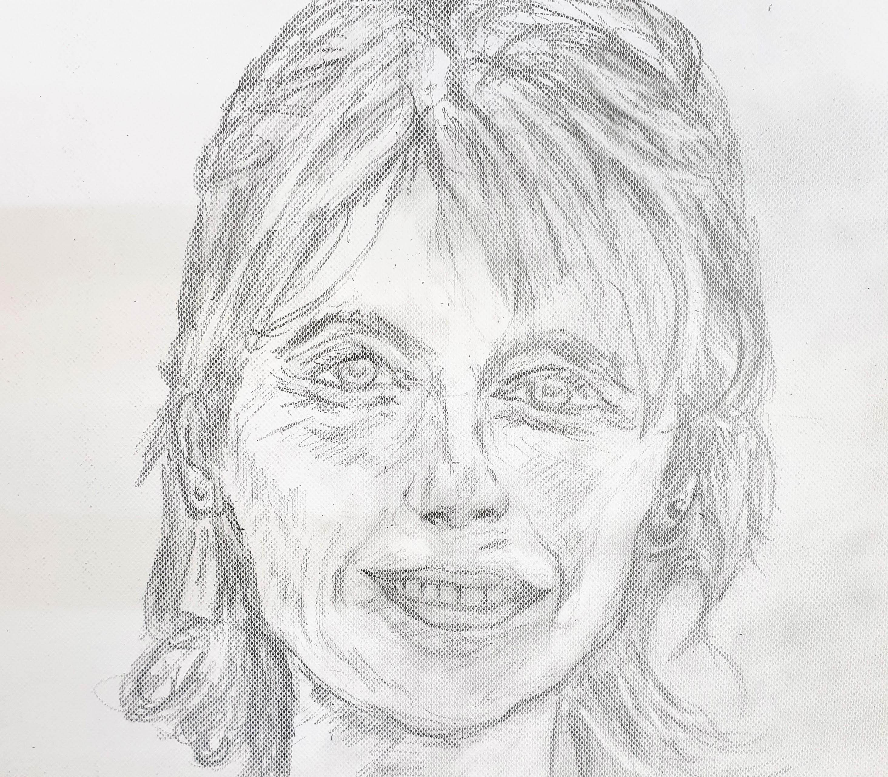
Meanwhile,I still practise portrait drawing,this week drawing our daughter Suzanne. Unintended I made here looking a little bit older than she actually is,but anyhow.
Suzanne
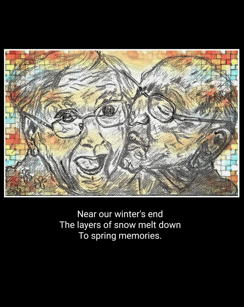
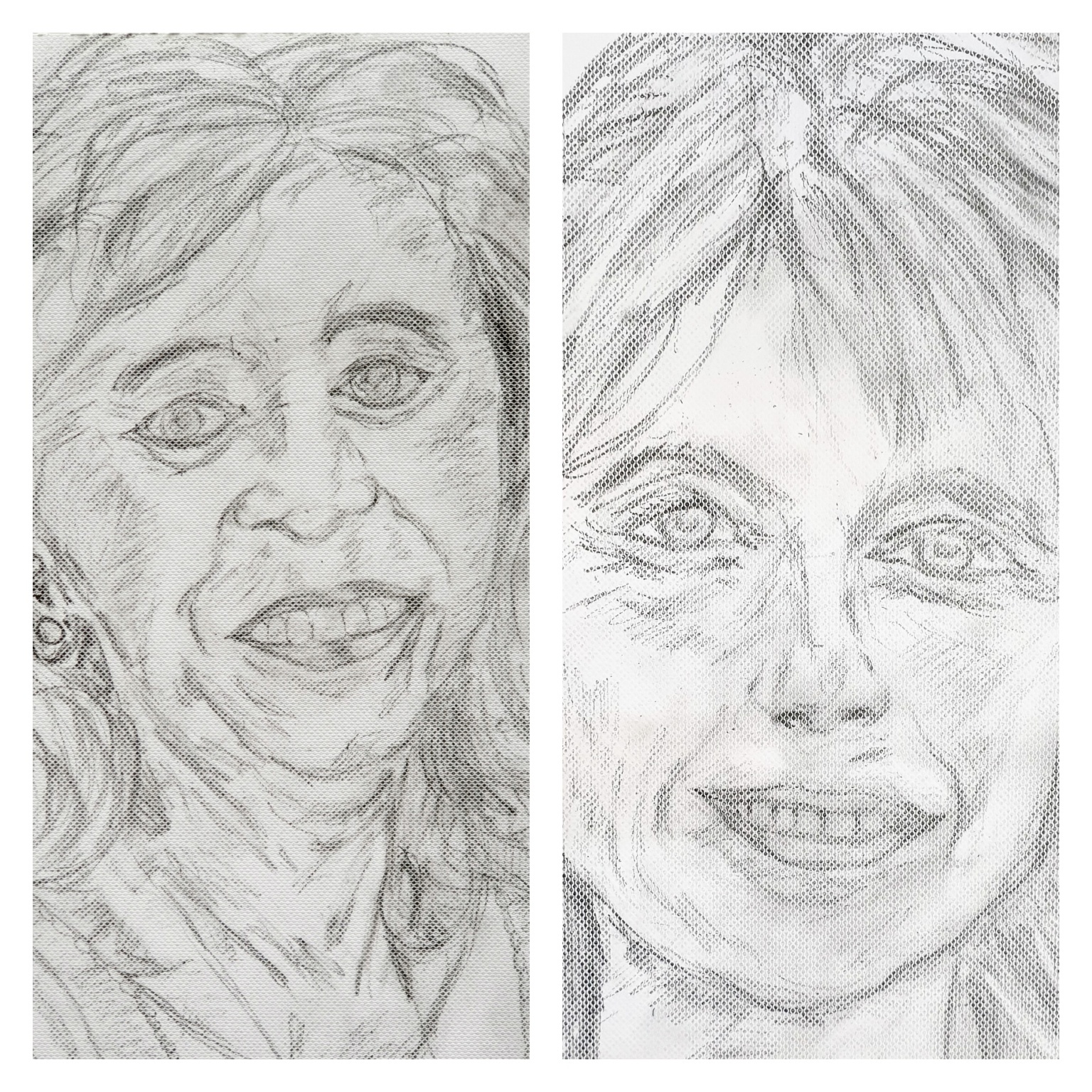
By sketching Suzanne,I noticed some parable,in a way,between mother and daughter.
Mother and daughter
My art teacher says that I am making progress. He is a nice man!
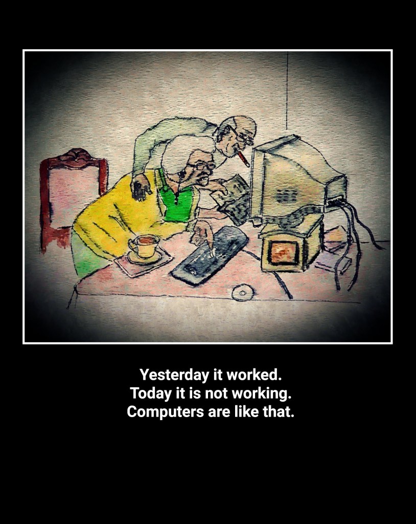
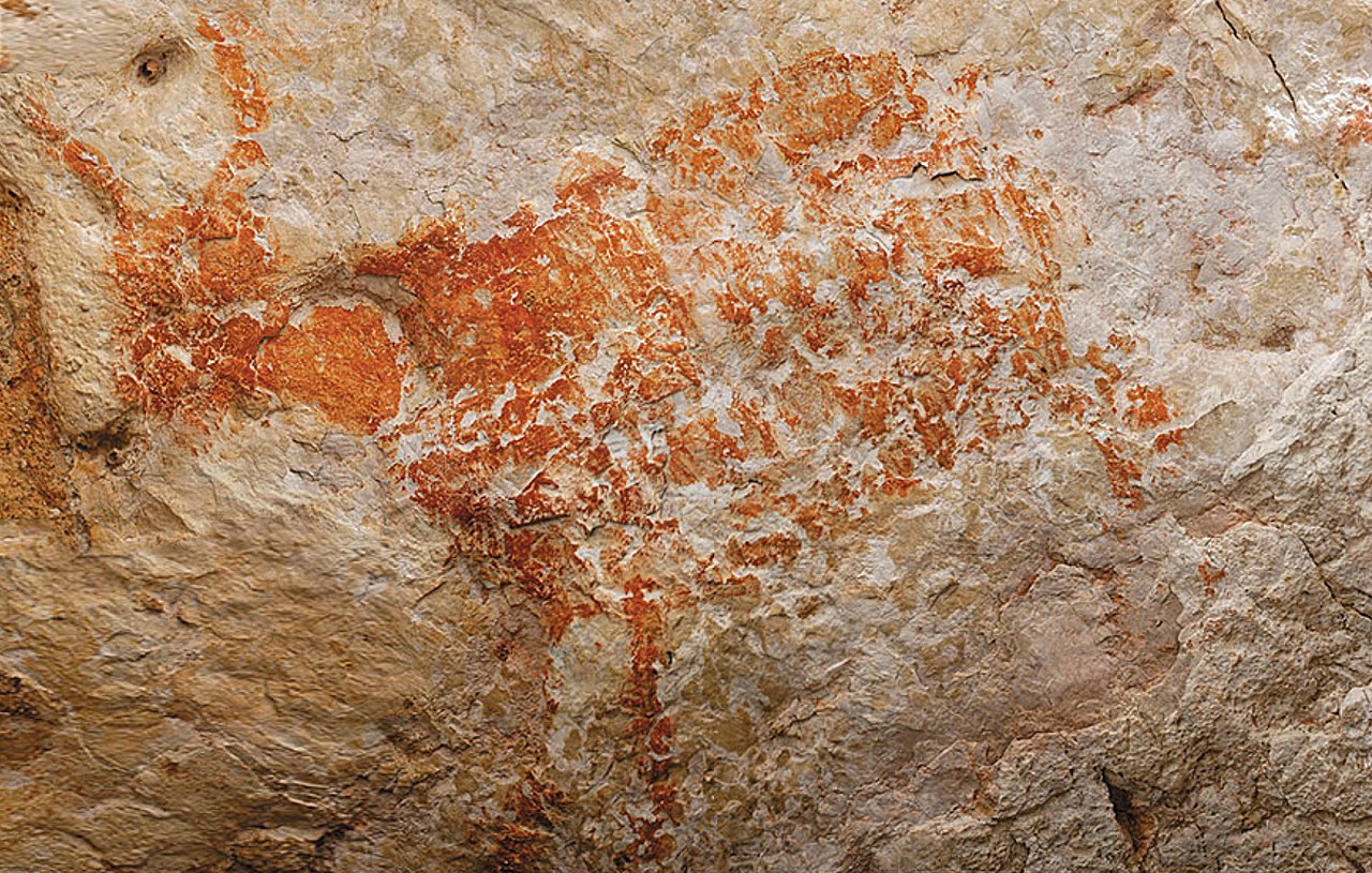
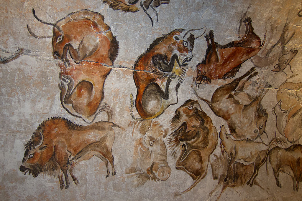
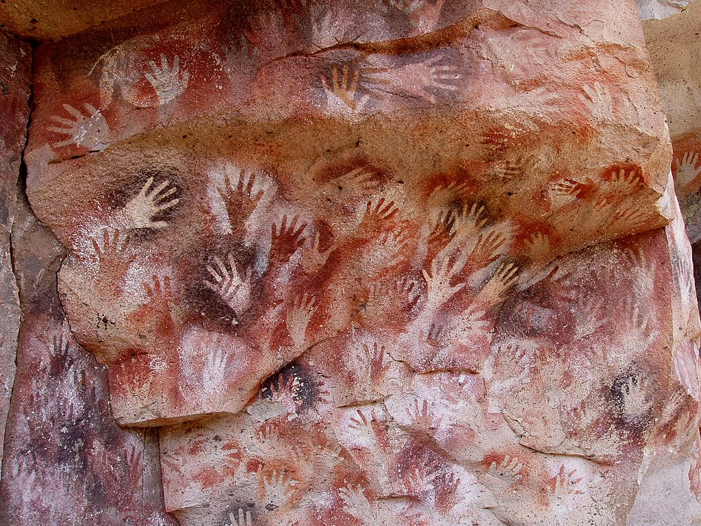
The Blog about painting and computers,especially AI,sketched a possible future of painting,whereby digital and human artists will cooperate.In that respect it is also interesting to know what the possible origins of painting are. Probably painting originated in ancient caves as a means of communication before human language was developed.
Cave paintings are found on the wall or ceilings of caves. The term usually impliesprehistoric origin, but cave paintings can also be of recent production: In the Gabarnmung cave of northern Australia, the oldest paintings certainly predate 28,000 years ago, while the most recent ones were made less than a century ago.
The oldest known cave paintings are over 40,000 years old , found in both the Franco-Cantabrian region in western Europe, and in the caves in the district of Maros (Sulawesi, Indonesia). The oldest type of cave paintings are hand stencils and simple geometric shapes; the oldest undisputed examples of figurative cave paintings are somewhat younger, close to 35,000 years old. A 2018 study claimed an age of 64,000 years for the oldest examples of (non-figurative) cave art in Iberia, which would imply production by Neanderthals rather than modern humans. In November 2018, scientists reported the discovery of the oldest known figurative art painting, over 40,000 (perhaps as old as 52,000) years old, of an unknown animal, in the cave of Lubang Jeriji Saléh on the Indonesian island of Borneo
Let me conclude by saying that painting has come a long way and will stay for an unforseeable time as a means of expressing both the inner-and outer world of human beings.
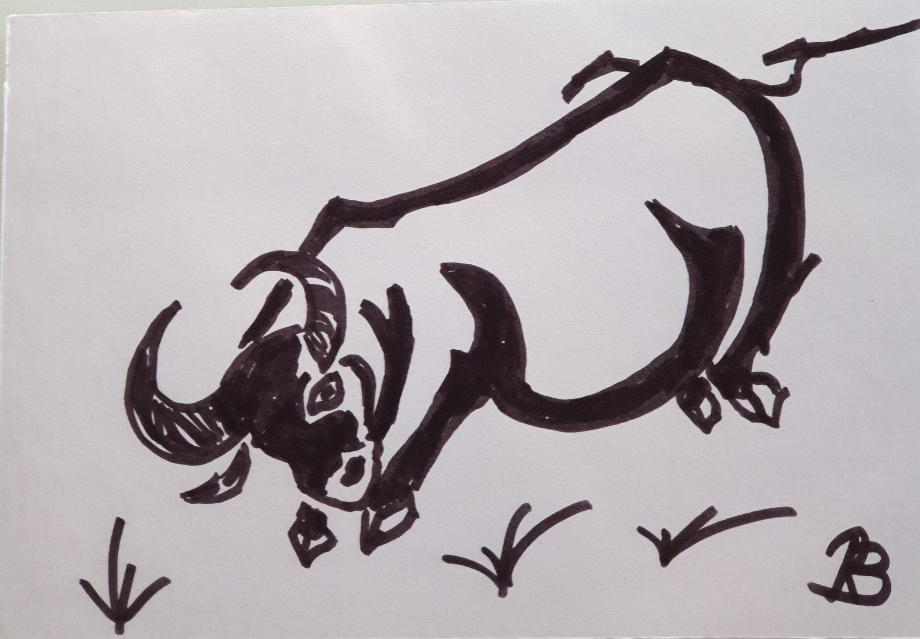
In the meantime I enjoy painting my way and end this Blog with my own little cave drawing,together with a Haiku,resuming a famous Zen story about the Bull as metaphor for the eternal principle of life.Painting proved to be my way of taming the bull.
Anger strikes the Bull As its world falls into parts, But there was no world
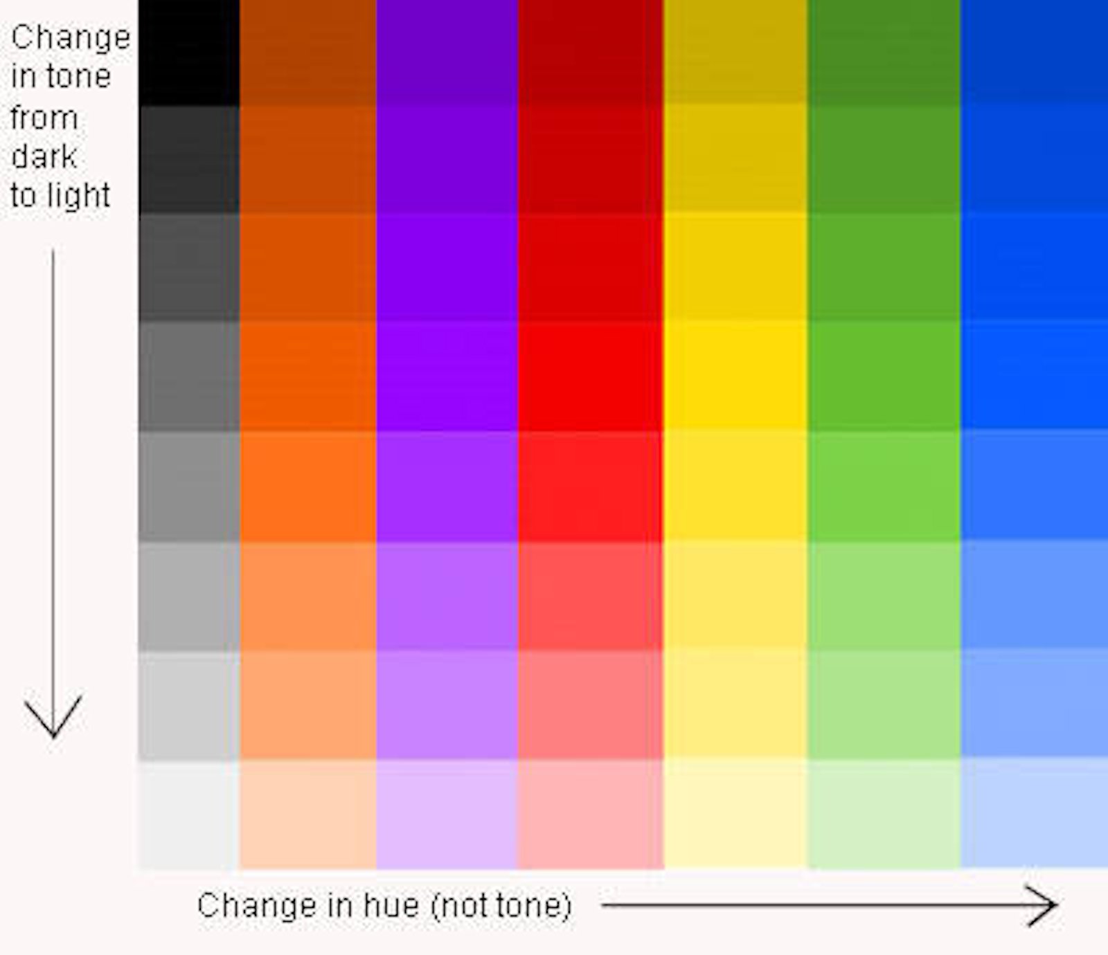
Earlier,when discussing Style,I described myself as an absolute beginner in painting,so this topic about Tone(or Value) should be interesting for me,but maybe also for those with more experience.
I’m not sure that I like your Tone……
There’s a lot of confusion about tone when using colour but we can consider it a parallel to what we are very happy to accept when we think of values of grey. We’re comfortable with the idea that there are different “intensities” of grey, from very dark (almost black) to very pale indeed. In fact we have all seen photos in newspapers that are completely in shades of grey. So, how do the photos or paintings done in shades of grey (or monochrome) manage to give a convincing feel of depth and form. The answer is in the use of different tones.
As the chart to the right shows, we ought consider tone in colour just as we do with tone in the grey scale.
The simple truth is that a successful painting or drawing may be produced using no colour (or just one) if tone is used correctly but a convincing painting will not result, however when many colours are used; if tone theory isn’t correctly applied.
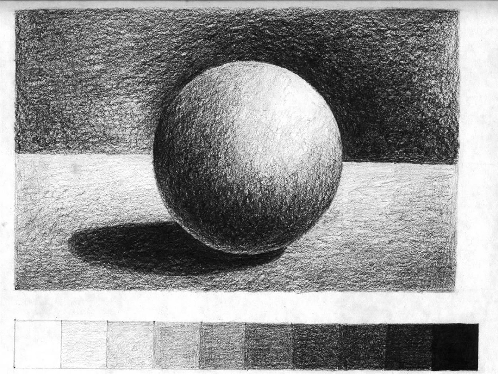
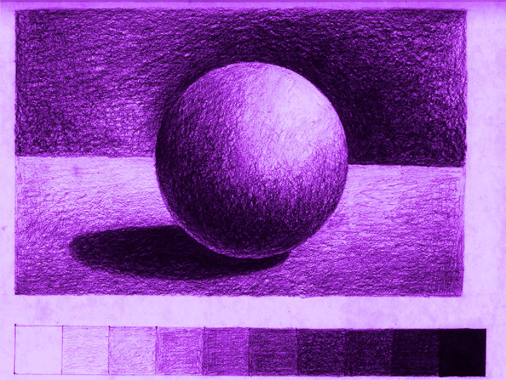
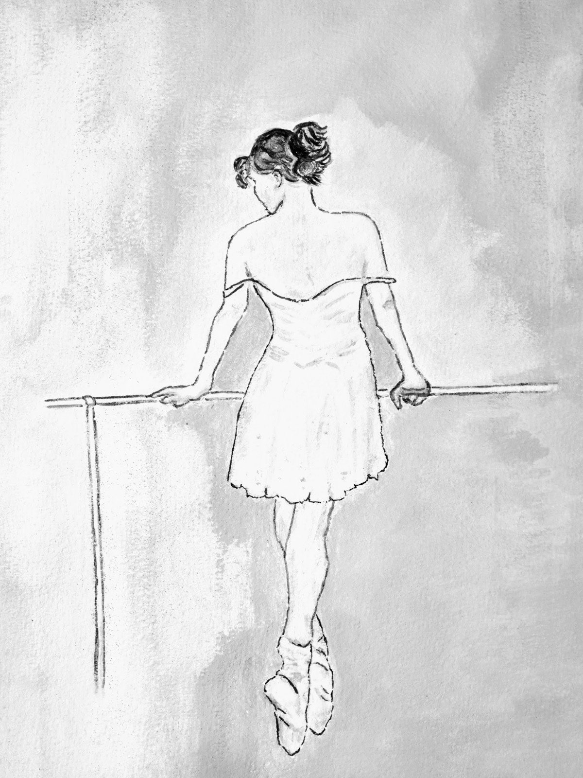
A good way of seeing if your painting (or any picture for that matter) has good tonal values is to make a “black and white”copy of it.If definition is lost in this version then chances are that the tonal values are not correct.
Look at the drawing to the right. We know immediately what it is…….we know what shape it is. Why? We say “well, it’s obvious isn’t it……it’s a sphere” but how do we know? What is there about this 2 dimensional image that tells us that? Again the answer is simple……. And that’s half the battle in explaining some principles …..they’re often too obvious for us to see because we’ve spend a lifetime recognising shapes by the shadows and light that hits them.
We know that this is a sphere by the shading on one side and the light on the other. But this is a tonal picture….. there is no “colour”. It’s true that this picture could have been created using a range of tone values of any one colour (as shown left) but it isn’t the colour that tells us the shape…… it’s the tonal values.
Note also how the eye is drawn to those areas where there is light against dark. So the correct use of tone not only makes our brain recognise the 2 dimensional picture as the 3D image that we want the viewer to see, but it also makes interest. We want the viewer to see that a tree is cylindrical, that an apple is spherical, that the field in our landscape undulates. This can all be achieved by correct application of tonal values
Tone can be used:
to create a contrast of light and dark.
to create the illusion of form.
to create a dramatic or tranquil atmosphere.
to create a sense of depth and distance.
to create a rhythm or pattern within a composition.
Look at some striking examples of the expert’s use of Tone
Tone As the Contrast of Light and Dark
CARAVAGGIO (c.1527-1610) Basket of Fruit, 1595-96 (oil on canvas)
‘Basket of Fruit’ is a striking display of summer fruit that, uncharacteristically for Caravaggio, appears dark against a light background. It is considered to be the first freestanding still life in Western art and is the only true example of the genre by the artist.
Tone as Form
ALBRECHT DÜRER (1471-1528) Old Man aged 93, 1521 (brush drawing on paper primed with color) Note above the drawing reads ‘The man was 93 years old and still healthy.’
Albrecht Dürer the great German artist from Nuremberg, made many tonal studies of heads, hands and drapery as preparatory sketches for his paintings. While on a visit to Venice in 1505, he adopted a drawing technique called ‘chiaroscuro’ (Italian for ‘light-dark’) which used three basic tones to create the illusion of form:
the dark tones were created with black ink.
the light tones were established with white gouache, an opaque form of watercolor.
the mid-tones were provided by the color of the Venetian Blue paper that he found in Northern Italy.
Tone As Drama
PABLO PICASSO (1881-1973) Guernica, 1937 (oil on canvas)
The painting of ‘Guernica’ is the depiction of the artist’s horror at the bombing of the small Basque village during the Spanish civil war. Pablo Picasso painted this huge canvas (11ft 6in x 25ft 7in) for the Spanish Pavilion at the Paris World Fair to focus international attention on this barbaric act.
‘Guernica’ is probably the most dramatic painting of the 20th century, yet it is painted in tones of black and white without any hint of color. Picasso deliberately avoids using color due to its emotional import which would detract from the dark despair of the subject.
Let me finish this subject with a beginners example of Tone in an early painting of me,called “gezicht op Hoevelaken”,followed by an overview of it’s tonal values or greyscale.According to me,the tonal values are well chosen,in order to create depth and distance
Gezicht op Hoevelaken
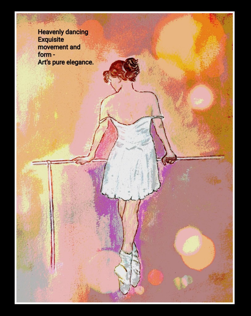
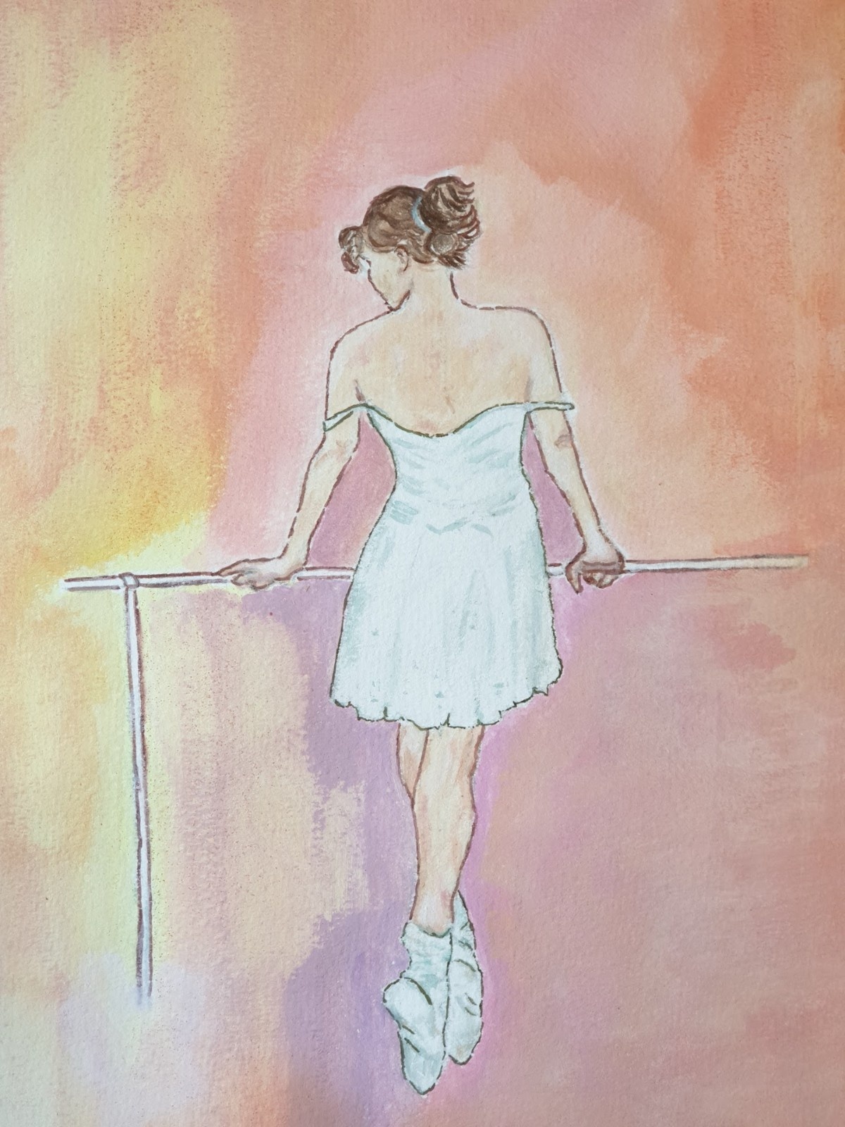
The following example of “my” Ballerina the Barre however shows a lack of tone variation,resulting in a weak contrast .
During the past 50 years, several artists have written computer programs to generate art—what I call algorithmic art. The process requires the artist to write a detailed computer program with a desired visual outcome in mind.
Example of algorithmic Art
New developments incorporate AI (Artificial Intelligence) and machine learning technologies to allow the computer more autonomy in producing images.
To create AI art, artists write algorithms not to follow a set of rules, but to “learn” the computer a specific aesthetic by analyzing thousands of images. The algorithm then tries to generate new images in adherence to the aesthetics it has learned.With a similar strategy AI proved to be succesful in games like Go or Chess,but also for instance in analyzing X-Rays.
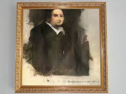
Recently an AI artwork was sold for $432,500 — nearly 45 times its high estimate — as Christie’s became the first auction house to offer a work of art created by an algorithm
Edmond de Belamy (AI generated)
The portrait in its gilt frame depicts a portly gentleman, possibly French and — to judge by his dark frockcoat and plain white collar — a man of the church. The work appears unfinished: the facial features are somewhat indistinct and there are blank areas of canvas. A label on the wall states that the sitter is a man named Edmond Belamy, but the giveaway clue as to the origins of the work is the artist’s signature at the bottom right,an algebraic formula.
This portrait, however, is not the product of a human mind. It was created by an artificial intelligence, an algorithm defined by that algebraic formula.
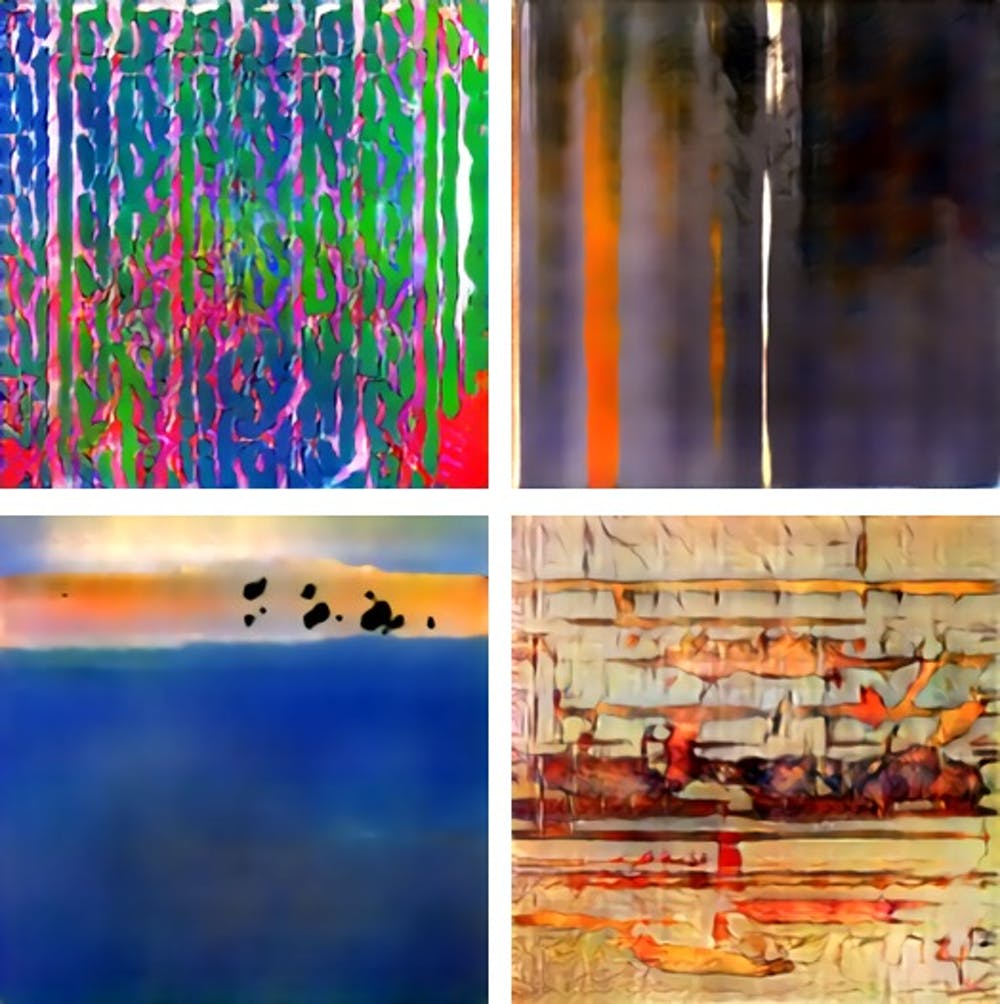
Maybe this portrait is a bit boring but the developments in AI are going fast and recently at the Basel’s art fair several paintings,made by AICAN (an AI algorithm from Rutgers University) were shown and 75% of the people could not tell the difference between AICAN or a human artist and found the paintings inspiring.
AICAN generated pictureAICAN generated pictures
Of course, just because machines can almost autonomously produce art, it doesn’t mean they will replace artists. It simply means that artists will have an additional creative tool at their disposal, one they could even collaborate with.
I often compare AI art to photography. When photography was first invented in the early 19th century, it wasn’t considered art—after all, a machine was doing much of the work. The tastemakers resisted, but eventually relented: A century later, photography became an established fine art genre. Today, photographs are exhibited in museums and auctioned off at astronomical prices.
I have no doubt that art produced by artificial intelligence will go down the same path
Maybe I should study again computer programming,especially AI,but honestly I am glad not having to concentrate again on formulas like
The central part of the algorithm for the generation of the portrait of Edmond de Belamy.
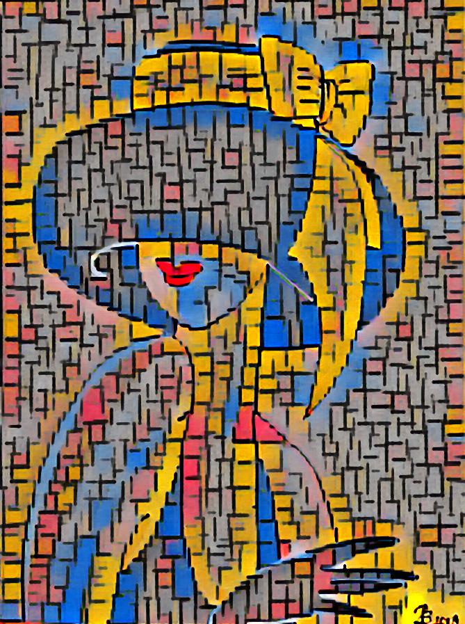
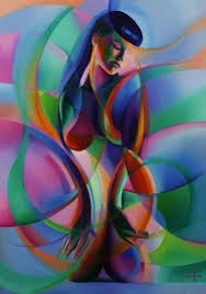
Of course I had to play a little with one of my paintings (Classy lady with hat) and some help of the computer,not really AI ,but applying some filters.
A Piet Mondriaan filterA Georgia O’Keeffe filter
While being pleased with the results,I took this one step further and used this last picture as input for Google’s AI program “Lens” that tries to recognize style and characteristics and search for meaningful associations.Guess what:,it came up with a painting from Corné Akkers (my teacher in portrait drawing),called “the return of Betty Page”.
The return of Betty Page by Corné Akkers
Although it is fun to play around a little,I’d rather spend my time on painting without the help of computers,but just with paint on canvas and a little inspiration.
This Blog will be a little bit harder to grasp than the former ones,mailnly because mathematics remains abstract to most of us. While one is an exact science and the other an artistic endeavour, it’s interesting to note painting owes a great deal to maths.
Geometry: An Essential Ingredient in Modern Drawing
Geometry is one of the first things which comes to our mind when we consider the link between mathematics and painting. It is a branch of mathematics whose objective is to study shapes in space.
Geometry in Art
Is drawing not the artistic arrangement of forms to create a composition? And is painting not derived from drawing?
The Golden Ratio: Maths Applied to Painting
The golden ratio is an excellent example of the link between mathematics and painting.
In ancient Rome, architects, painters, sculptors and designers understood the difference between an aesthetic work and a creation of chaos. They were greatly interested in this question and have studied how a work, though composed of unequal parts, may be aesthetically appealing.
Roman architect Vitruvius was one of the first to identify the golden ratio. The ratio can be used to create sequences, repeated infinitely within subsections of the same work.
The golden appears in the form of the Parthenon (Source: Emptyeasel.com)
Several mathematicians, including the famous Fibonacci, author of the Fibonacci sequence, have proven the existence of the golden ratio in nature Even the human body is defined by this famous ratio.
In painting, there exist the golden rectangle, the golden spiral, the golden triangle and the golden ellipse. Together these elements define precisely where each part of a painting must be located, in order that the whole be harmonious and pleasing to the eye.
Leonardo da Vinci: A Genius of Mathematics and Painting
Leonardo da Vinci is undoubtedly one of the greatest figures in the field of art, mathematics and engineering. A true genius, this inventor and artist lived from 1452 to 1519 and was the originator of may advances in maths technology, some well before their time. We owe him the notion of perspective, a fundamental concept in artistic representation.
In this drawing, Leonardo sets out various measures of a human body, in the form of one defined which is supposedly “perfect”. Among the dimensions represented, we see that by extending our legs, the shape formed by them and the ground is that of an equilateral triangle. Also, it shows how the combined length of our two straight arms is equal to our height.
In this work, Leonardo precisely measured and represented each part of the human body, proportional to the whole.
The golden ratio can also be seen in the Mona Lisa (Source: Juan Ángel Paniagua Sánchez)
As a mathematician, Leonardo da Vinci knows about the golden ratio, and uses it in many paintings. In the Mona Lisa, for example, the face subject’s face fits perfectly into a golden rectangle. The same is true of the proportions of her body which, from elbow to elbow, fits into a golden rectangle.
The Last Supper, painted between 1494 and 1497, also employs the golden rectangle, to which both the table and room depicted conform in their dimensions.
The Golden Ratio in The Last Supper (Source: Emptyeasel.com – Leonardo da Vinci)
If you want to make progress as a painter, you will need to spend some time on your elementary maths lessons and on becoming skilled in perspective and geometry.
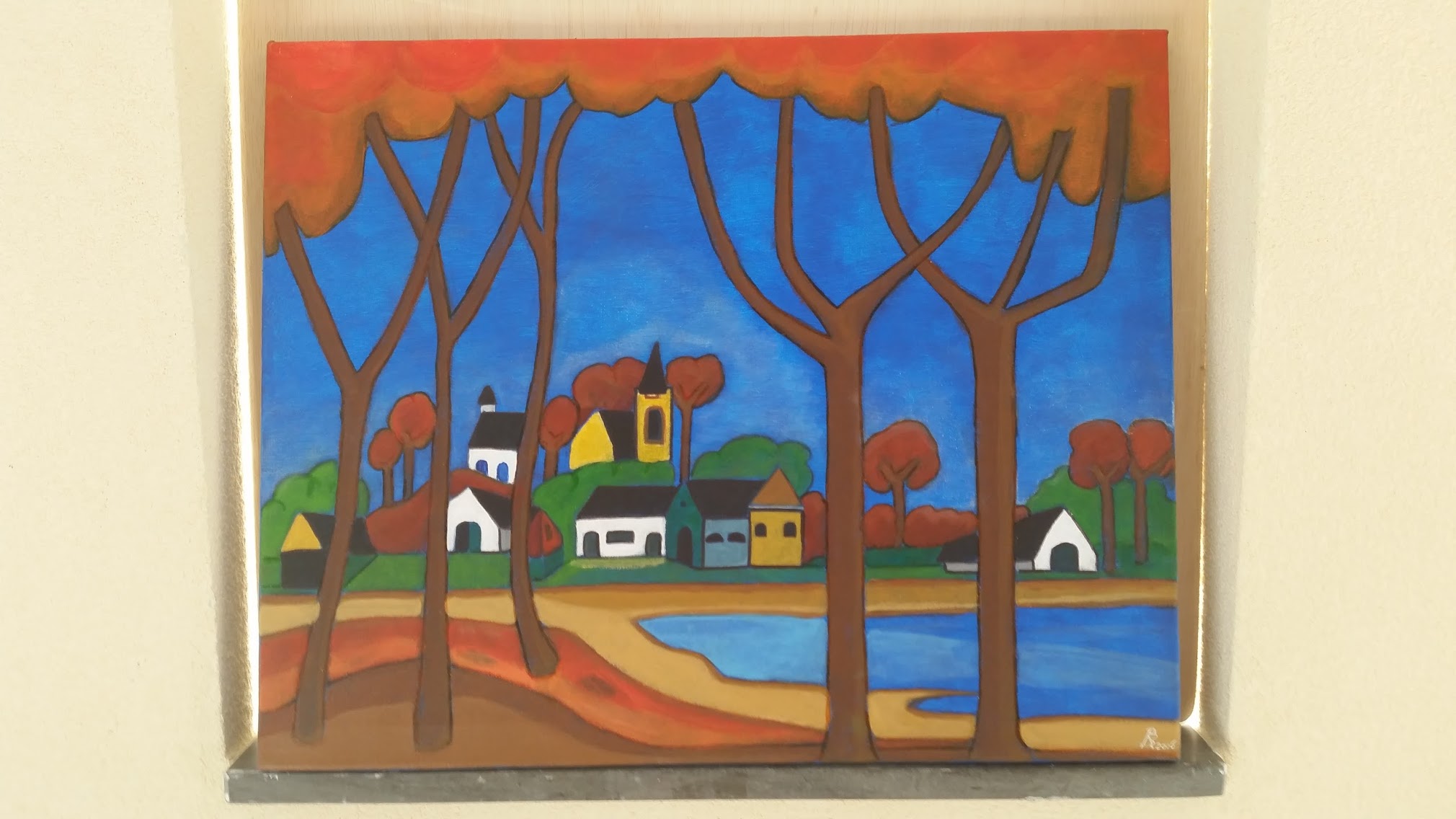
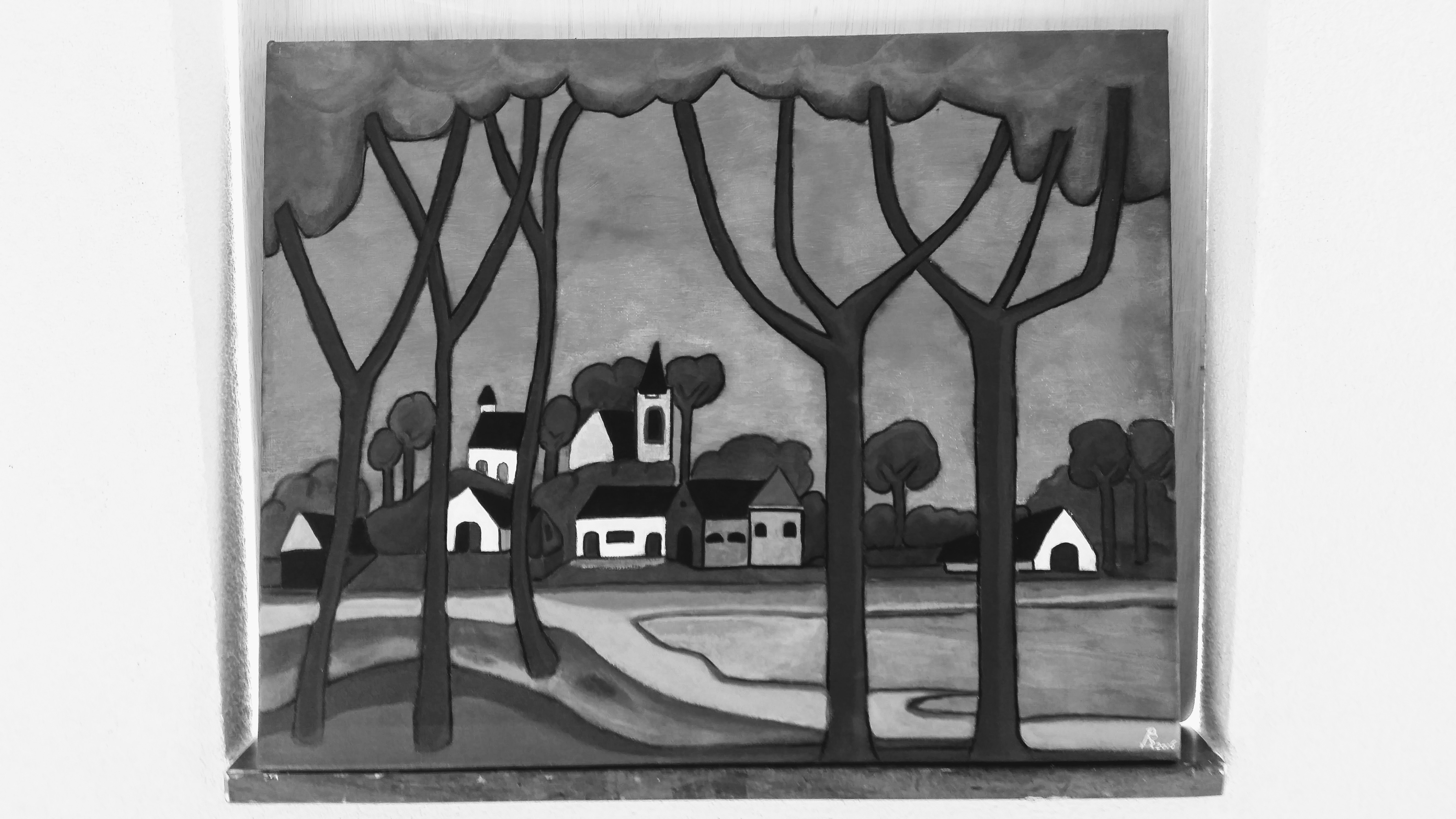
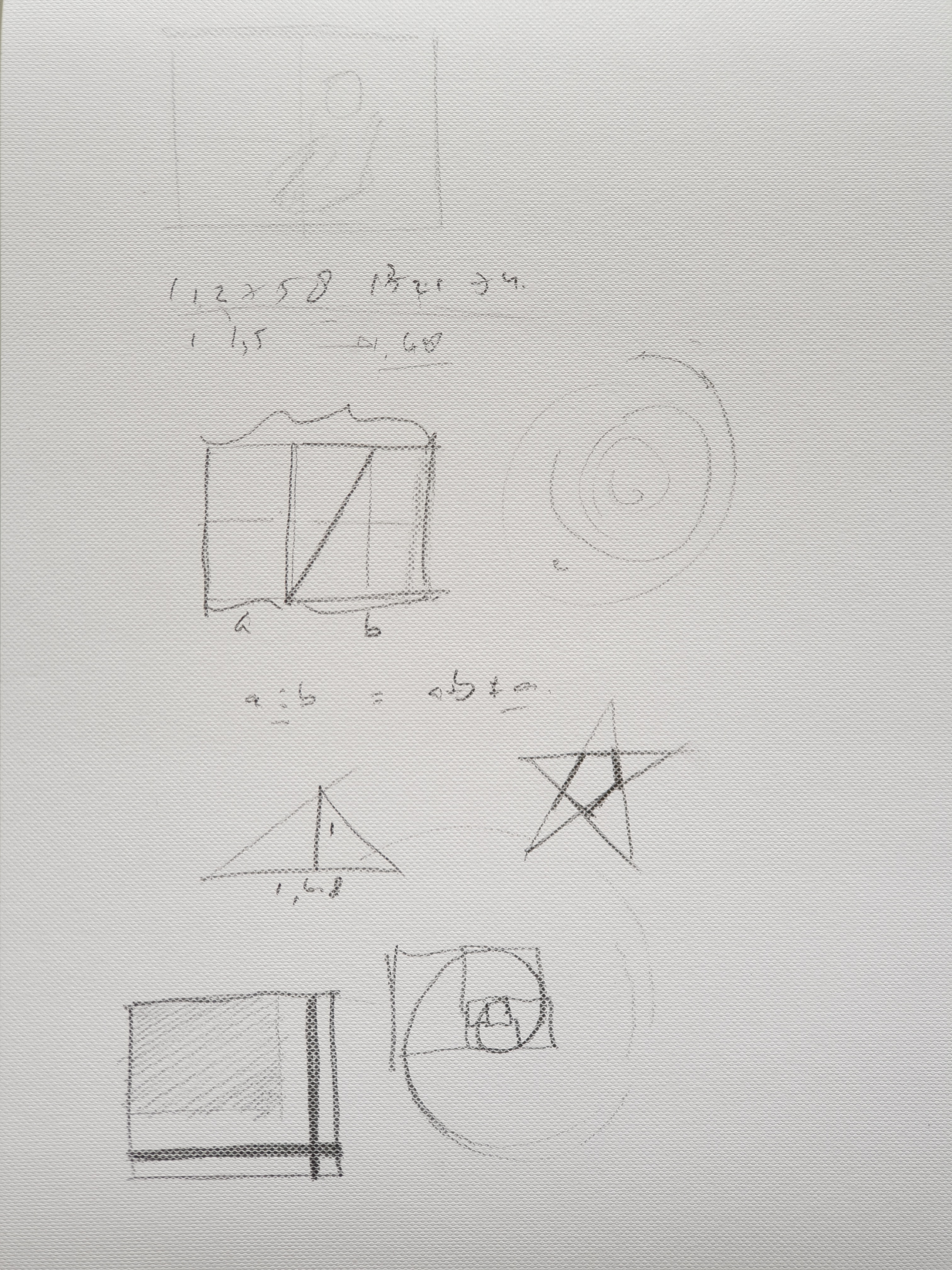
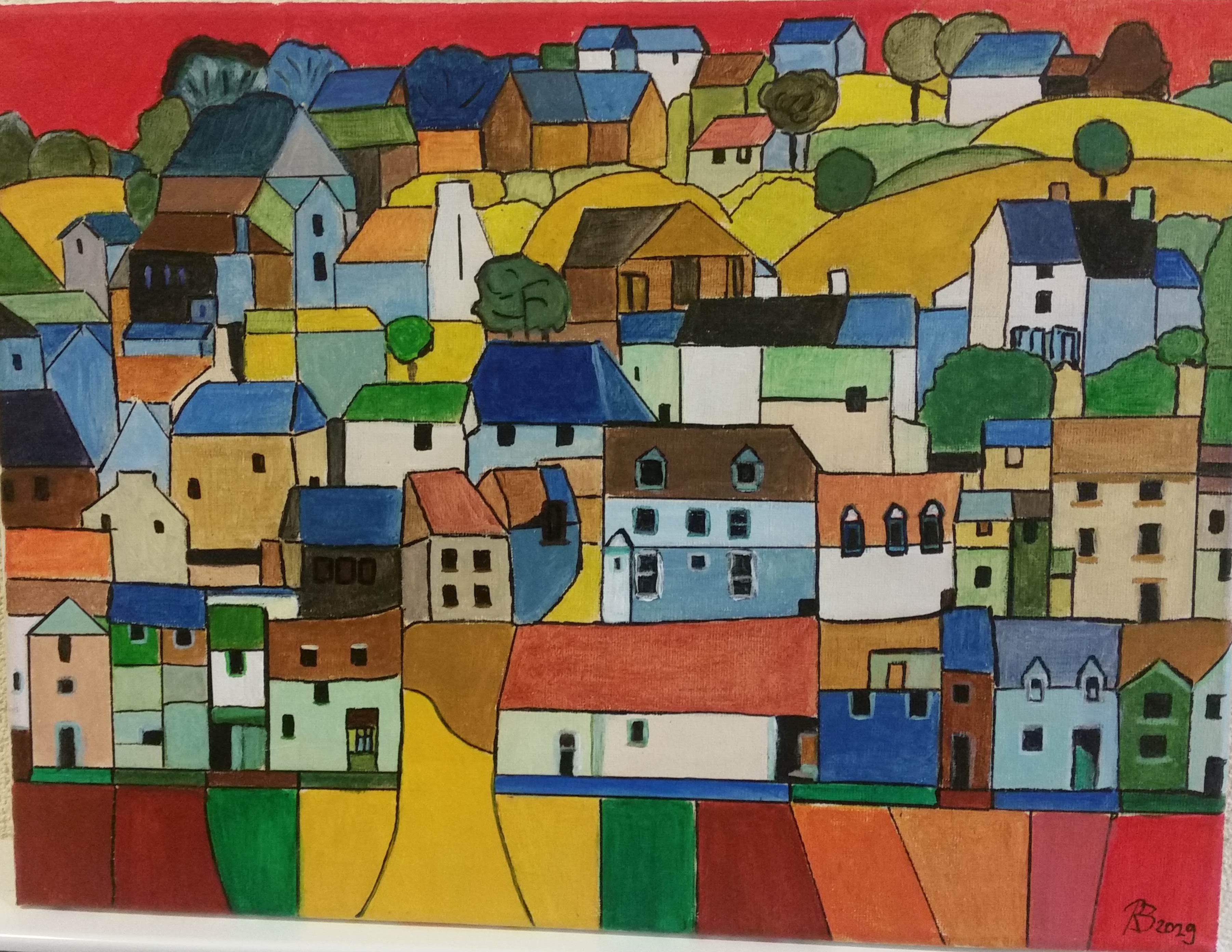
Although a main part of my academic studies existed of mathematics,until now I did not use it very explicitly in my painting attempts.Having said that I will present you however some homework and one geometrical painting,whereby some elementary maths has been “applied”.
Playing with the golden ratio etc.Village on the hill, a geometrical division of the plane.
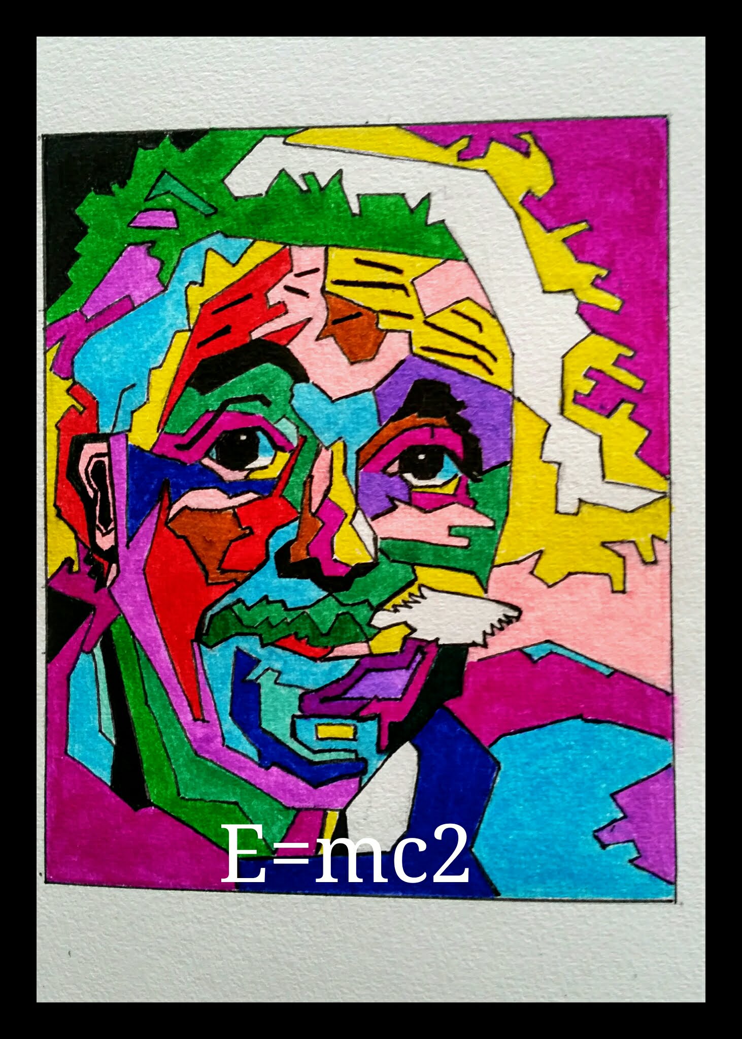
Let me conclude the chapter with a saying of one of my greatest heroes in science and creativity: Albert Einstein.
“After a certain level of technical skill is achieved, science and art tend to coalesce in aesthetics, plasticity, and form. The greatest scientists are artists as well”.