Already a long time ago people noticed similarities between music and painting,or basically between sound and color.While music has to do with compositions in time,painting has to do with compositions in space and both trigger different emotions. Besides painting I like to play the piano and listen to music,preferably Jazz.Also there is a strong influence on painting by music and vice versa.
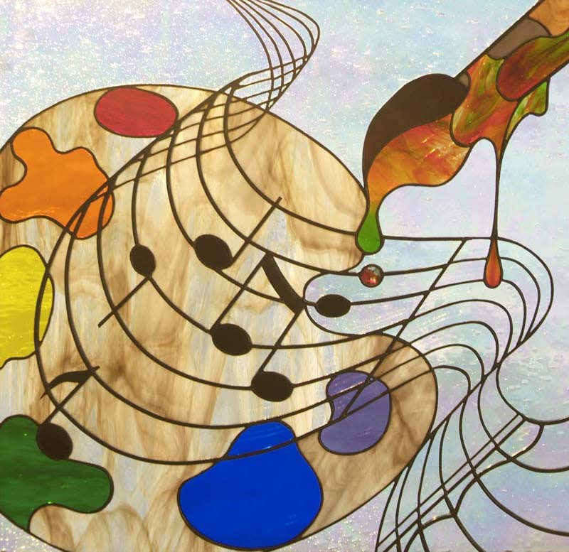
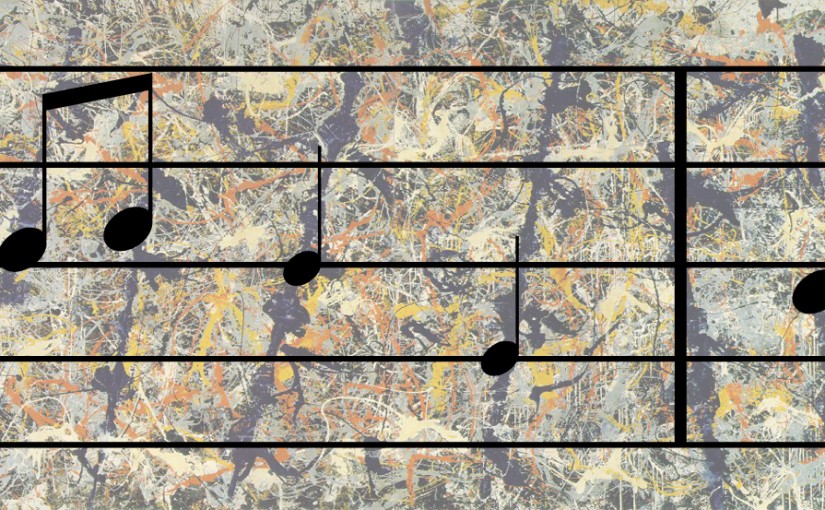
Similar to music,visual art has a composition. Instead of a composition of beats, notes and tones… visual art has a composition of lines, shapes and colors. Like the rhythm of music, a lot of art pieces have a rhythm of lines and shapes. You can see this very pronounced in the dark lines that cut through the painting in Jackson Pollock’s Blue Poles,or Number 11. In this image the music bar was overlayed to show the rhythm of the painting.
Painting and drawing are not just about rendering objects the best one could in the middle of the canvas. It is about creating a scene. It is about how the shapes interact with each other and create an emotion with the viewer.
I could,for instance, create a symmetrical composition to show stability…. or I could create an asymmetrical composition with the focal point on one side to add drama and motion.
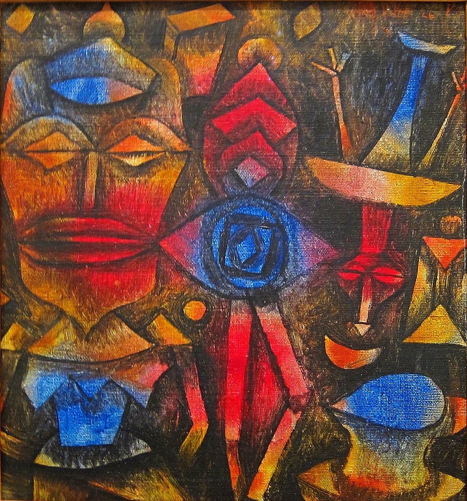
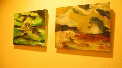
Also, like music, visual art can create a mood. Rigid shapes and contrasting colors can give a harsh exciting mood like a full rock concert. You can see this is the painting by Paul Klee below. While organic soft shapes and light analogous colors can give a calm mellow feeling like a mellow acoustic song. You can feel this in the Monet painting below. Sometimes this is even illustrated in the album art of a band.
Paul Klee – Collection of figuresMonet – Branch of the Seine near Giverny
Of course just adding calculated notes doesn’t make good music. Music comes from the heart and soul. It comes from the expression of the musician. This also carries over to visual art. Drawing shapes on a canvas doesn’t make art. Art is the expression of the artist.,the mood they are feeling and the exploration they are taking.
Over the years,musical composers were inspired by paintings,such as for instance
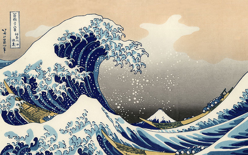
The Great Wave off Kanagawa – Hokusai
Easily one of the most recognizable pieces of Japanese art(The great Wave of Kanagawa), is part of a series of paintings focused around Japan’s Mt. Fuji. In this particular work, Mt. Fuji is relegated to the background, and it is the massive wave threatening to overcome three fishing boats that takes the foreground. It is said that this was the inspiration for Claude Debussy’s “La Mer
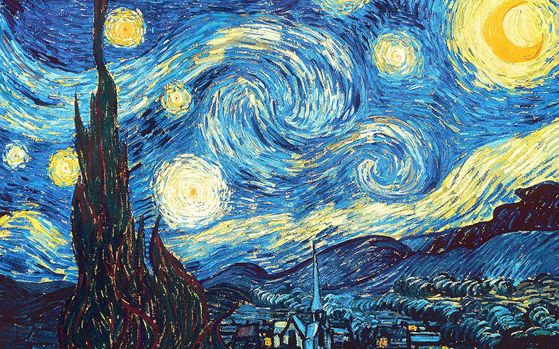
The Starry Night – Vincent van Gogh
The night sky was somewhat of a growing theme for Vincent Van Gogh in the late 1880s, and his paintings Cafe Terrace at Night and Starry Night over the Rhone both show hints of what is to come in this, one of his most famous paintings. The scene presented in the painting is a view of Saint-Rémy-de-Provence from Van Gogh’s room at the Saint-Paul Asylum in France. Henri Dutilleux’s orchestral work Timbre,Space Movementis subtitled La nuit etoile (The Starry Night) after this painting, and Finnish composer Einojuhani Rautavaara wrote an opera about Van Gogh’s life, Vincent. He later adapted this music into his Symphony No. 6, the first movement of which is titled Starry Night.
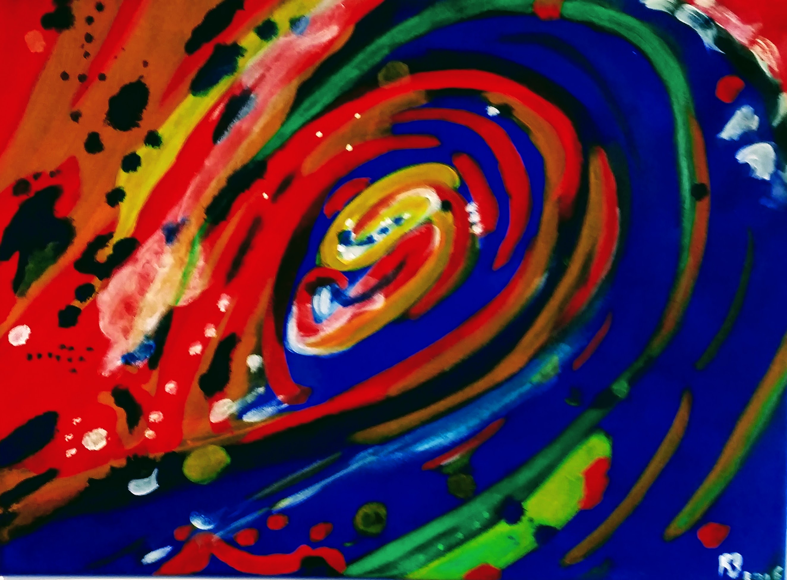
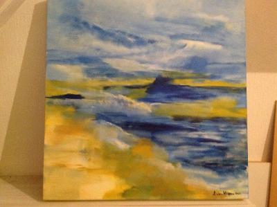
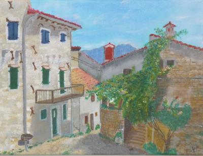
An early attempt from me to try and paint an abstract composition,based on the jazzy Bossa Nova,called Wave (Antônio Carlos Jobim), resulted in the following painting. Although I like abstract compositions (or improvisations),I think I still have a lot to practice on this.
Many of us have heard about the benefits of meditation, but sometimes find it hard to do. Fewer of us know about the profound benefits of artistic expression. Creating art, however, is another way to access a meditative state of mind and the relaxation it brings. The process of making art overrides the need for verbal communication. Creativity is its own language and enables humans to connect with one another — and themselves — on a non-verbal level.
Especially when practicing the Japanese disciplines Sumi-e ink painting and Haiku poetry I “easily” get rid of the constant chatter in my head,being in the moment,although I find that sometimes a misleading expression.
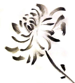
On Sumi-e black ink painting I wrote something already in this Blog.It is all about trying to capture the essence of nature in a few brush strokes.
Haiku poetry: This was originally developed by Japanese poets.These are poems that use sensory language to capture a feeling or an image,often inspired by nature. A Haiku is composed of three word groupings in separate lines.The seventeen total syllables are divided into a five-seven-five syllable count for each corresponding line.Because Japanese words are commonly shorter than that of the English language,it is not uncommon to vary the 17-syllable count.
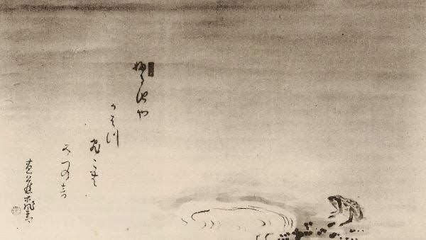
Matsuo Bashō(1644-1694) was the most famous poet of the Edo period in Japan. One of his most famous Haikus is about the frog and the old pond.
An old silent pond… A frog jumps into the pond, splash! Silence again.
Te next Sumi-e painting tries to capture this Haiku.
The old pond
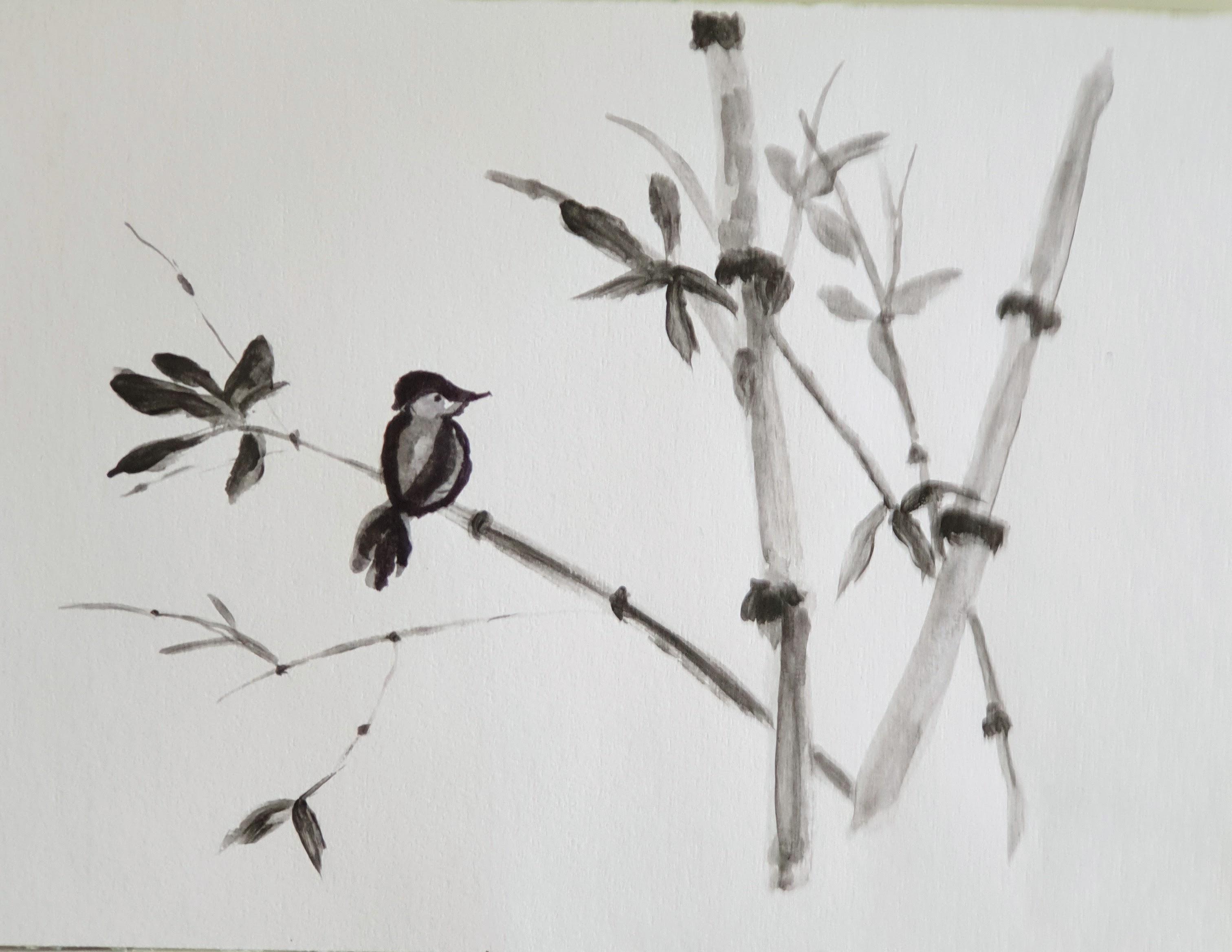
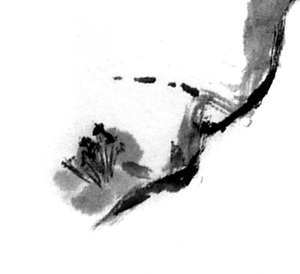
Today I tried to create a combination of Sumi-e and Haiku,which,compared to Basho is almost a kind of “profanity”,but anyway.
Bird sitting on branch Bamboo standing firm in air Beautiful moments
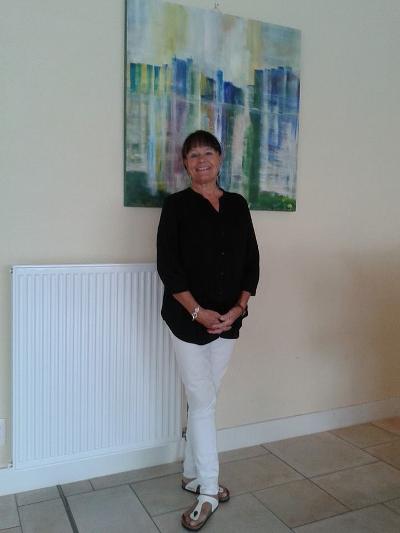
The driving force behind our weekly painting lessons is Lisa van Nispen,who not only is a very creative and enthousiastic teacher,but she also manages to create a very good atmosphere in the group.A few years ago I really started painting from scratch and learned a lot from Lisa,especially composition,use of colors etc. During our lessons,Lisa walks around and gives advice in a friendly manner,never “forcing” things to do her way.The end result always becomes better ,while giving us the impression we invented it ourselves. After a short bio from Lisa,you will find some of her large oeuvre.
Lisa van Nispen
Lisa van Nispen. Born in Denmark, and moved to the Netherlands in 1977. Worked for many years as a surgery assistent at the University Centre Hospital of Leiden(LUMC). Drawn and painted for as long as i can remember. Followed courses in painting. Started giving paintingworkshop’s in 2007. Participated in many exhibitions during the years. My works in acrylic are inspired by impressionist and abstract art. I started in 2010 in de Blauwe Tram, Leidschendam, giving paintinglessons. I have 2 classes every week. I love painting in luminous and contrasting colours.I learn my students to enjoy working with colours on a white canvas, everything can happen. Look beyond the horizon. It is such a joy, painting, and being together with other artlovers.
As I stated earlier,I participate in a weekly painting class under the guidance of Lisa van Nispen.In this Blog I want to show you some artwork of my fellow students.
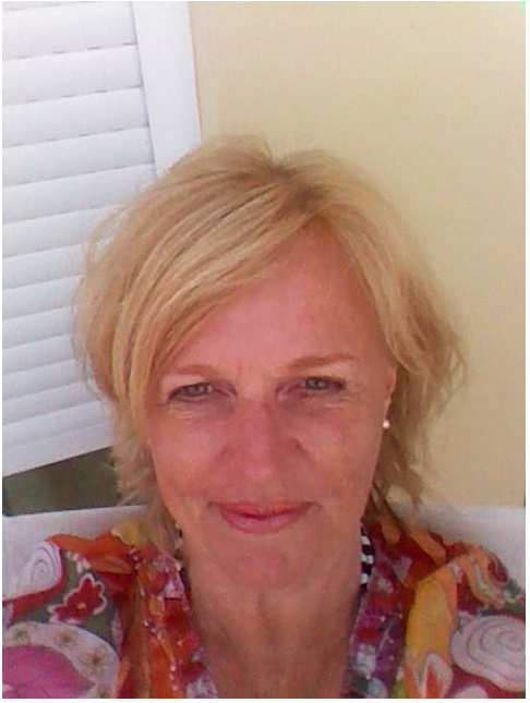
The first one to contribute is Henny,who has already an impressive portfolio.
My name is Henny Molleman-Bertina,married to Wim and we have one son.
Already from december 2011 I enjoy the painting lessons in community centre “de Blauwe Tram”,together with about 10 enthusiastic fellow students.With our excellent teacher Lisa van Nispen,we are weekly working on our artworks and it is nice to see how every student develops a particular style.
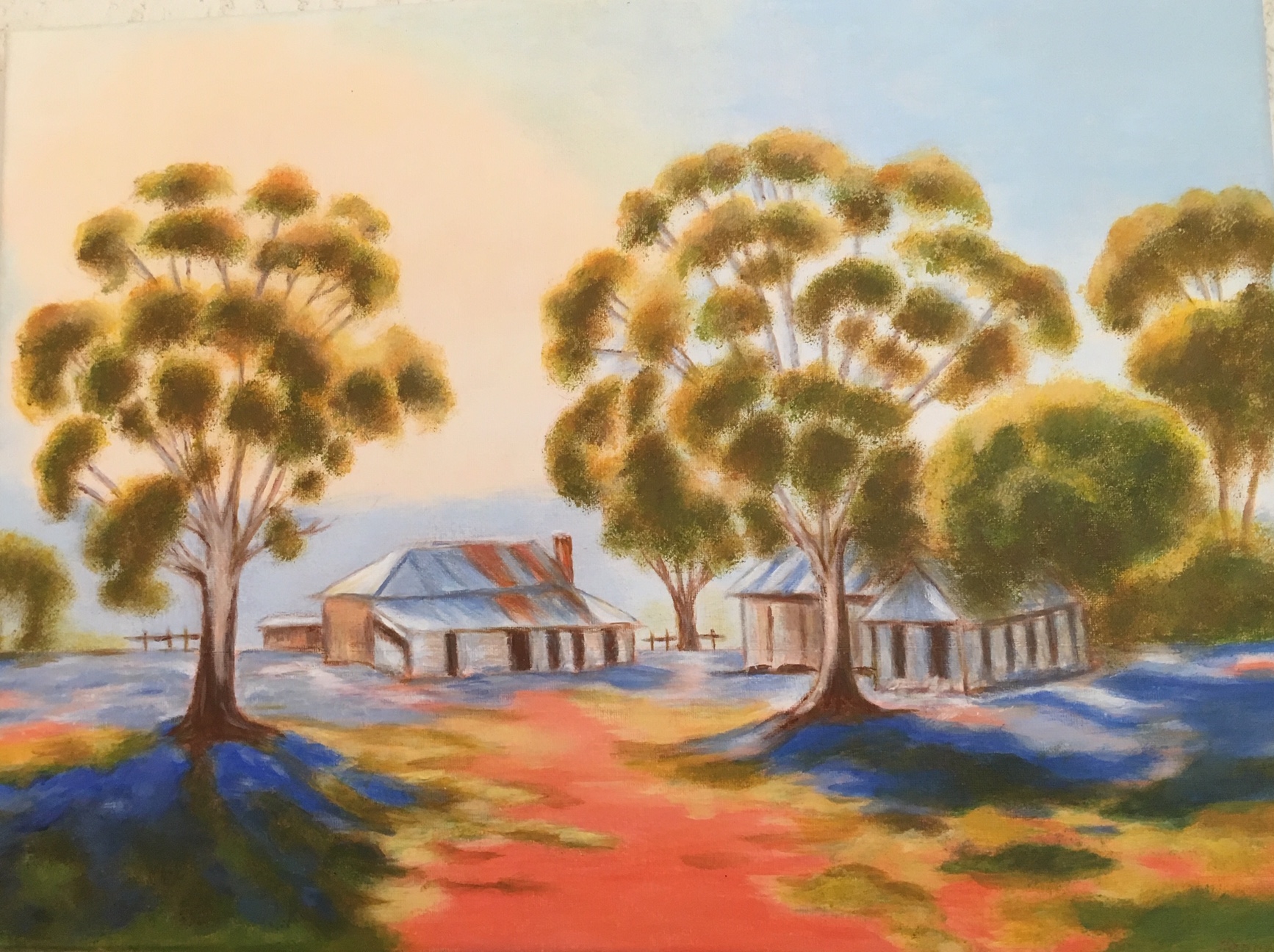
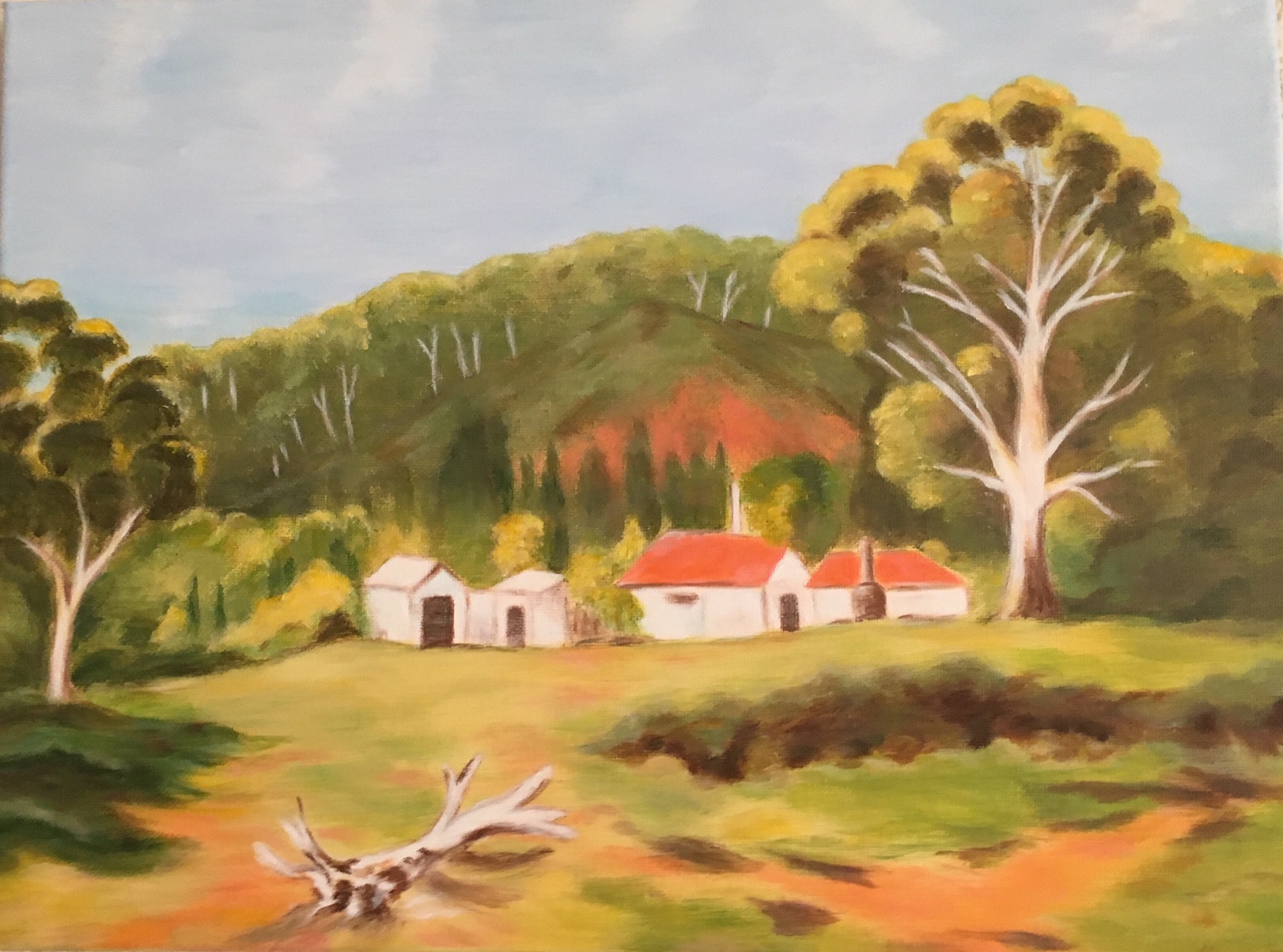
Between 1980 and 1983 I attended painting courses organised by “The Centre of Artistic Education” in the Hague.The teacher,Bernard Olsthoorn,was a talented artist.At that time we mainly painted in watercolor.Due to a lack of time I could not continue these lessons.After 28 years working as a Management assistant in a busy office,I retired in 2011 and started painting again.
My main interest is painting Australian landscapes .A lot of ideas and impressions come from visits to our son who lives in Australia.The colors there are fascinating.I hope to be able to continue and enjoy this nice hobby for a very long time.
Here are some examples of my artwork.
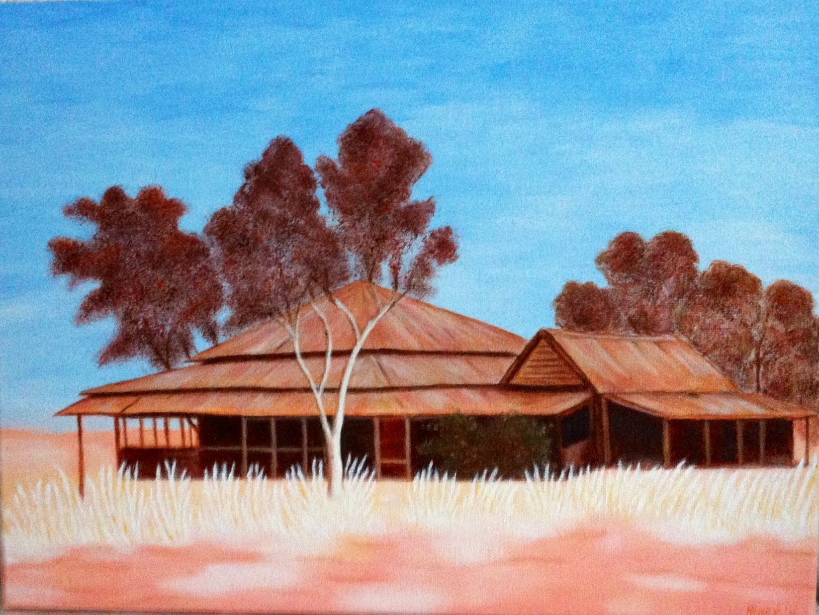
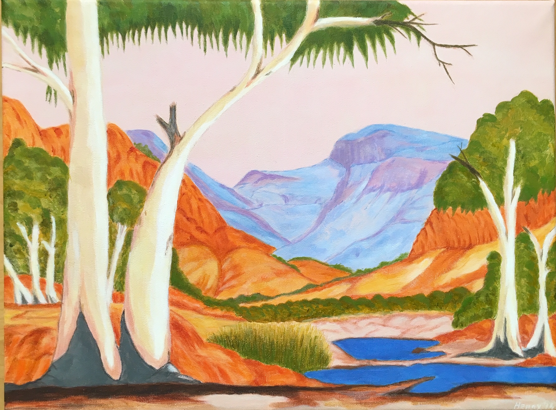
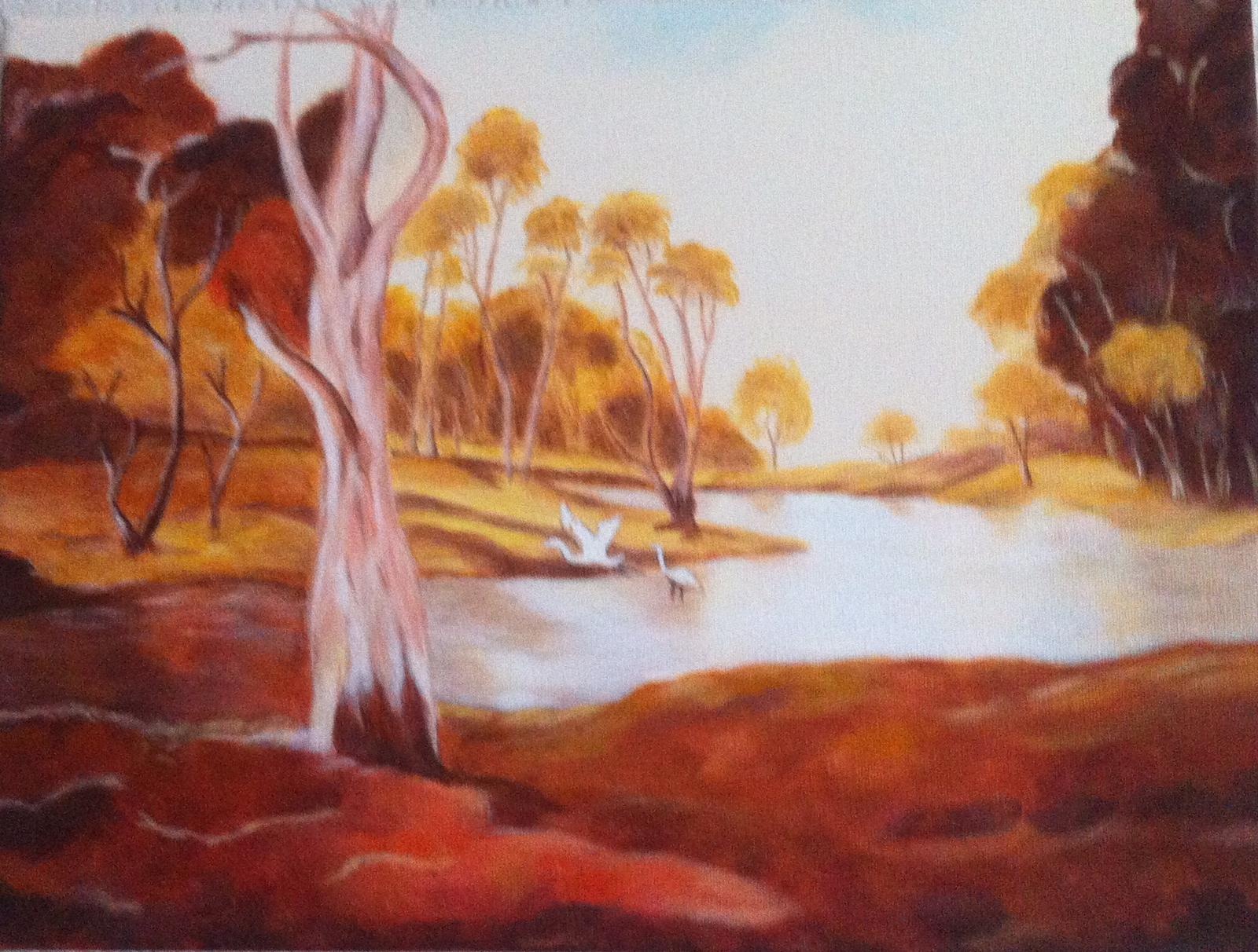
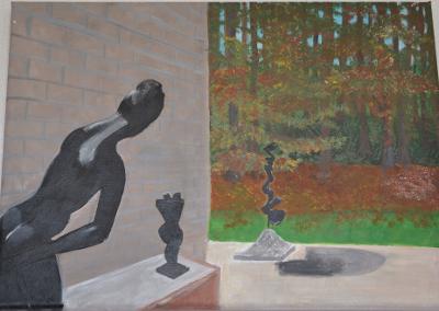
Afternoon glowSofala mountainQueenslander MaxweltonMcDonnel Ranges The Silent Lily Pond
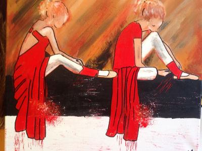
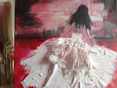
The next fellow painter is Marion,of which you will find some beautiful paintings in her own specific style.
I am Marion Korpershoek, married to Ies, We have two children, a son and a daughter, both working. I started my painting lessons in the year 2012, after a long period of working in several jobs, fashion, jewelry and gardening. I enjoy the lessons from our teacher Lisa van Nispen and I learn a lot of it. Portraits are my favorite, inspired by books, nature or travelling. I love the work of Astrid Engels, a famous Dutch painter .
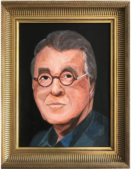
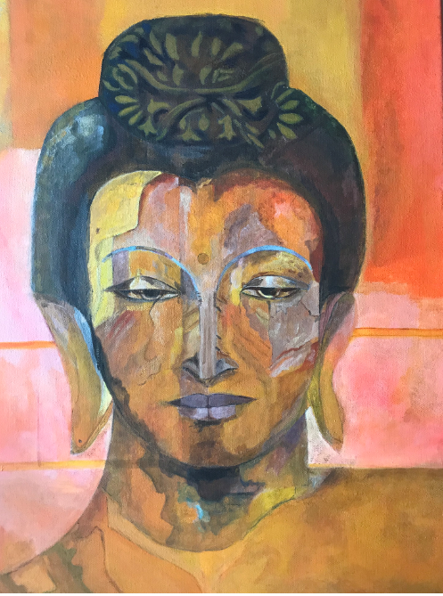
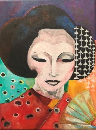
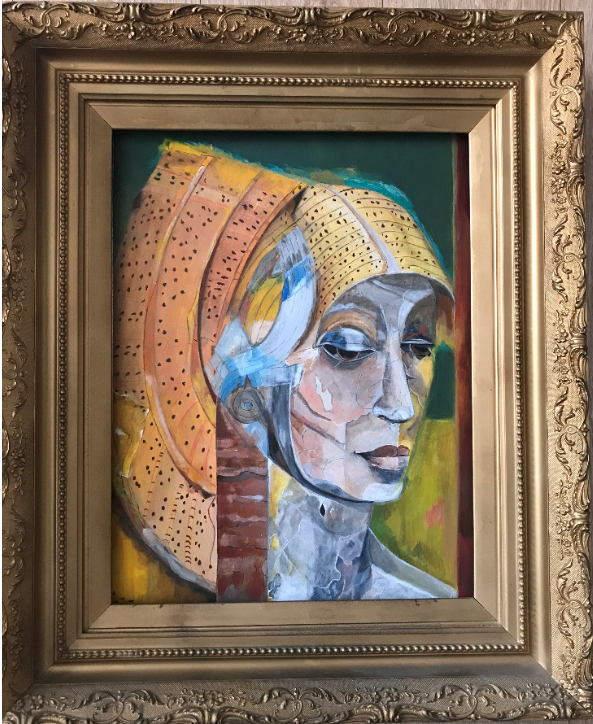
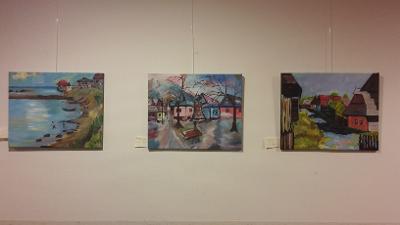
MarionPortrait of Jeroen Krabbé (Dutch actor and painter)Tara BuddhaSeat of my SoulMesopotamian Princess
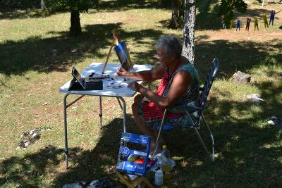
The next fellow painter is Petra, who again makes beautiful work,which,according to me, is clearly recognizable. Petra,not only paints during our painting lessons,but also sometimes at home or outside in the open air,as you can see below.
Painting on the campsite
I am Petra,living in Leidschendam with my partner Paul.Our two children have finished their studies,have a job and live in Utrecht and the Hague.In 2004 I attended some painting courses and started painting in charcoal and pastel chalk,followed by acrylic and oil paint.When the teacher left,I stopped painting,but when I ended my career as a marketeer,I started taking lessons again at “de Blauwe Tram”. During all those years I still have not found my own theme,although I am inspired by my own pictures. I like to try a lot of things,inspired by the group and our teacher Lisa.
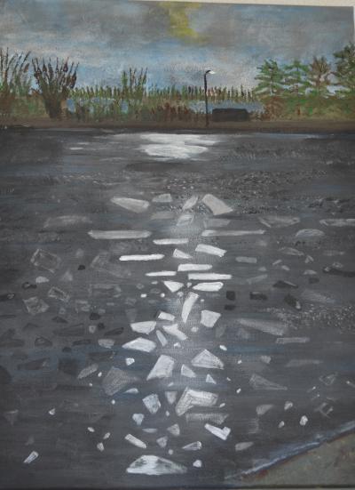
de bevroren Vliet (frozen Vliet canal)Some paintings at an exhibitionKröller Müller museumVillage in France
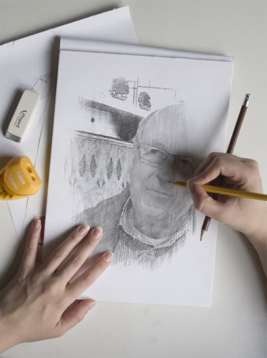
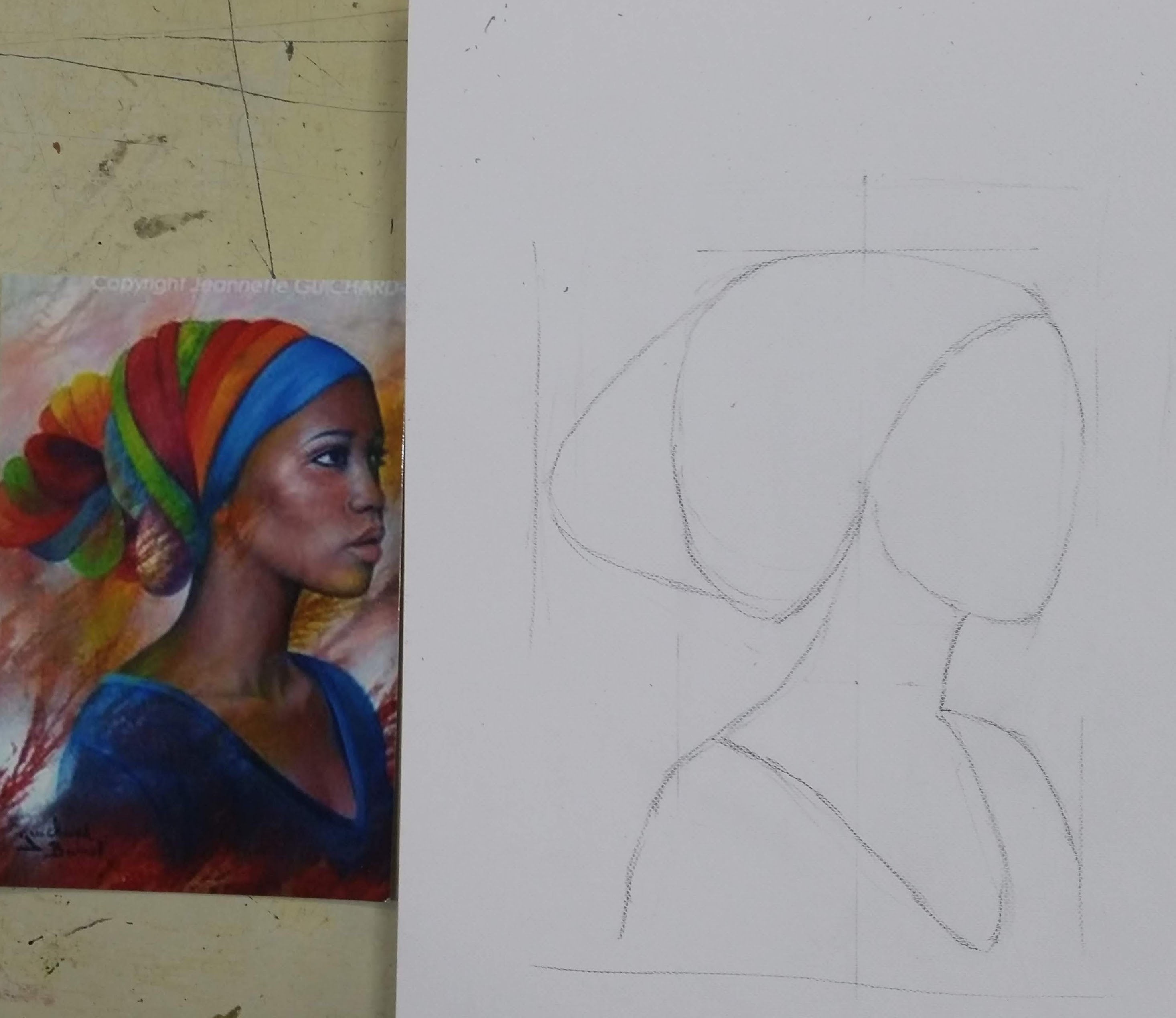
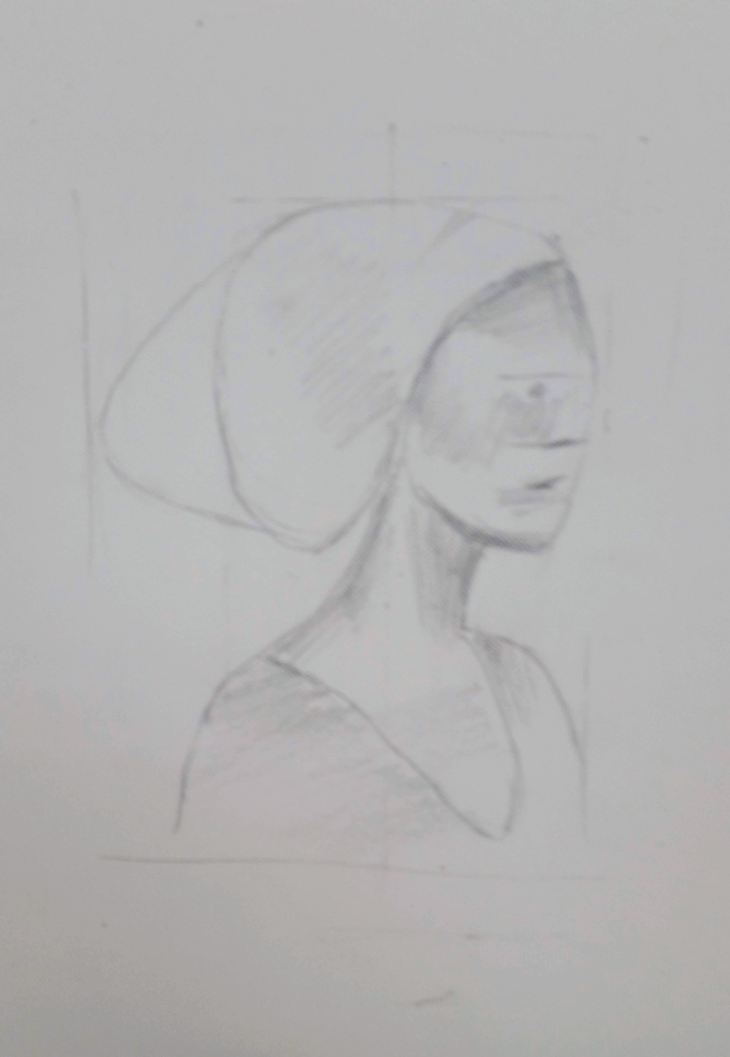
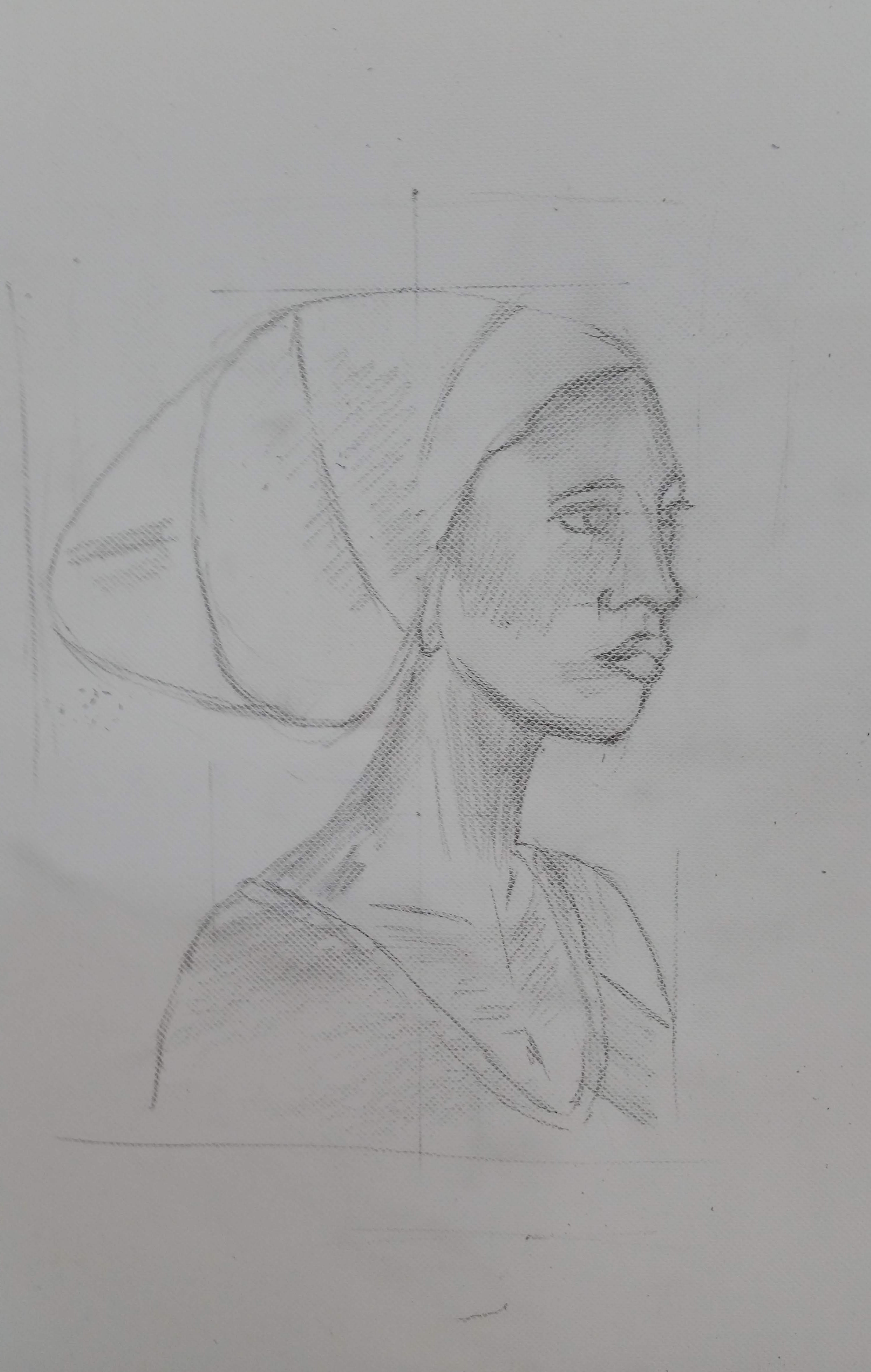
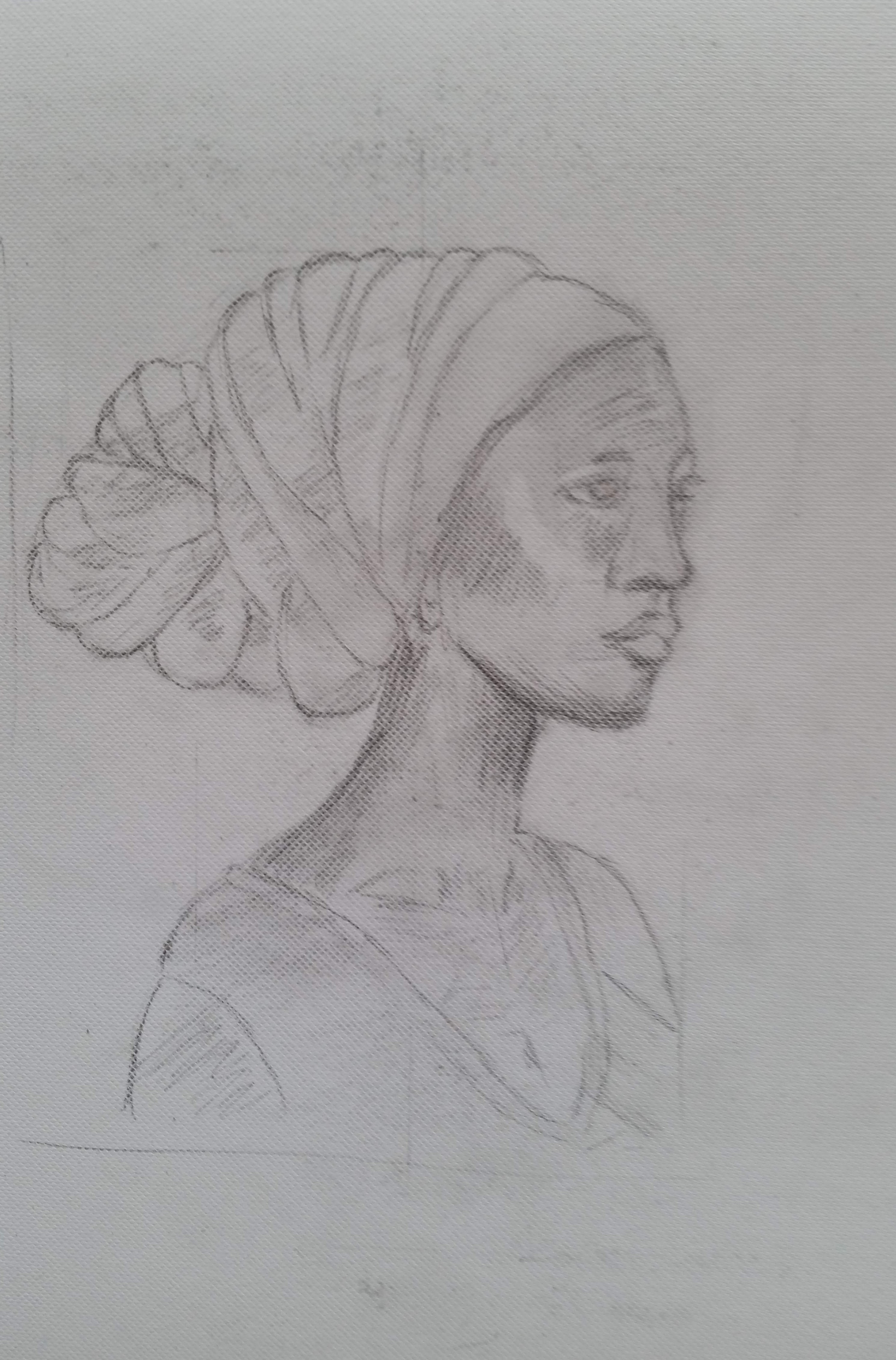
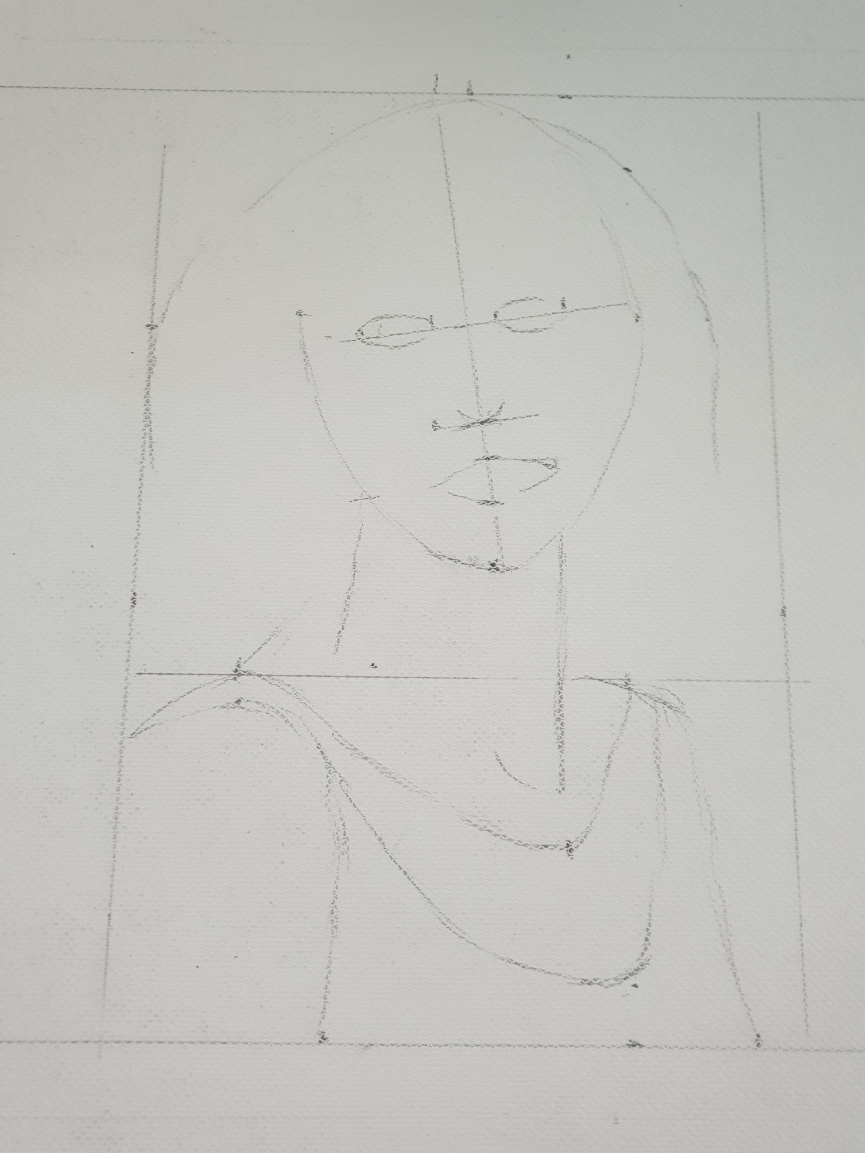
Today I’ve had my first lesson in portrait drawing from Corné Akkers (see former chapter).Of course there are libraries written full of theory but after a few basics I had to start drawing the portrait of an African woman.The most essential lessons were about proportions,working from outside in (first set up raw contours),don’t jump into details too fast,work with tone and tint,where tone is of the utmost importance to create difference of light and dark(contrast).In the end the picture “dictates” more or less the details after having worked on the essentials.Also seeing the curved lines relative toward our preferred orientation of straight horizontal and verical lines proves to be important.Last but not least we discussed the importance of composition and negative space.For instance when you try to draw a very tall buiding as a whole,you’ll get a lot of negative space relative to the tall buiding.Unless you want to fill that space,it is sometimes better to draw part of the object.
Working this way with a medium soft (B5) pencil and a lot of erasing,after thwo hours I produced a reasonable drawing.
‘If you teach me something.I’ll forget;if you show me something,maybe I’ll remember;if you make me do it,I’ll make it my own’
CONFUCIUS
Let’s beginThe contours (and proportions)First tone surfacesMore detailFar from perfect but much better then before.
See below an earlier attempt to sketch this portrait,not taking care very well of proportions,shades etc.and jumping into details too fast.
I am eager to learn,and above all,to practice a lot more!
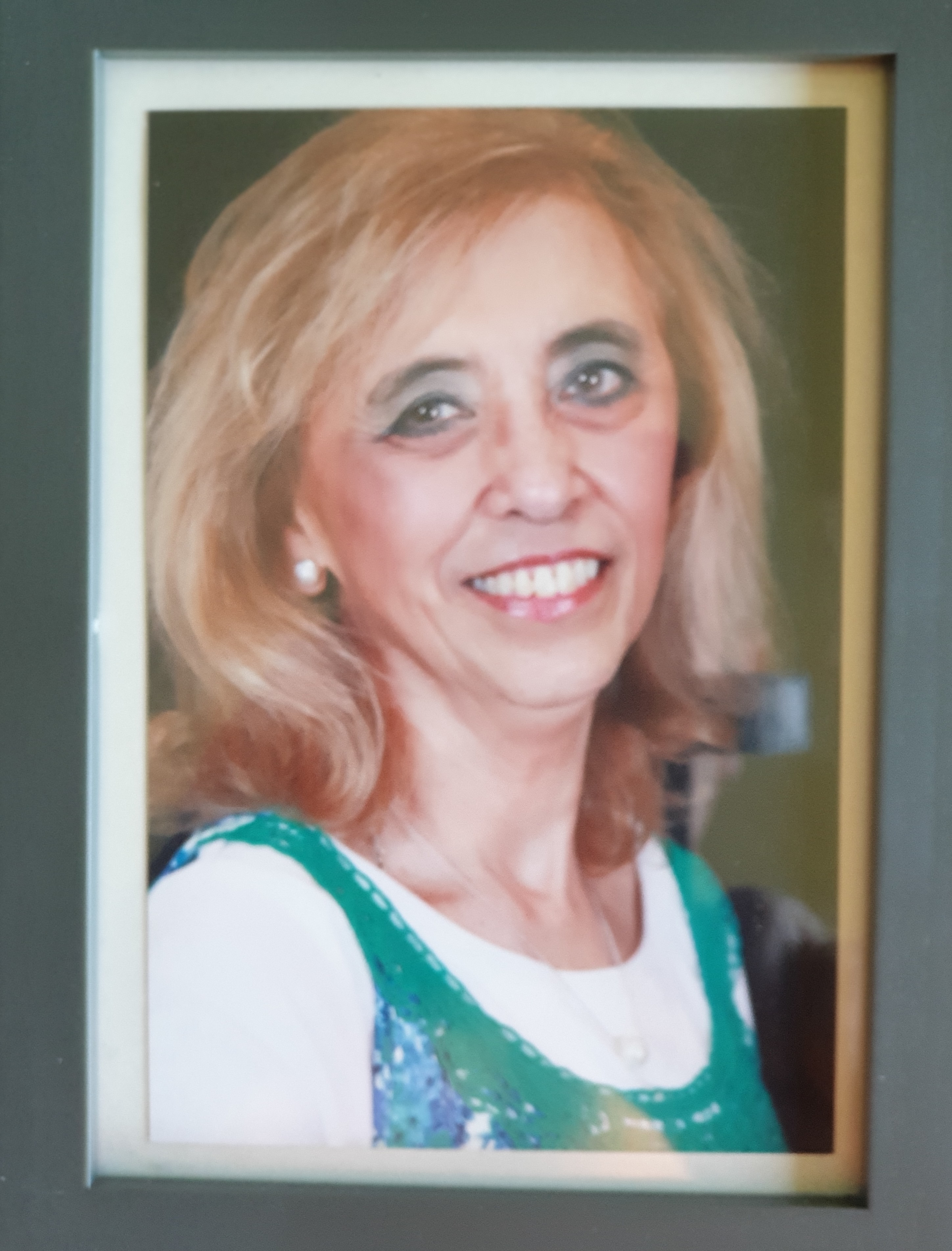
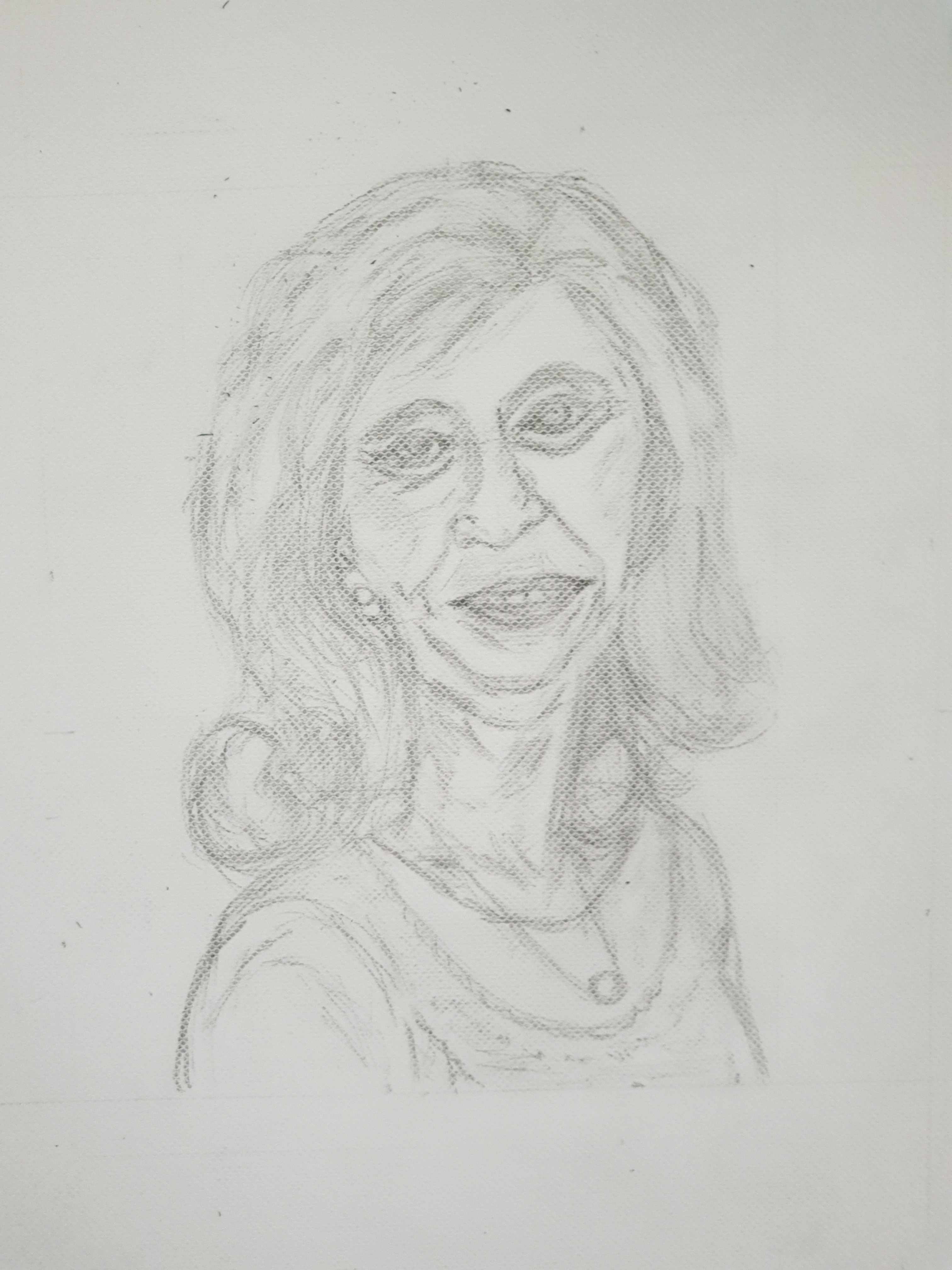
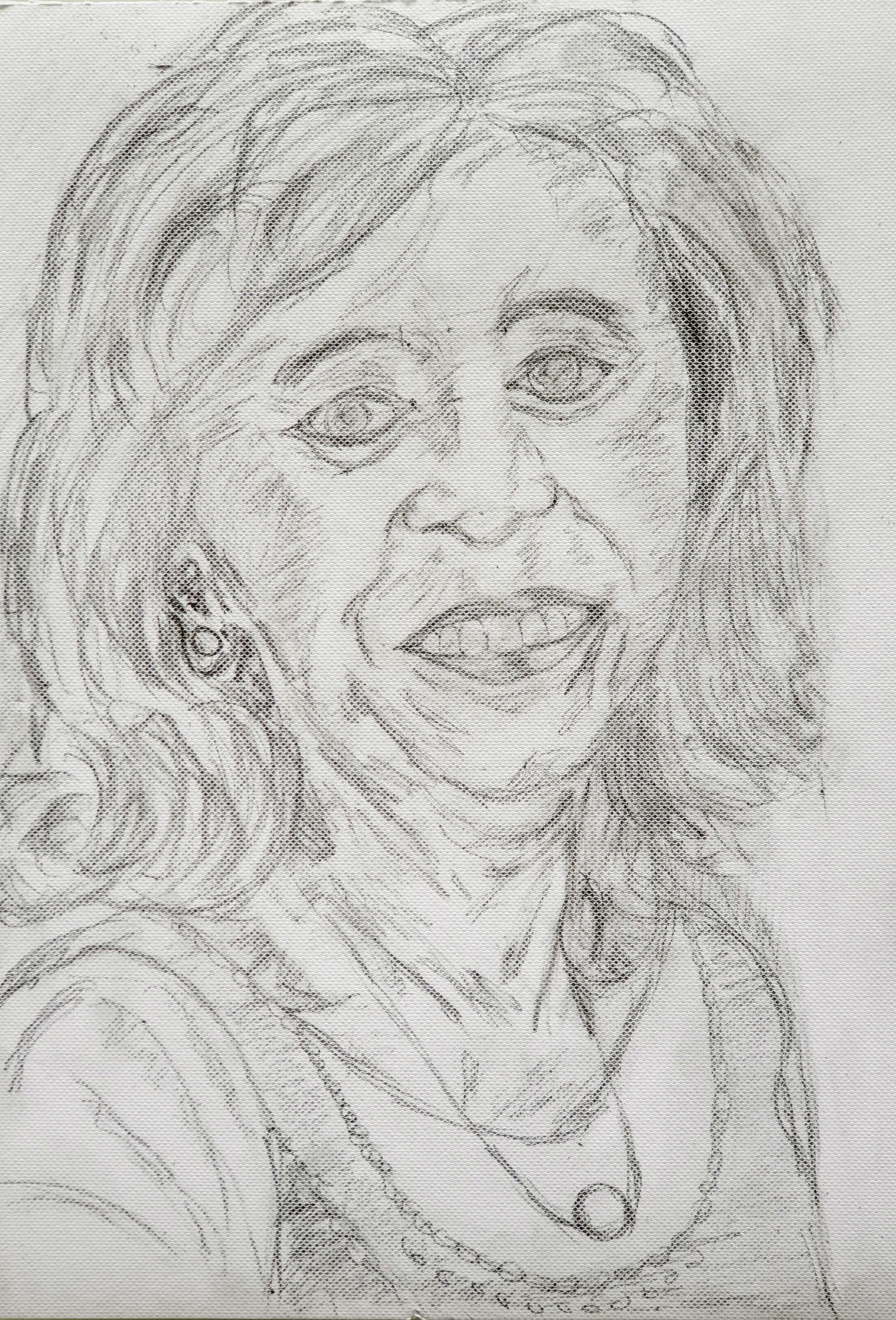
During my second lesson,I choose the challenging task to draw a portrait of Magda,my wife. In the end it proved to be a complicated task because I worked 1:1 from a small photo,meaning that every small mistake matters and seems to be magnified.I started with the advice from Corne to try to divide the original photo into a simple geometry: in this case 1.5 squares did the job. Although the end result certainly was recognizable,for instance the mouth proved to be (very) wrong and needs more work.
The original photo
The contours in 1.5 squaresThe (end) result
I had to try Magda’s portrait again and am a little bit more pleased with the result. This time I made the portrait a little larger and before adding some details I first applied Tone to the drawing
Somethimes people ask me ,what is your painting-style and I really don’t know and honestly I don’t mind.Style has to do with the way you present something to the world and to me: it depends on mood,mindset,etc. etc.
With respect to painting,just as with classical music,the style of the great painters of Golden Age I find very talented,but it is not my favourite.In music I like much ,more certain Jazz styles and especially the art of improvisation .In painting(or drawing) I find more pleasure in certain “modern” styles ,under which I also share impressionism.Besides that, minimalistic styles,such as Sumi-e have a lot of attraction for me as they pin down on the essentials and “less is more”.
Here you’ll find a short overview of a few modern styles.
Abstract Art
Abstract art is the style of art that focuses on spontaneity and does not focus on reality. Artists often use colors and shapes to convey and evoke certain emotions. Typical abstract art includes a large variety of colors along with geometric shapes and figures. Abstract art does not depict a certain image or photo, but rather it is often seen as a design.
Surrealism
Surrealism is a style of art that juxtaposes realistic images together to create an illogical effect. Oftentimes, this type of art is said to have dream-like qualities because the imagery depicted is surreal. This style of painting intends to emphasize the subconscious.
Pop Art
Pop art is the style of art that came from the mid-1950s that depicted objects found in everyday life. Andy Warhol is an artist that specialized in pop art and he was very good at using random everyday objects like a can of soup to create a plain yet very enticing piece of art. Oftentimes, colors are added to very bland pieces of art to make the art stand out and look more modern.
Minimalism
Minimalism is the type of art that is characterized by its simplicity. This type of art focuses on the subject that the artist is trying to depict. Usually, this type of art avoids vibrant colors and designs and sticks to plain, usually neutral colors. To some, this type of art may seem boring, but really it is an art form that only some can appreciate.
Futurism
Futurism is the style of art that focuses on subjects like speed, technology, and the future of the world. Usually, futurism depicts man’s triumph over nature. This type of art features a lot of realism as well as color and emotion. This style of art also has a theme of movement. Usually foreshadowing the future.
Impressionism
Impressionism is a style of art that originated in Paris, France. It features brushstrokes that emphasize light. Usually artists who focus on this type of art like to paint outside in order to capture sunlight and the actually appearance of the objects they are trying to paint in natural lighting.
Photorealism
This style of art is in the name itself. It features a realistic painting of a photograph. This is done with a real picture of the subject and then painting it. In other words, this type of art is a painting of a picture. Therefore, the painting will look just exactly like a photograph. Unlike abstract art, photorealist painting must capture the realism of a photo into a painting.
Hyperrealism
This type of art is very similar to photorealism. Artists who focus on hyperrealism use high resolution cameras to capture their images and they paint them on canvas. Compared to photorealism, hyperrealism features exaggerated shadows and random objects that display lifelessness. Some say hyperrealism focuses on a false reality thus giving this style of art a modern feel.
So there is a lot of beauty,expressed by different,so called, styles,but as I stated earlier,I don’t believe I have one and do not want to paint or draw according to a certain style.I rather believe very much in the following Zen-saying.
So I hope to be and to stay a beginner: maybe that’s my style!
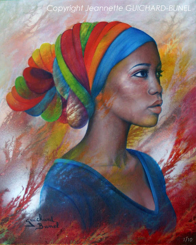
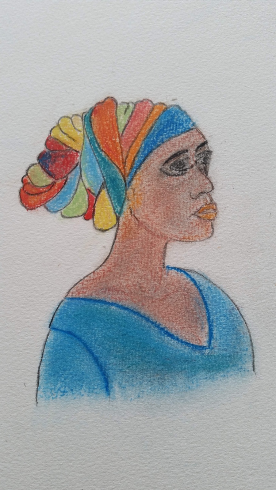
Every time I try to sketch or paint a human face,it turns out to be a failure.As an example I tried to capture the following portrait of an exotic woman.
It turned out to be a “nightmare”,also recklessly using pastel chalk for the very first time.Hopefully the lady never sees my drawing.
I am eager to learn more of portrait drawing and decided to take some lessons from Corné Akkers,a well known artist who organizes workshops in Voorburg.I will have my first lesson next Saturday.
Here you will find a short bio of Corné.
Biography
Born in 1969 at Nijmegen. Corné’s work can be seen in many countries all over the world. Corné employs a variety of styles that all have one thing in common: the ever search for the light on phenomena and all the shadows and light planes they block in. His favorites in doing so are oil paint, dry pastel and graphite pencil. He states that it’s not the form or the theme that counts but the way planes of certain tonal quality vary and block in the lights. Colours are relatively unimportant and can take on whatever scheme. It’s the tonal quality that is ever present in his work, creating the illusion of depth and mass on a flat 2d-plane. Corné combines figurative work with the search for abstraction because neither in extremo can provide the desired art statement the public expects from an artist. Besides all that, exaggeration and deviation is the standard and results in a typical use of a strong colour scheme and a hugh tonal bandwith, in order to create art that, when the canvas or paper would be torn into pieces, in essence still would be recognizable.
Corné Akkers
Hopefully I can improve my drawings of human portraits.
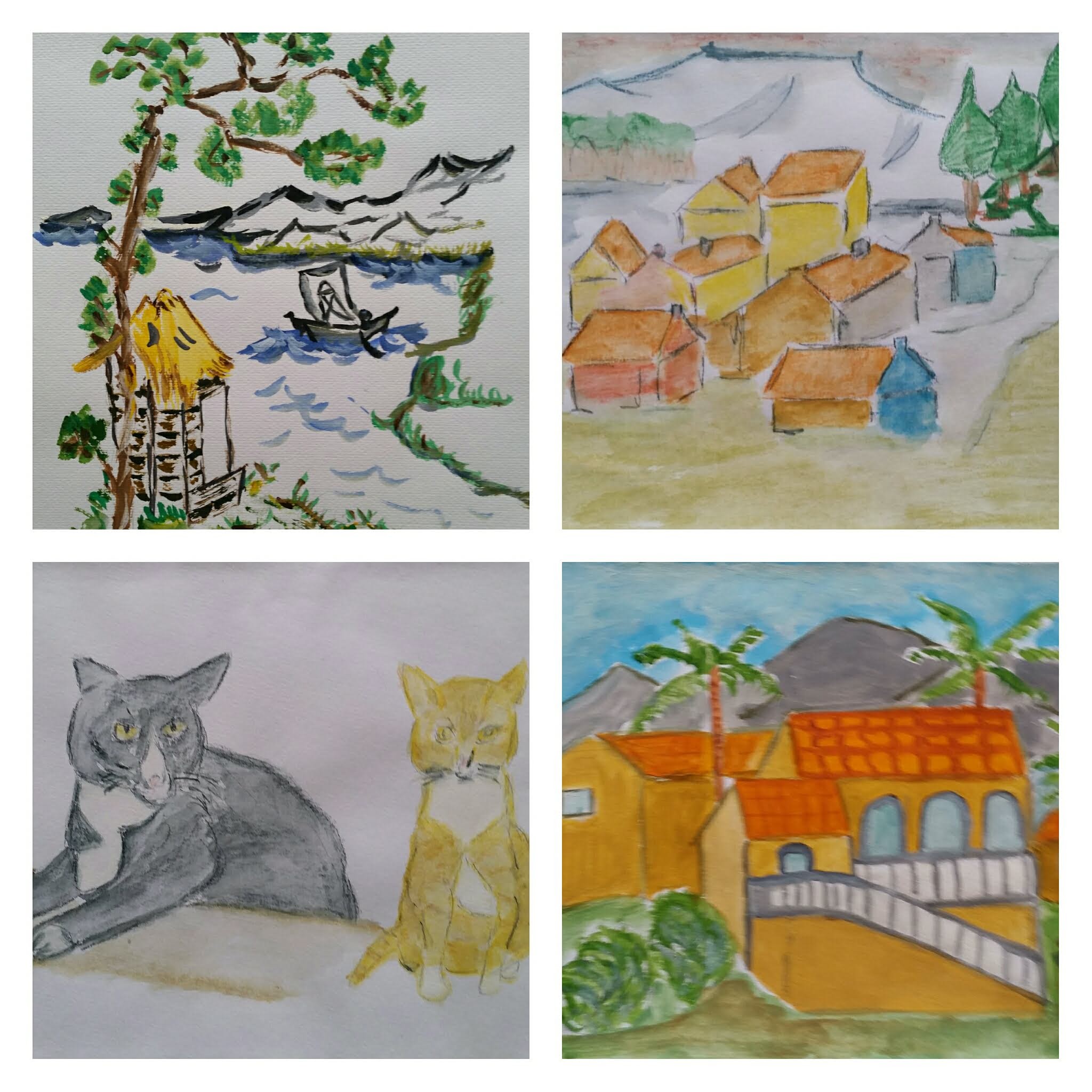
Before I joined the paintingclub in 2015, I almost never tried to sketch or paint something.However recently I found some attempts which I’ll share with you here.Of course I see some development but leave the judgement to you,the viewer.
Chinese scenery 2013,Fantasy village 2005,Our 2 cats Joepie and Dibbes 2005,View from our holiday house in Gran Alacant (Spain) 2014.
De Nederlandse versie van Sumi-e,of Chinees/Japans penseel schilderen is opgenomen in een apart hoofdstuk.
During our winter stay in Spain(2016) I took some lessons in Japanese/Chinese brush painting,or Sumi-e from Jose Sepulcre Diment who is a professor at the University of Alicante.Here you will find a description of the background and essentials of it.
What is Sumi-e
Ink painting originated in China and then was later adapted by the Japanese. The word sumi-e translates from Japanese to mean “ink painting.” Using the same materials today as were used hundreds of years ago, sumi-e artists use contrast and harmony to create paintings that embody the spirit of the natural world. This contemplative art form is based on the idea that less is more. It’s about taking a deep look at an object or scene, and leaving only what is absolutely necessary to invoke the essence of the object. Traditional sumi-e features inspiration from nature; flowers, trees, mountains, and animals are common subjects.
Set up
From the set up of the workstation, to the preparation of ink, to laying down brushstrokes, everything is based on intentioned placement. The workstation is set up to follow a Zen philosophy, to calm the mind and create a clean space for focus and contemplation.
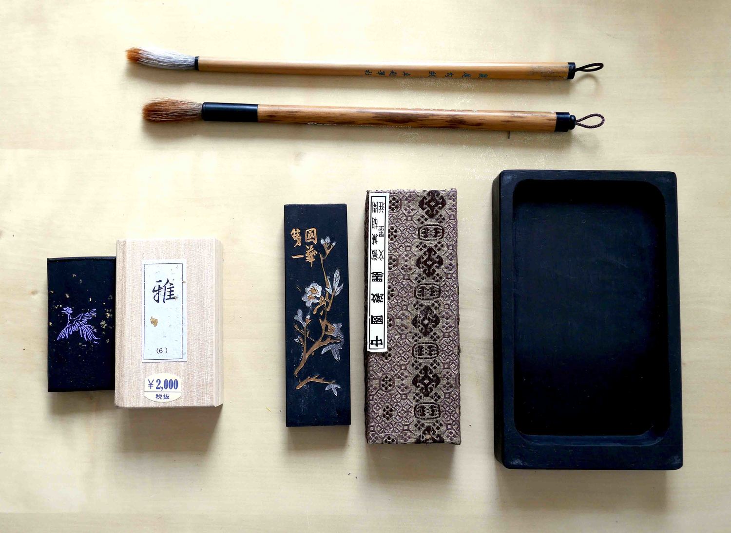
Tools of the trade: beautifully embossed ink sticks, a simple ink stone, and bamboo brushes.
Materials
Sumi-e supplies are fairly basic, requiring only an ink stick, an ink stone, rice paper, and a brush. The ink stick is ground into the ink stone with some water to make a fluid ink; depending on the amount of water used, the pigment will be lighter or darker on the gradient scale. The brush is held perpendicular to the paper, which differs from other forms of painting (and feels a bit strange at first). The amount of water and ink loaded onto the brush will dictate the texture or contrast of the brushstroke. Learning to hold the brush and add the right amount of ink takes practice.
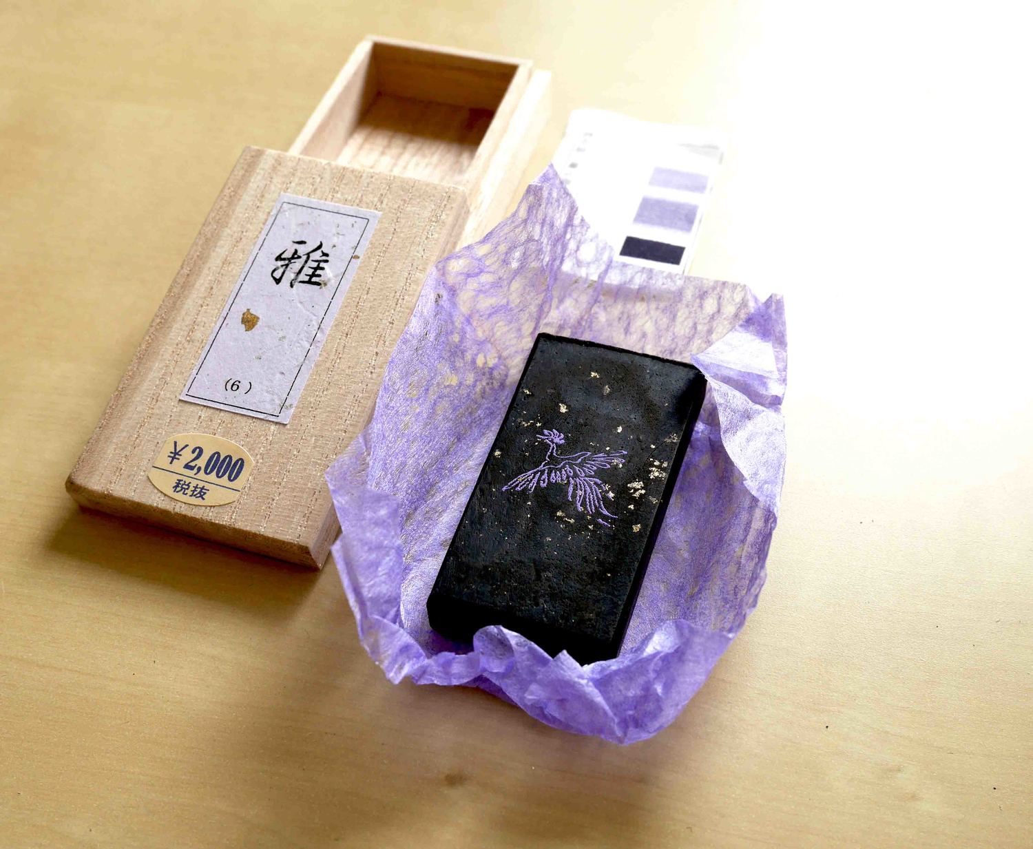
A more rare hue of ink stick (violet), brought back from Japan.
Basics
There are 4 main brushstrokes, also know as the Four Gentlemen. From these basic strokes, it is possible to make all of the common subjects found in Japanese brush paintings.
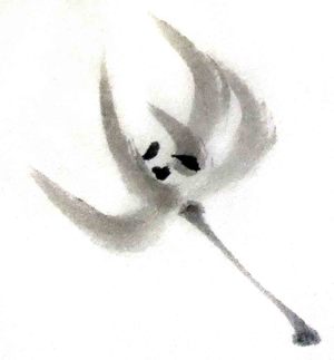
Orchid
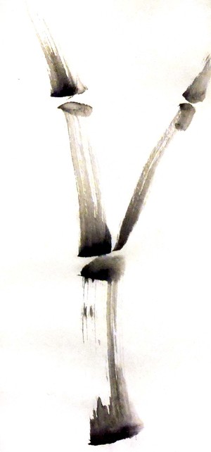
Bamboo
Chrysanthemum
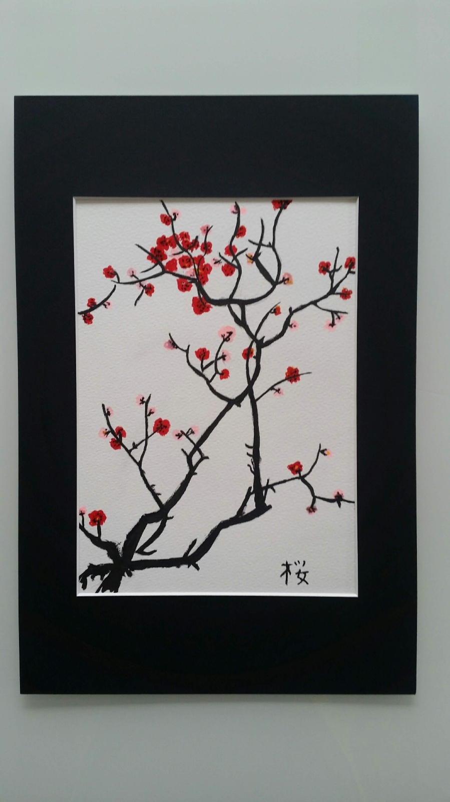
Plum blossom
Breathing
With each brush stroke, your whole body (not just the arm or wrist) moves as you breathe out, following the stroke across the paper. For a long smooth stroke, like the ones used for orchids, the breath is long and smooth. For the tiny petals of the chrysanthemum, each petal would be marked by a small escape of breath. Think of it as yoga or tai-chi, but with a brush.
Reflections
Sumi-e painting is more meditative than I expected. The simplicity of working only in greyscale allows you to focus on the brush strokes. Working with watercoIour I found the techniques similar, though more precision was needed. In watercolours, you have the opportunity to move the paint around, add another layer of colour, or even lift off excess paint. In Sumi-e, because the ink is permanent and the paper is so absorbent, you have one chance to get the brush stroke right. Each stroke must be made with intention and thought.
Returning to watercolour painting after this workshop, I’ve found that knowing the Four Gentlemen brush strokes has helped improve my painting techniques. The cross-connections and sharing of skills is where I find so much value in learning and trying new things.
This Sumi-e article is a copy of my Blog during our winter stay 2016 in Gran Alacant(Spain) where I took some lessons to learn about the art of Japanese/Chinese brush painting. It is written in Dutch,but I will publish a separate Enlish version hereafter.
In 2016,tijdens onze overwintering in Spanje heb ik kennis gemaakt met deze fascinerende techniek
Ik ben in Alicante naar een eerste les Chinees-Japans schilderen geweest,totaal anders dan de westerse schilderkunst en vooral de relatie met de Taoistische- en de Zen filosofie boeit me. Ik krijg les van José Sepulcre Diment,een leraar aan o.a de Universiteit van Alicante. Hierbij eerst wat achtergrond informatie over Sumi-e.
Het Japanse ‘sumi-e‘ schilderen is van oorsprong afkomstig uit China (shuǐ mò huà). Rond de 12de eeuw is het met Zen-Boeddhistische monniken meegekomen naar Japan, waar het ‘sumi-e’ ging heten: ‘zwarte inkt schildering’. Met alleen zwarte inkt en water wordt het schilderij gemaakt. Sumi-e komt waarschijnlijk voort uit de Oost-Aziatische kalligrafie, beiden zijn sterk verbonden met het Zen-Boeddhisme en Taoïsme. Bij sumi-e wordt met zo min mogelijk penseelstreken zoveel mogelijk verbeeld, de bedoeling is de essentie van het onderwerp uit te drukken. Hiervoor is naast techniek en kennis van het onderwerp, concentratie nodig. De schilder probeert niet alleen het onderwerp weer te geven, sumi-e is een vorm van meditatie, het resultaat is een uiting van spiritualiteit.
Onderwerpen
Vaak worden er bij sumi-e landschappen of onderwerpen uit de natuur weergegeven; planten, bloemen, bomen, takken, bladeren en dieren. Om een onderwerp goed te kunnen weergeven is het nodig het onderwerp te kennen, te begrijpen.
Materialen In China werden de belangrijkste benodigdheden in de schilderkunst en de kalligrafie ‘de vier schatten van de studeerkamer’ genoemd.
Penseel, inktstaaf en inktsteen
Penseel Het penseel (fude) is de eerste schat. De penselen die voor sumi-e worden gebruikt hebben een bamboe steel met aan de onderkant meestal een lusje. Het haar van de penseel is van een geit, schaap, paard, wolf, hert of konijn. Deze penselen kunnen veel water en inkt opnemen. Er zijn verschillende maten en er zijn stevige, zachte en langharige penselen afhankelijk van haarlengte en haarsoort. Verder zijn er speciale penseelsteunen om de penselen tijdens het schilderen even op te kunnen leggen. Na het schilderen moeten de penselen goed met water worden schoongespoeld en uitgeknepen. Daarna kunnen ze met het lusje aan een penseelrek worden opgehangen om ze te laten drogen.
Inkt De tweede schat is inkt, in de vorm van een zwarte inktstaaf (sumi). Traditioneel wordt er bij sumi-e, in tegenstelling tot de Chinese schilderkunst, geen kleur gebruikt. Er bestaan blauwzwarte of bruinzwarte inktstaven. Ze worden gemaakt van houtskool van de pijnboom of dennenboom en hars of beenderlijm als bindmiddel, soms is er ook wierook aan toegevoegd. Om de inkt te kunnen gebruiken wordt de staaf met wat water over een inktsteen gewreven. Tegenwoordig is de inkt eveneens verkrijgbaar in vloeibare vorm.
Papier Papier is de derde schat, meestal wordt Japans rijstpapier (washi) of Chinees rijstpapier gebruikt, dit wordt gemaakt van plantenvezels. Het is verkrijgbaar in vellen en op rol. Er zijn verschillende soorten rijstpapier; glad of ruw (grove of fijne vezels) dun, dik, weinig of veel absorberend, met stukjes bladgoud erin en handgeschept of machinaal vervaardigd. Ze geven een verschillend resultaat. Onder het papier kan een stuk vilt worden gelegd om het teveel aan water op te nemen. Het plaatsen van kleine gewichten (presse papier) op de randen van het papier voorkomt dat het papier verschuift of oprolt tijdens het schilderen.
Inktsteen De vierde schat is een inktsteen (suzuri), deze is meestal gemaakt van natuursteen; leisteen of tufsteen. Een inktsteen is rechthoekig en plat van vorm en heeft een vlak gedeelte en een diep deel. Op het vlakke deel wordt de inktstaaf gewreven. Het diepe deel is gevuld met wat water waarmee de inkt kan worden gemengd.
Techniek Bij sumi-e worden dezelfde materialen en technieken gebruikt als bij de kalligrafie. Penseelstreken moeten snel, zeker en vloeiend van beweging zijn, bij twijfel ontstaat een vlek omdat het papier sterk absorberend is.
Verschillende inkttonen Door het mengen van de zwarte inkt met water kunnen variaties in toon worden gemaakt, die zelfs tegelijkertijd in een penseel opgenomen en toegepast kunnen worden.
Penseel hanteren Het penseel is op drie manieren te hanteren, door de penseel verticaal te houden ontstaan rechte en smalle lijnen, voor brede lijnen en vlakken moet het penseel schuin worden gehouden en voor grotere vlakken horizontaal. Door harder met het penseel op het papier te drukken ontstaat een dikke, bredere lijn. Verder kunnen texturen worden gemaakt door het penseel verticaal of schuin vast te houden en ermee te wrijven of te draaien.
Zegel De schildering wordt voorzien van een zegel (hanko) met karakters, voor de naam van de schilder. Zegels zijn meestal gesneden uit speksteen en worden gestempeld met rode Chinese stempelinkt.
Mijn eerste les van José ging uiteraard in op de achtergronden en de basistechnieken van deze vorm van schilderen met zwarte inkt. Eerst moet ik met Chinese eetstokjes proberen allerlei voorwerpen op te pakken om daarna de juiste (hand)houding voor het penseel aan te leren. Vervolgens oefen ik op de basis penseelstreken Hen (Chin.) of Yokokaku (Jap.) en Shu of Takekaku.
Hierna wordt ingegaan op de “4 edelen”,oftewel de wilde orchidee,de bamboe,de chrysant en de pruimenboom. Natuur heeft in de (oosterse) schilderkunst vaak een symbolische betekenis. Bijvoorbeeld: bamboe staat voor eeuwigdurende vriendschap en een langdurig leven. Bamboe vertegenwoordigt flexibiliteit geworteld in kracht. Het versterkt in de persoon die hem schildert een flexibele innerlijke houding : Net als de bamboe , vecht hij niet tegen de veranderingen die plaats vinden in het leven , maar stroomt mee en past zich aan (Wu Wei). Degene die zich op deze manier gedraagt is “groen in alle seizoenen”, hij blijft in harmonie met zichzelf en evenwichtig zelfs als de seizoenen, de fases in het leven, zich veranderen. Orchidee, bamboe, pruimenboom, en chrysant vertegenwoordigen de ‘ki’ of de levensenergie van de vier seizoenen en de vier levensfasen van de mens. Elk motief gaat gepaard met specifieke penseelstreken. Door het combineren van deze penseelstreken kan elk onderwerp worden geschilderd.
We oefenen lang op de Bamboe.(zie ook filmpje over José) Aan het eind van de les nog wat probeersels met de chrysant,waarbij ik merk dat loslaten,lichtheid,concentratie absoluut vereist zijn om deze schildertechniek enigszins onder de knie te krijgen.
Ondanks mijn zeer matige Spaans en het zeer matige Engels van José heb ik toch het nodige opgestoken van deze fascinerende techniek.
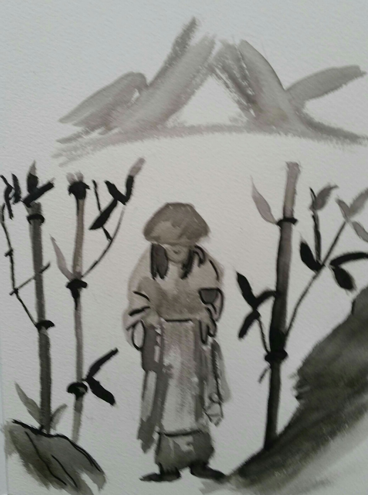
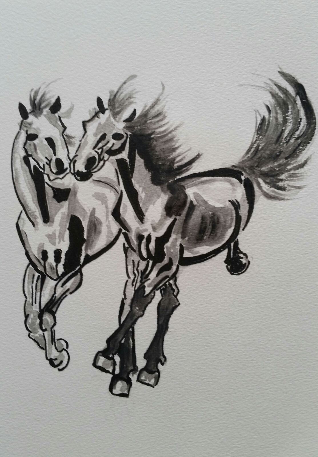
Recent heb ik weer wat pogingen gedaan met o.a het volgende resultaat.Het betreft hier een combinatie van Sumi-e (penseel) en pen-tekenen.
Zen monkGalloping horsesSakura,cherry blossom or “kersenbloesem” in Dutch.